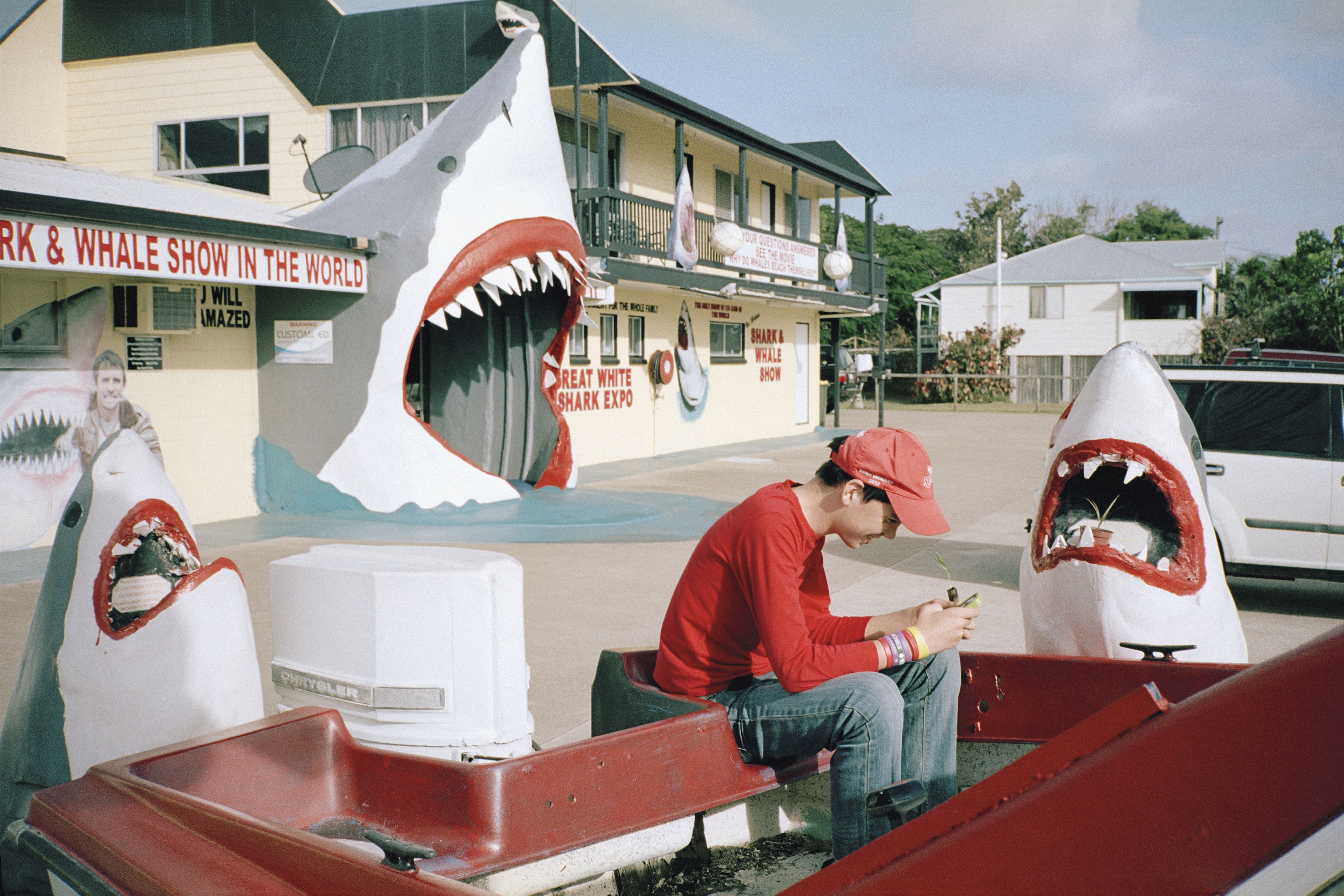
The Resurrection issue.
/ Volume 01
EDITORS LETTER
G'day Fuckers,
No Cure is back, for those of you who missed us (Hi, Mum!).
If you're wondering where we've been, well, I don't really want to get into it, but the misso dumped me, took the kids, and told Centrelink where to find me. Okay fine, you want the truth? I guess middle age caught up with me and I've been spending my days shacked up in the country, working an actual 9-5. I spend my Saturdays at a farmer's market. Look away, I'm hideous!
It's been five long years since No Cure vanished from the newsstands, and nothing much has changed apart from the reflection in my bathroom mirror, which is scarier than a Sunday afternoon. What about you guys? Yeah don't pretend you've been pining for these pages when I've seen you fucks flicking through TikTok videos, mesmerised by ageing Millennials performing dance routines.
I've decided we need to put entertainment back on paper where it belongs, before the algorithms join forces with those little robot vacuums we bought cheap from Aldi and start chopping off our dicks. Anyway, I got the band back together, and am thrilled as fuck to present The Resurrection edition, which celebrates the rebirth of No Cure.
Hopefully after a five-year hiatus you'll find this edition full of nostalgia, fresh inspiration, good vibes, and plenty of laughs. Or maybe it'll be more like finding that half-eaten tub of Jalna yoghurt festering in the back of the fridge. I can't make any promises.
If you've got thoughts—good, bad or sexual—email them to me at mark@nocuremag.com. Unless you're from Centrelink, in which case I died in an awful accident involving an ice-cream van and a loose bridge railing.
Until next issue!
Editor: Mark Zeidler

RAD
/SHIT
Get the latest Rad Shit from the best brands and artists.
BANGKOK RUNNING MAN
Brolga's latest print 'Bangkok Running Man' is available as both a standard and
embellished edition. Each of the embellished prints are hand drawn by the artist with original drawings – no two are the same! Embellished print priced from $295.
STANCE X BERT KRAK
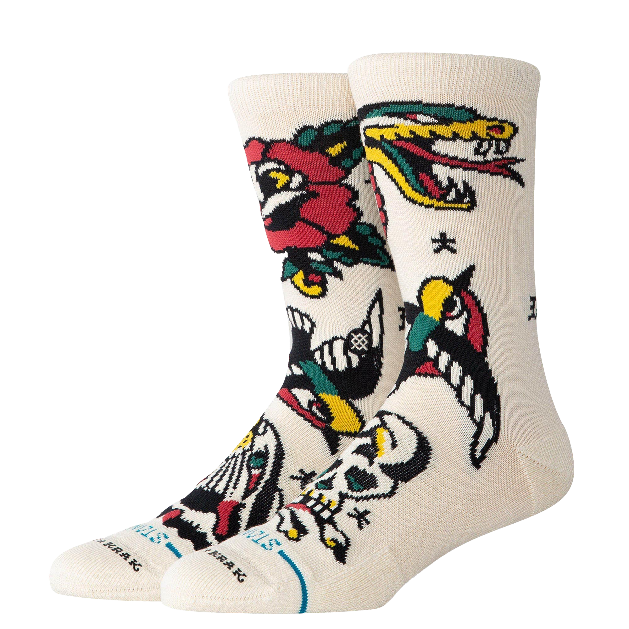
Stance have teamed up with legendary tattoo artist Bert Krak to drop their fan-favourite crew socks in BERT’S ICONIC STYLE. It’s bold, it’s classic, and it’s tattoo culture—without the lifelong commitment. Yours for $29.99.
LIVING IN THE 70's

Fresh colours have always been part of the Chuck Taylor repertoire. In laidback shades, these premium Chucks 70's are ready to take on all your best looks.
DRESSED TO IMPRESS
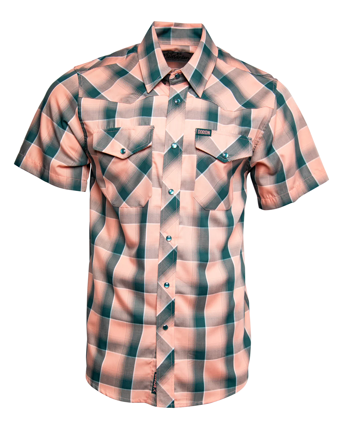
Bright peach and cool teal meet crisp white in the 'Pleasanton Bamboo' short sleeve shirt, a plaid built to keep things fresh all summer long. Priced at $49.99.
MODERN CLASSIC
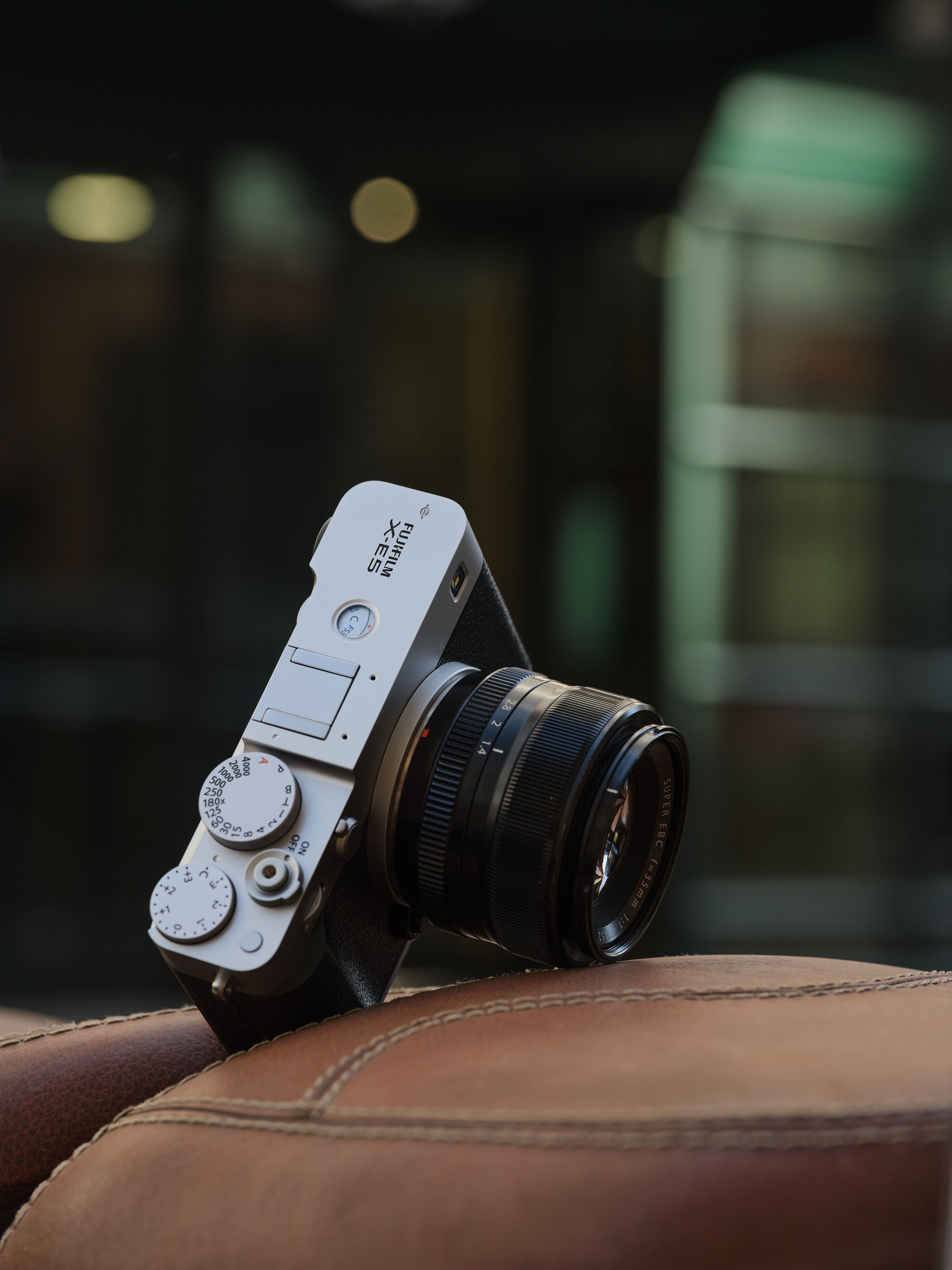
FUJIFILM X-E5 embodies what it means to be a modern classic, combining a sophisticated, elegant design with analog controls that inspire image making. Crafted solely from machined aluminum, the top-plate retains the essence of a classic camera with its angular design. Camera body priced at $2,699.
fujifilm-houseofphotography.com.au
GO WIRELESS

Enhance the everyday with the ATH-CKS30TW+: the true wireless earbuds that stimulate the senses with chest-thumping bass and immersive active noise-cancellation. PRICED AT $199.
A TOUCH OF NOSTALGIA
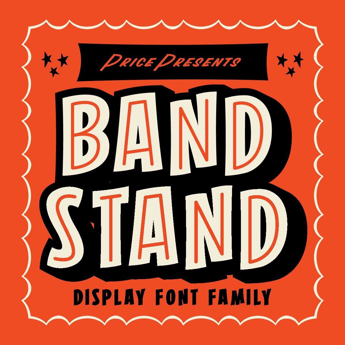
Melbourne-based illustrator Travis Price has many cool looking fonts over on his site – 'Corner Store' and 'Band Stand' are our favourites. Both of these nostalgic-looking fonts takes you back to a time when life was a little more simple.
Perfectly imperfect, both fonts are ideal for branding, posters, packaging, or any project that needs an old-school aesthetic.
Save 25% off with the code NOCURE. This exclusive deal for No Cure readers expires 1 January.
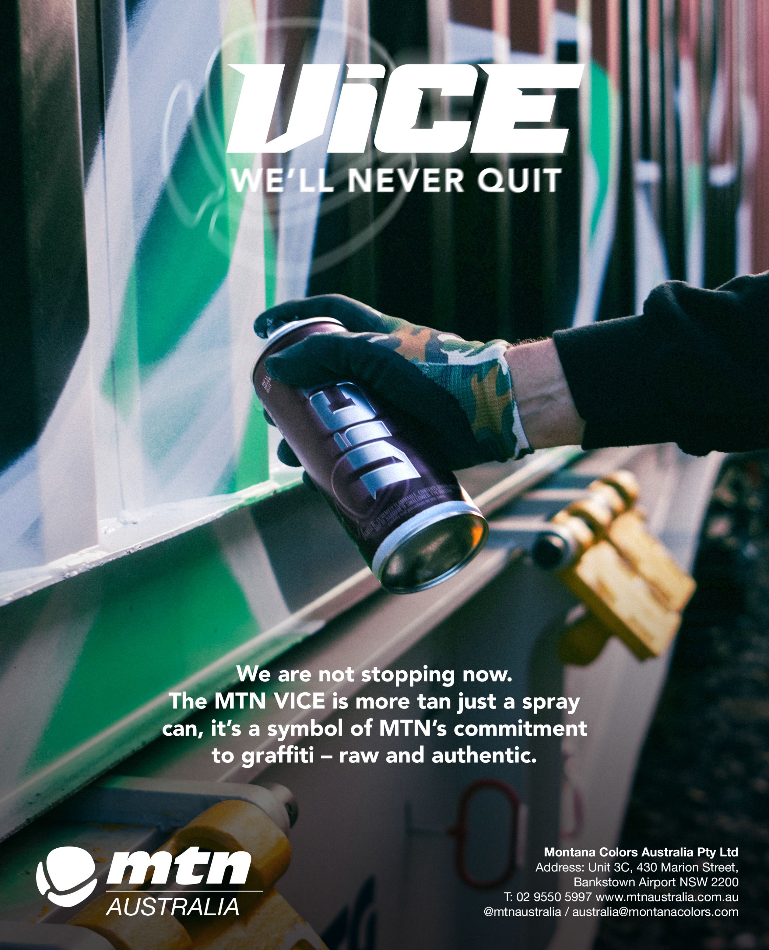
PRECISE CONTROL
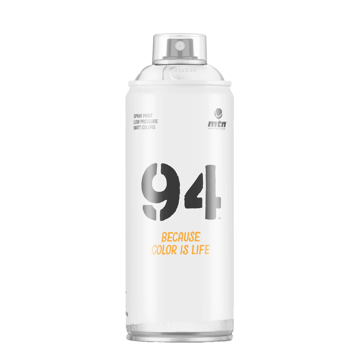
MTN 94 Spray Paint cans provide artists, craftsmen and your everyday DIY'er precise control to achieve your finish and effects with ease. Now with 217 high opacity colours in its range you will never be short of producing your best work.
SUPERWOW GALLERY
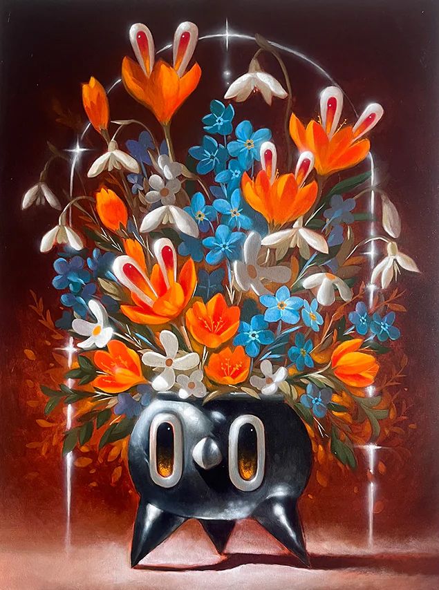
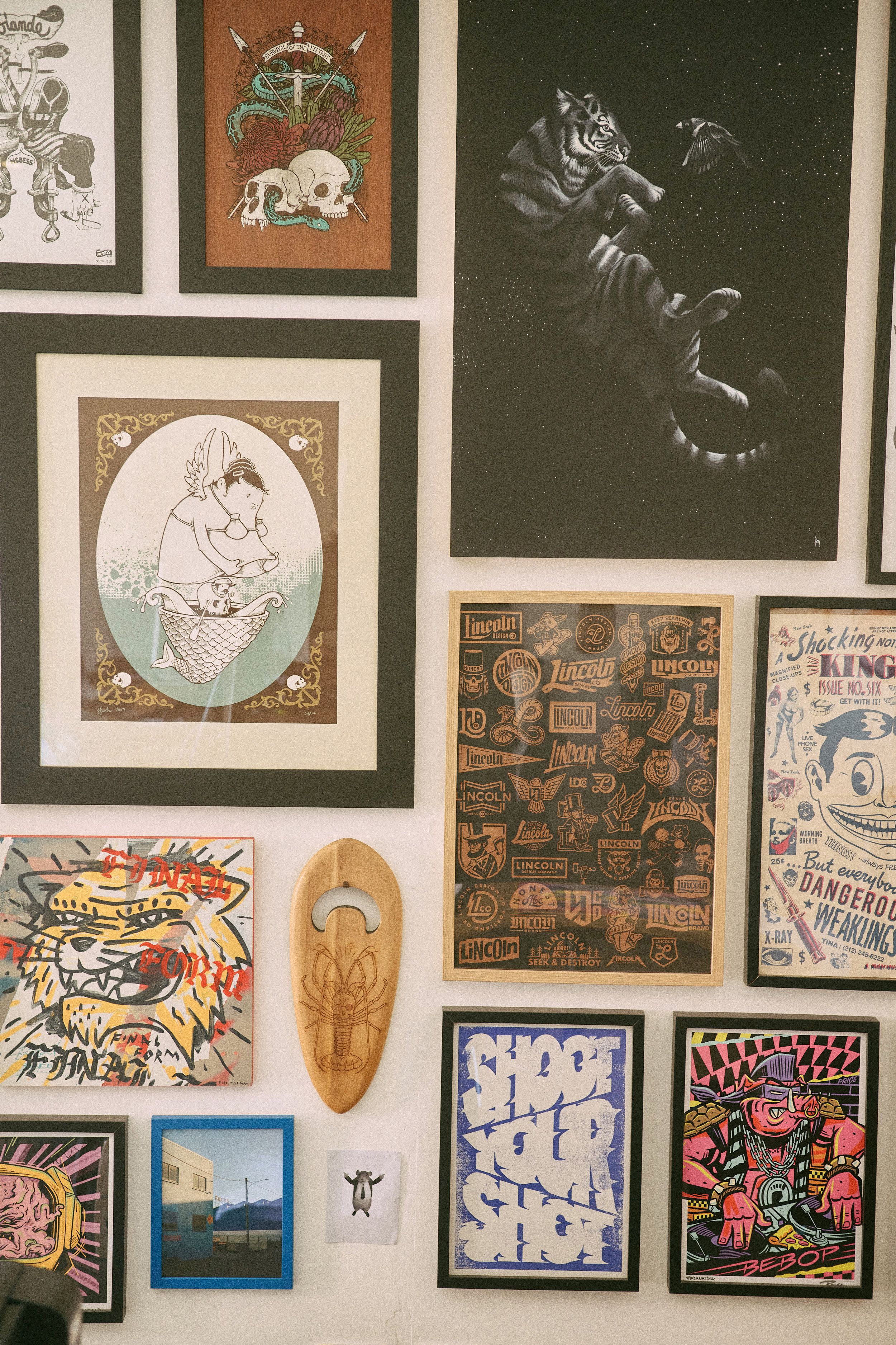
Superwow Gallery, situated in Moffat Beach on the Sunshine Coast, is a new contemporary art space that showcases a diverse range of artistic expressions through monthly solo and group exhibitions. Featuring both renowned international artists and emerging talents from Australia and beyond including artist Krachok (whose work is pictured here).
STICKER RADNESS
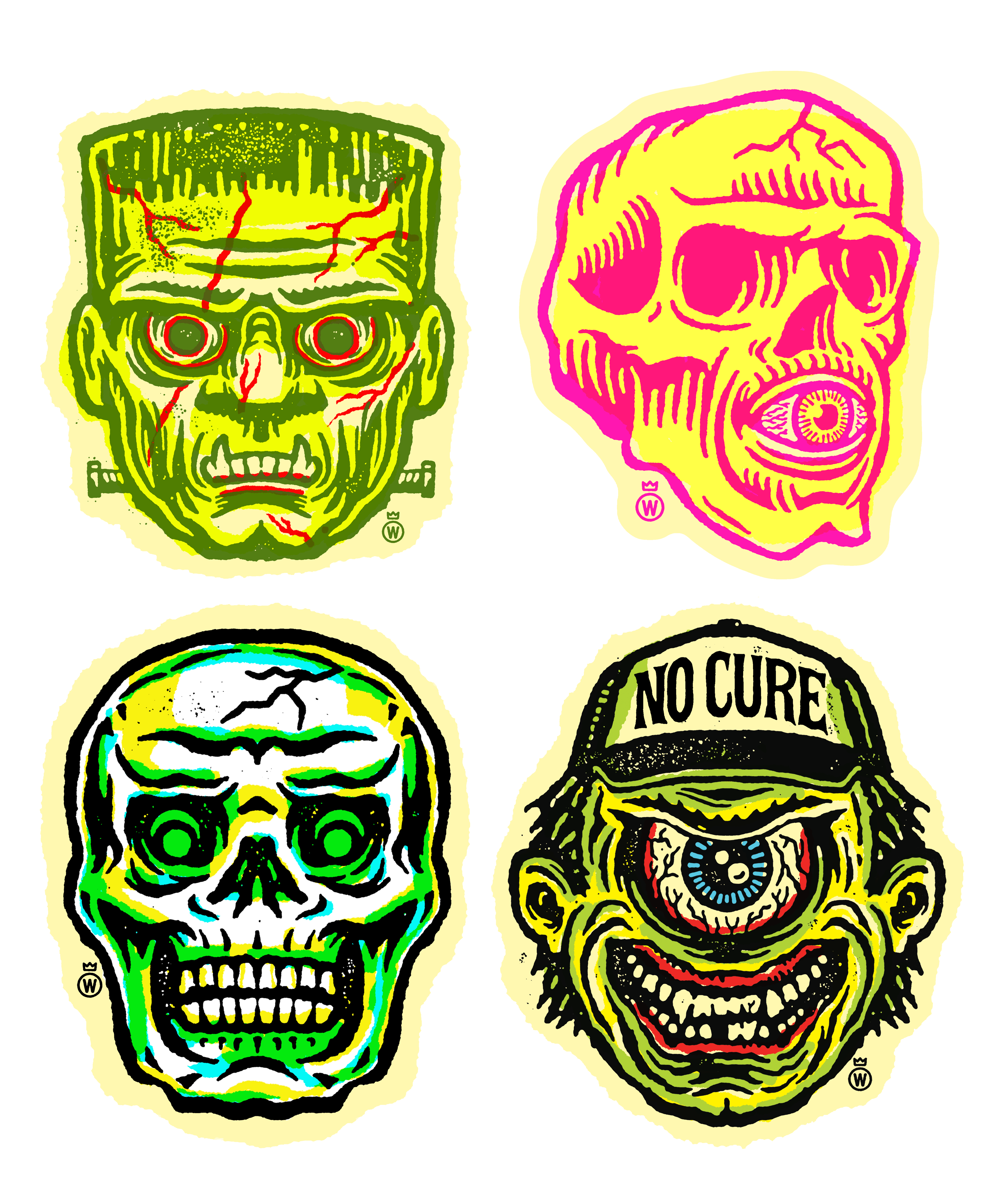
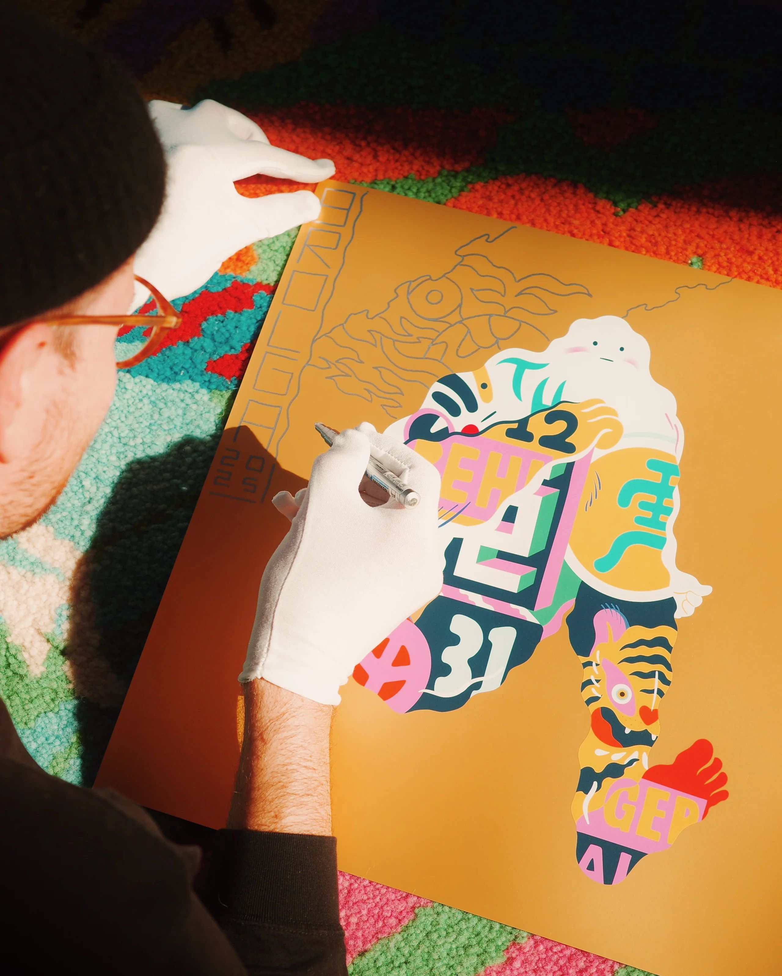
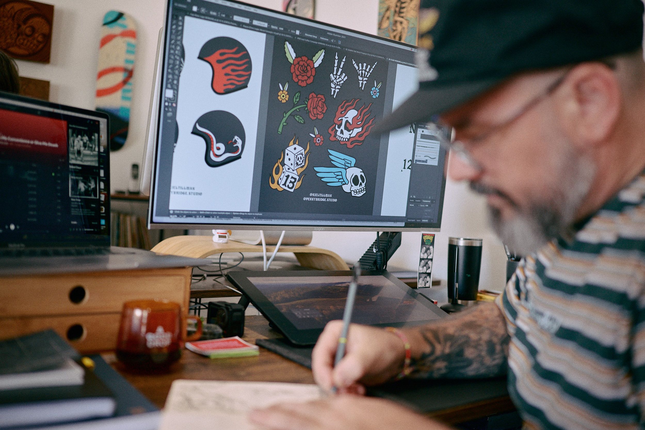
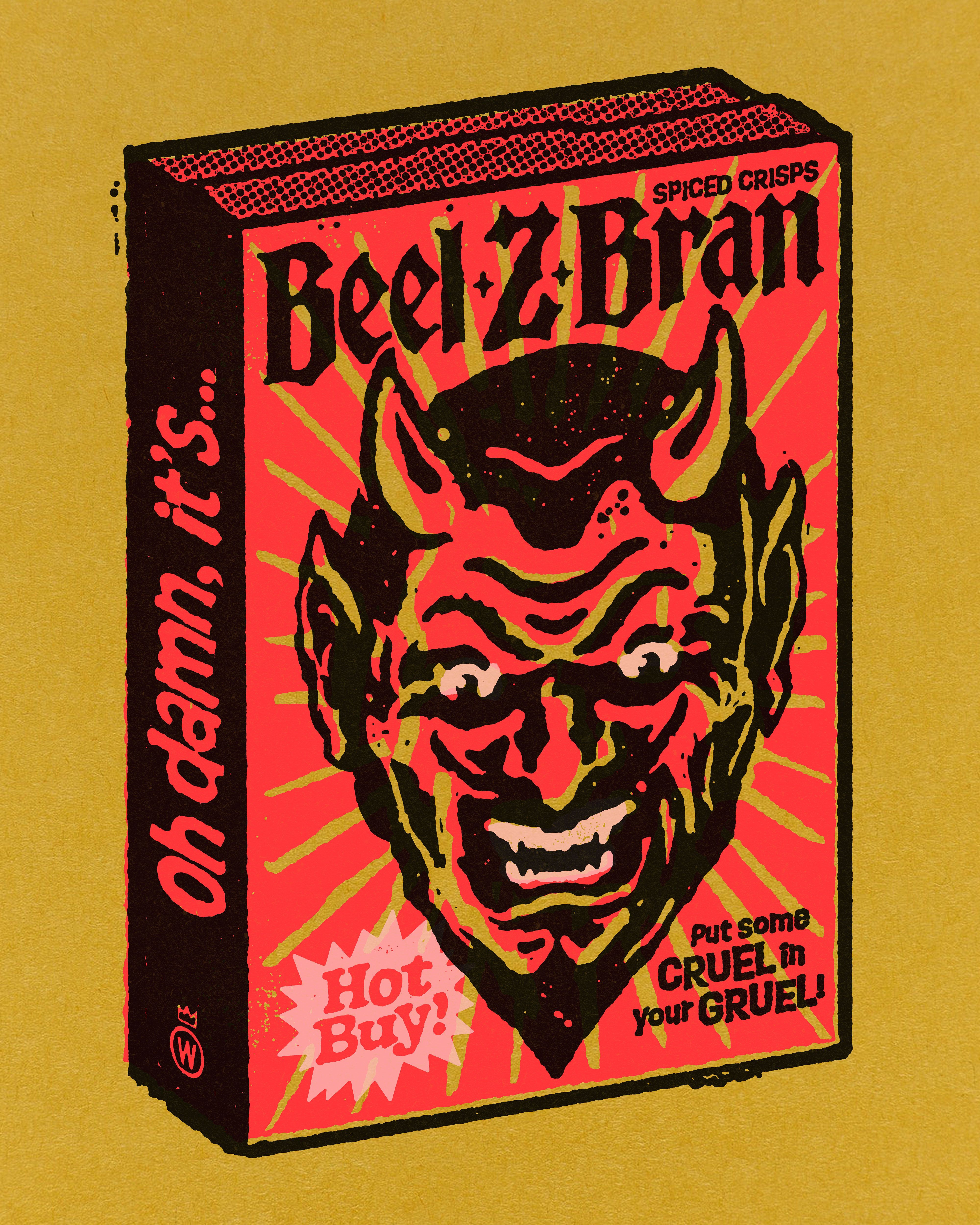
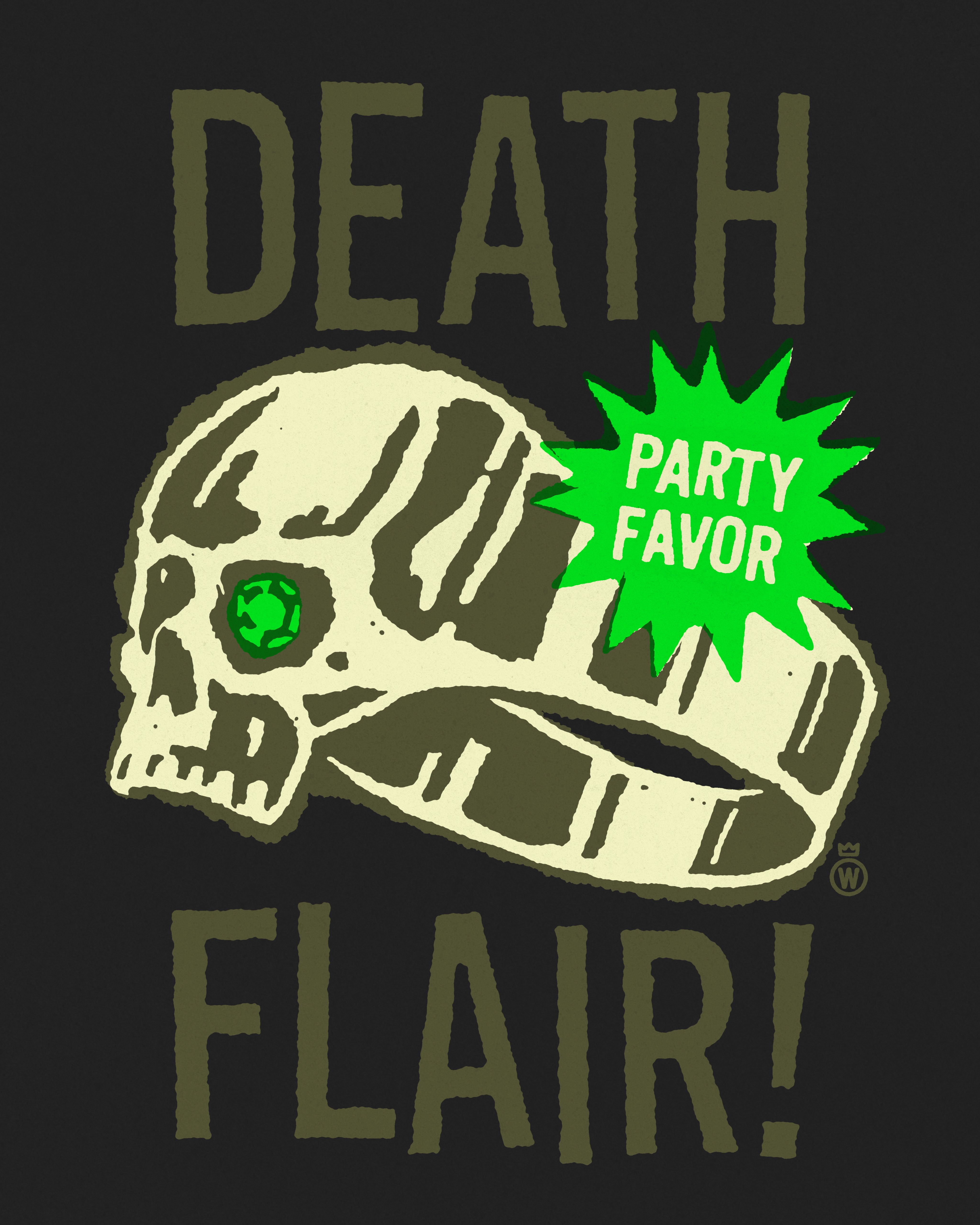
This issue we teamed up with the legends at Rad Stickers. If you bought a copy of No Cure you would have these waterproof, scratch-proof and fade-resistant rad stickers in ya dirty mitts. Front cover artist Dr.Wolfenbergen AKA Justin Moll came up with these amazing designs. To upload your own designs visit:
NO CURE X INKBOY REBIRTH TEE
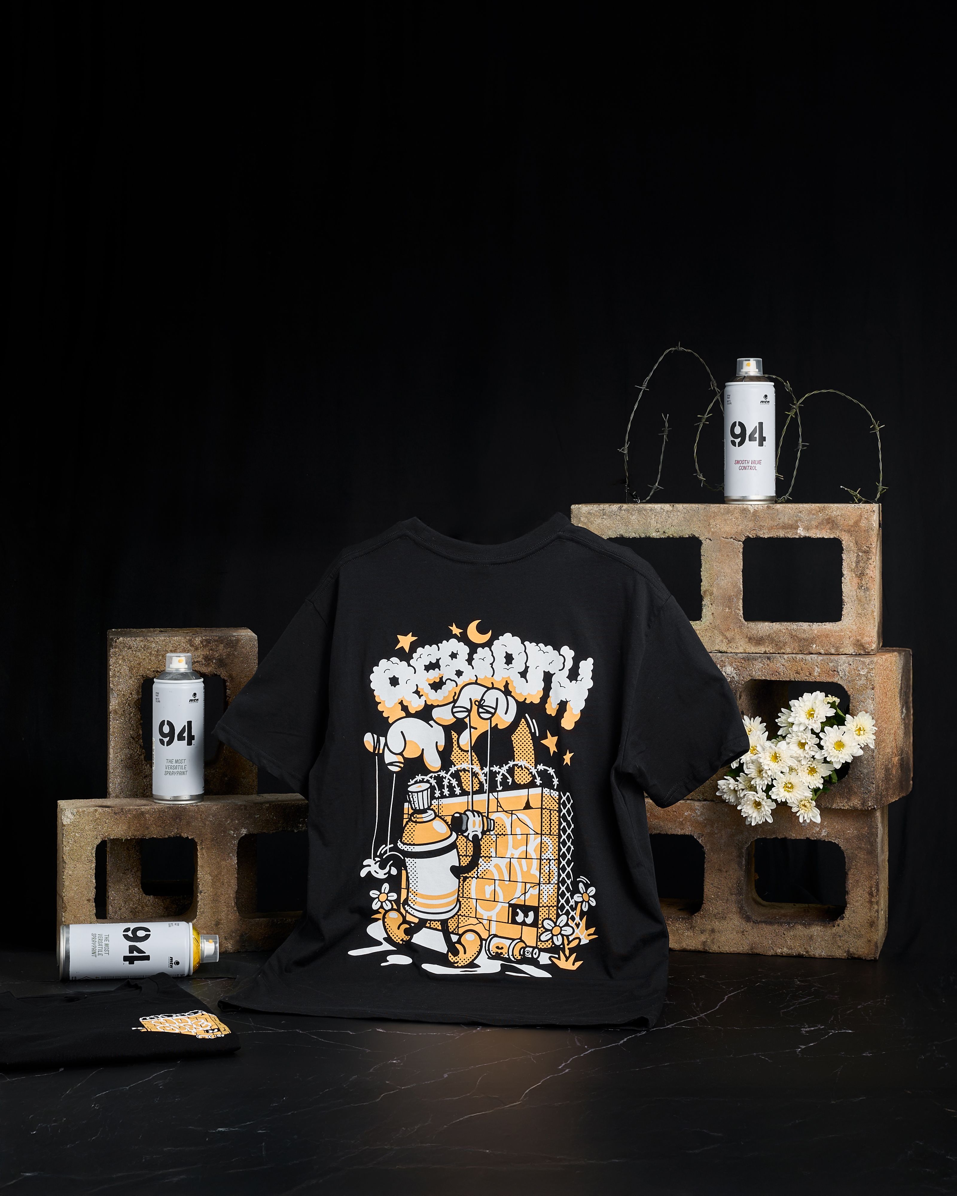
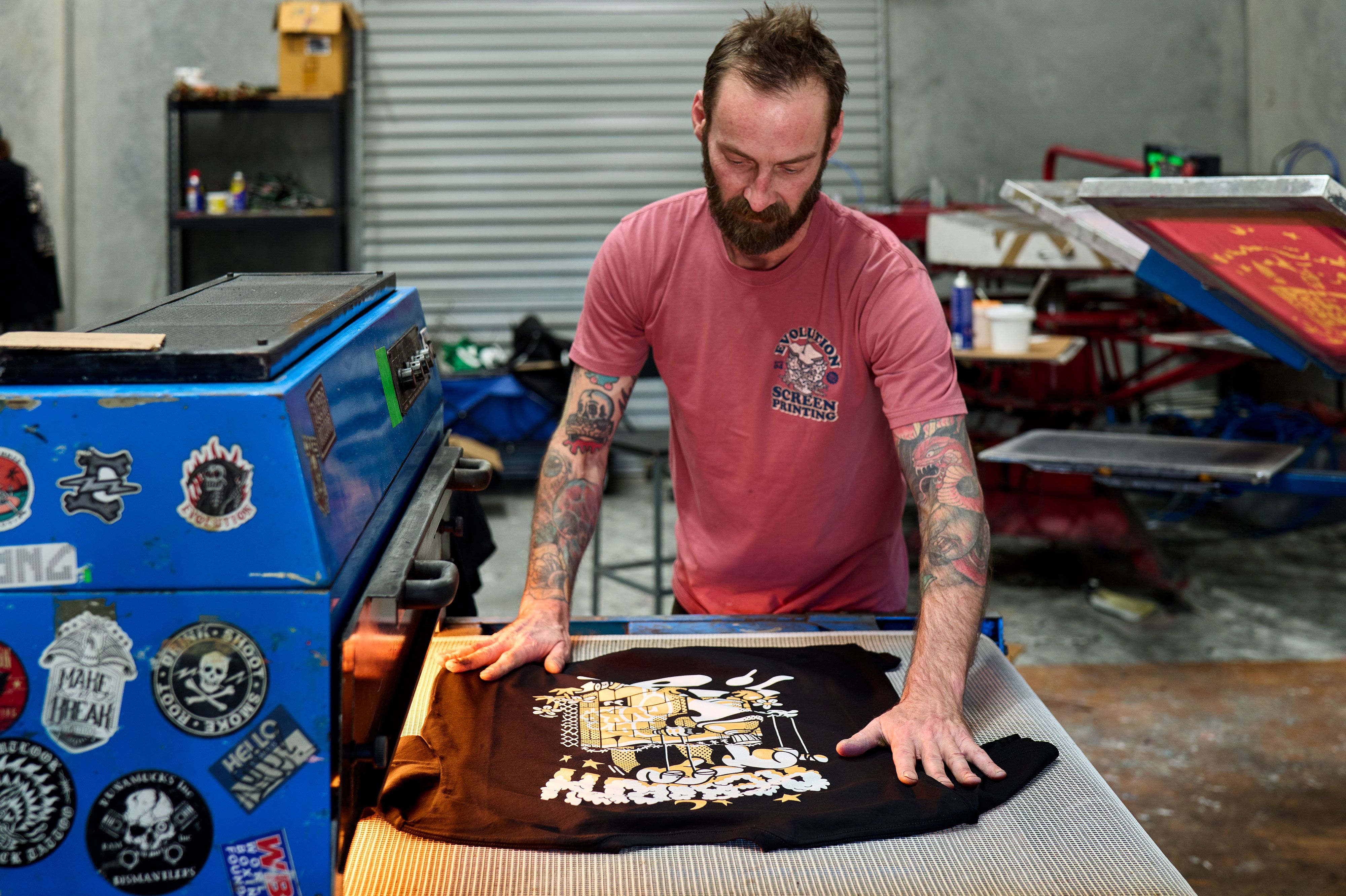
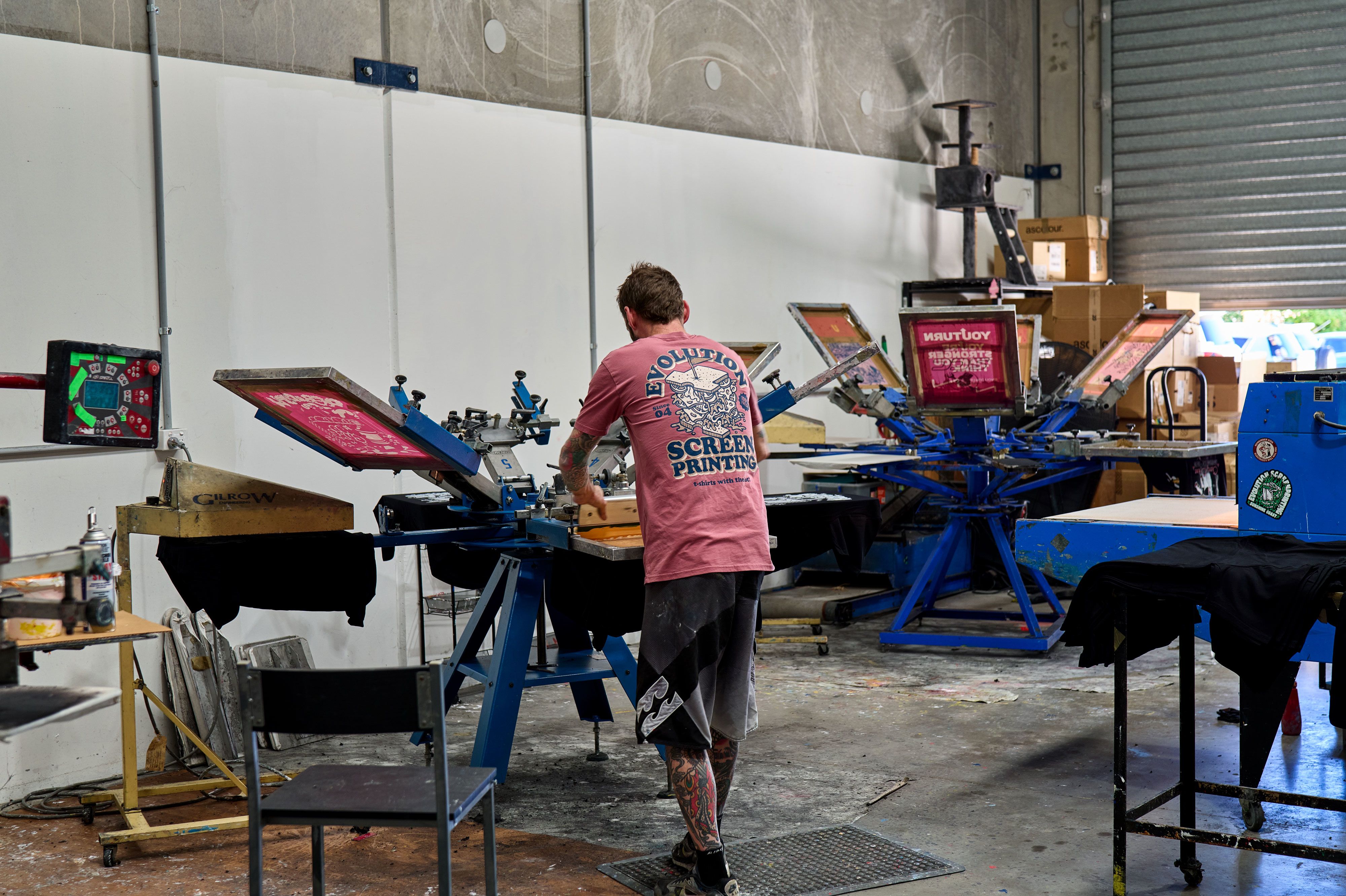
To celebrate the launch of our comeback issue we decided to drop the No Cure x Inkboy - Rebirth tee ($40). Teaming up with ascolour, the staple tee was the perfect canvas for this print. A shout out to Evolution Screenprinting for their top notch work. Dont be tight visit our online shop to pick one up!
DODGY PAPER
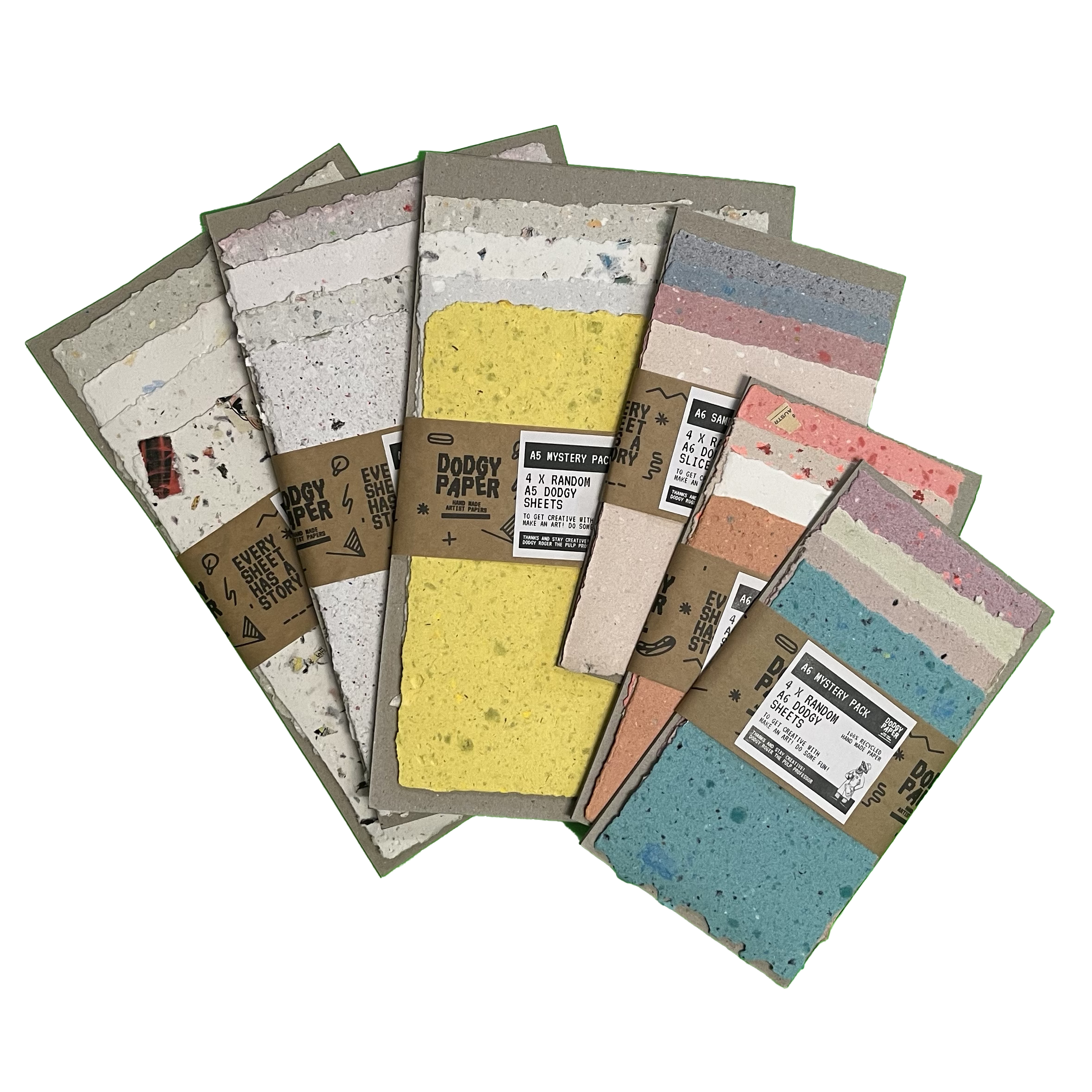
Calling all artists and creatives: Dodgy Paper produce every sheet by hand from recycled and upcycled waste. No two pieces are the same — each one comes with its own history. Add your story to the stack.


Homegrown
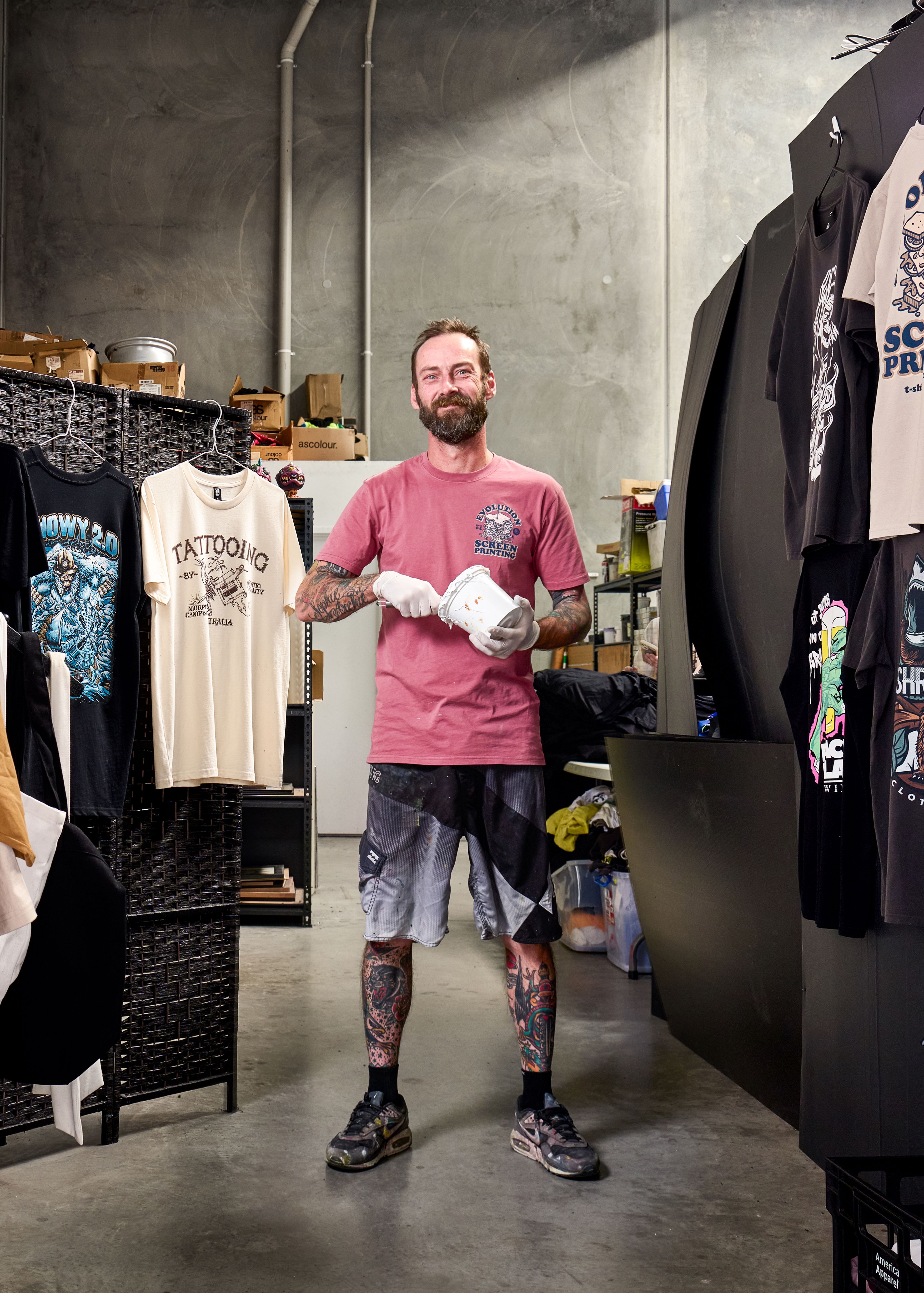
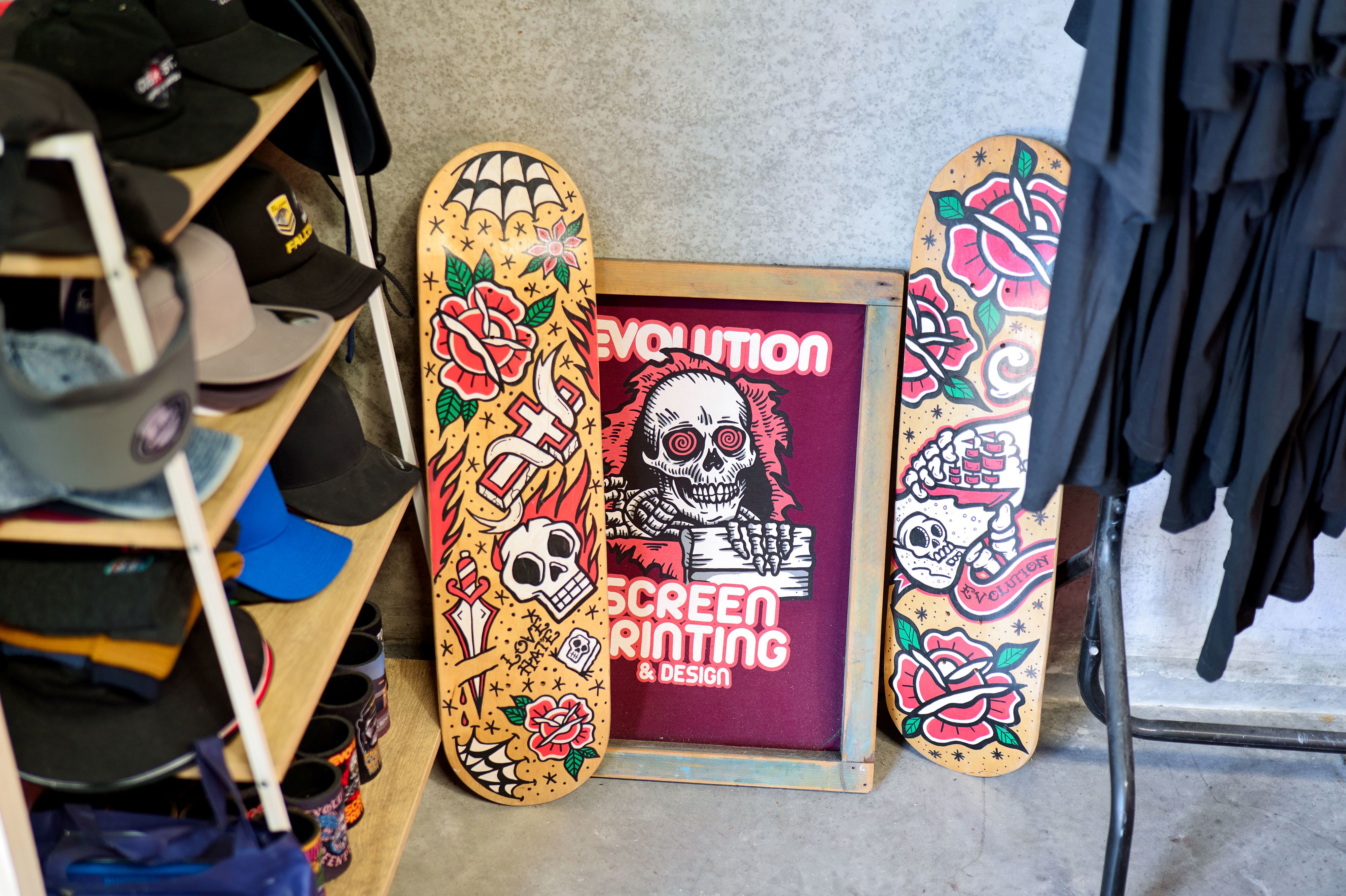
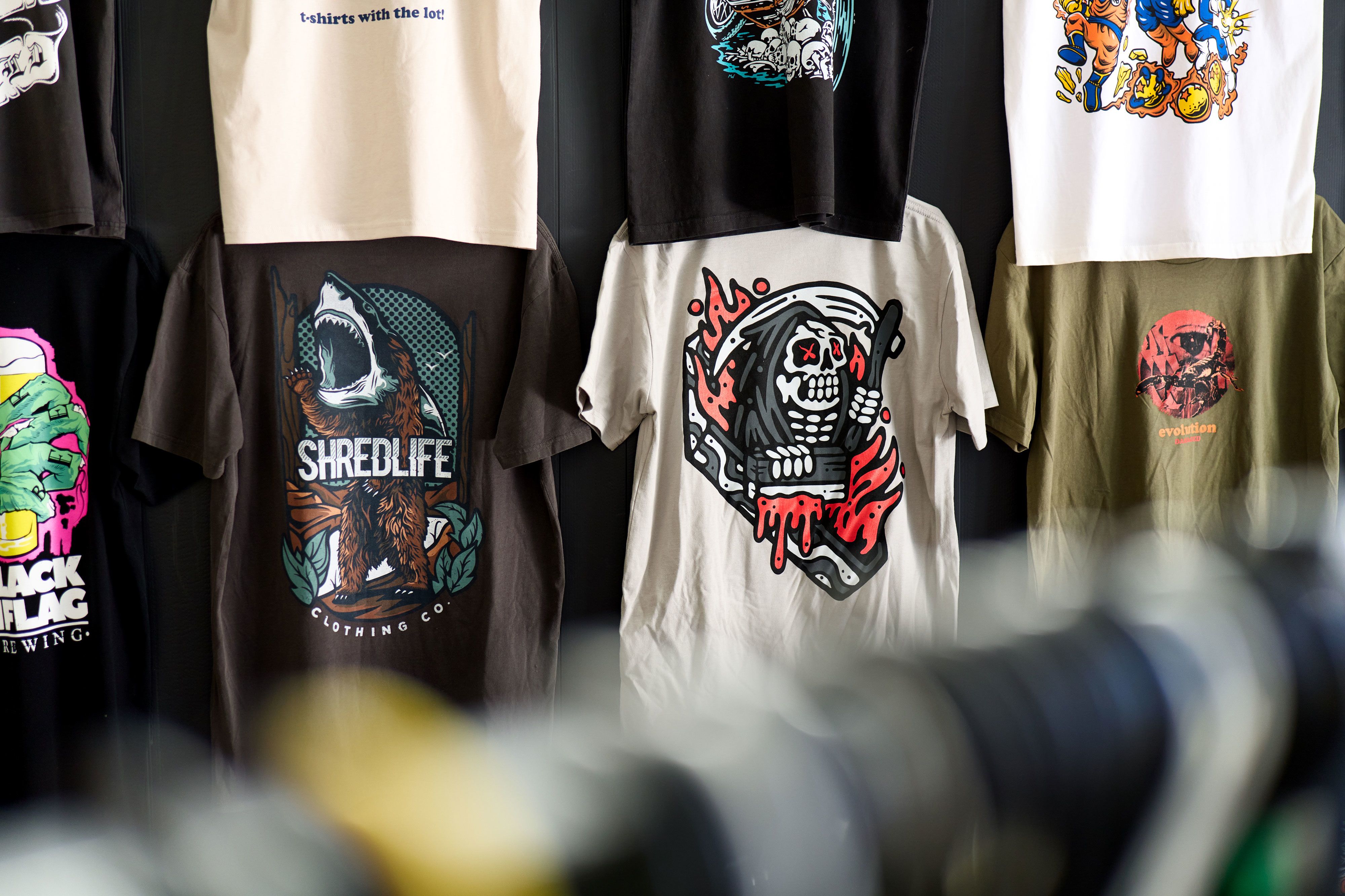
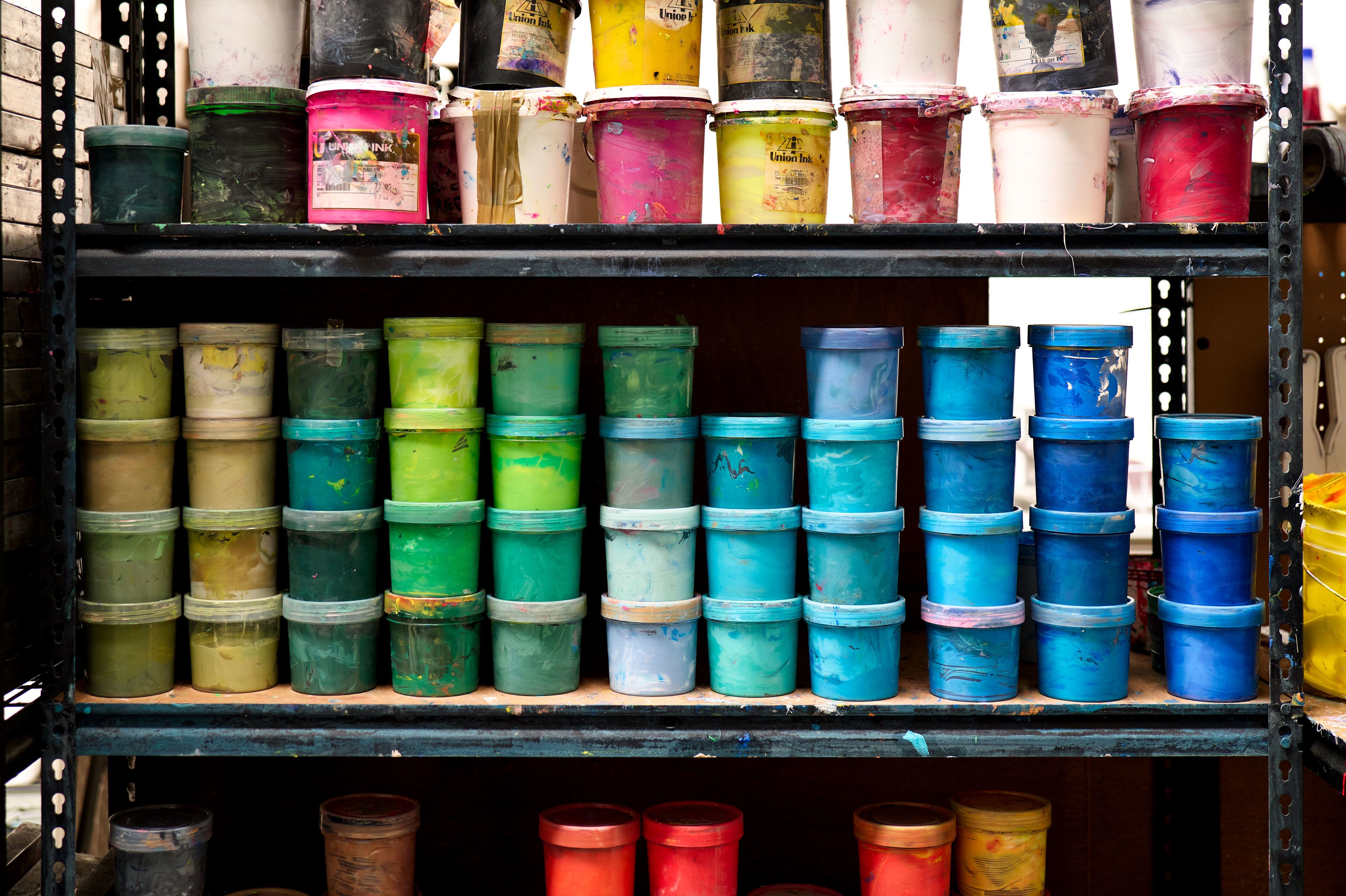
Evolution Screenprinting
Interview: Ruby Avery De-Waal

CHRIS LALIBERTE IS THE FOUNDING BRAINS AND HANDS BEHIND EVOLUTION SCREENPRINTING & DESIGN, A SUNSHINE COAST STAPLE THAT’S BEEN TURNING HEADS (AND TEES) FOR OVER 30 YEARS. WITH A DEEP RESPECT FOR THE CRAFT AND A LOVE OF RETRO AESTHETICS, CHRIS CONTINUES TO CHAMPION HANDS-ON SCREENPRINTING IN AN EVER-CHANGING CREATIVE LANDSCAPE. WE CAUGHT UP WITH HIM TO CHAT ABOUT HIS JOURNEY, HOW EVOLUTION CAME TO BE, AND OUR RECENT COLLABORATION TEE WITH AS COLOUR.

What first sparked your love for screenprinting? Can you tell us a bit about the early days of Evolution and how it all came to be?
I’ve always been artistic and naturally drawn to creative expression, so when I discovered screenprinting, it felt like the perfect fit. It was one of the few industries where I could really express myself creatively and make a living doing it. After spending ten years learning the ropes and honing my skills with my original employer, I decided to take the leap and start Evolution. It was a big move, but it felt like the right time to build something of my own and channel my passion into a business that reflected my values and style.
Over three decades of running a local business means you’ve seen how much things can change! How has Evolution evolved as a business since you started, and what are the biggest differences between then and now?
Evolution has grown and changed immensely over the years. We've evolved alongside the industry, scaling the business to adapt to shifts in the economy and embracing new technologies that have changed how we work. One of the biggest challenges has been finding and encouraging a new generation of screen printers, people who bring fresh energy and ideas to the craft. It's been all about adapting, staying relevant, and keeping the quality and creativity at the core of everything we do.
What are some of the standout trends or styles you’ve seen come and go? How do you blend old-school influence with new ideas?
Trends in this industry are constantly cycling; what's old eventually becomes new again. We’ve seen vintage and oversized styles make a huge comeback, especially 90s aesthetics, which are everywhere right now. What’s interesting is that the old-school influence often is the new idea, especially when it comes to t-shirt graphics. We’ve always stayed true to that retro inspiration while putting a fresh spin on it to keep things current and exciting.
If you could bring back any screenprinting style, technique or era, what would it be and why?
I’d bring back discharge printing in a heartbeat. It was one of the more challenging techniques, but that’s what made it so rewarding.

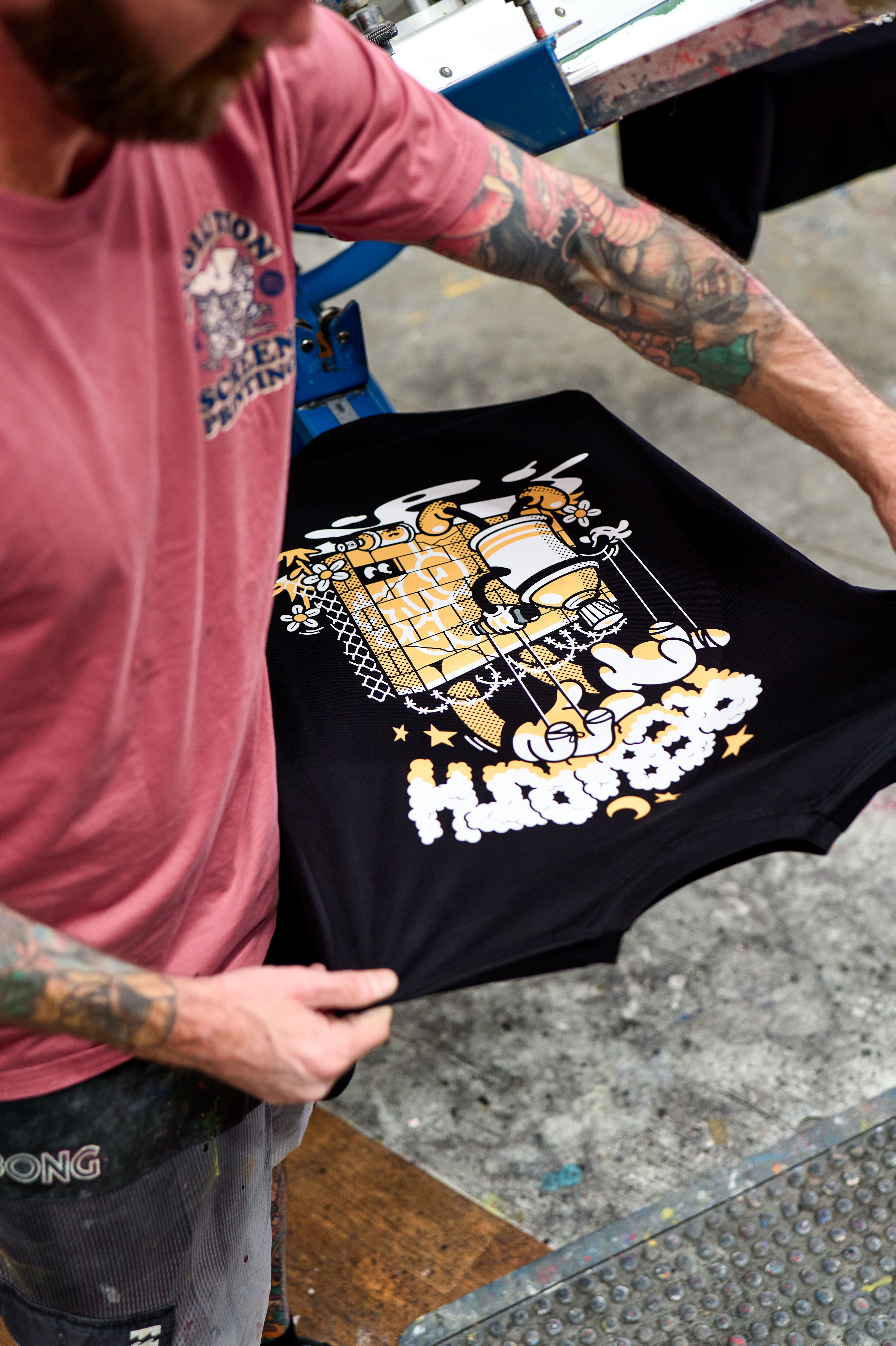
We’re stoked to have worked with you on our collab tee for this issue, alongside AS Colour! Can you share a bit about what it was like bringing the project to life?
As a long-time fan of No Cure, I was a subscriber way back in the early days. It was a real honour to be part of this collaboration. The whole project was a blast to work on. It’s an exciting time in screenprinting with big, bold graphics making a strong return, and being able to contribute to something that celebrates artists and art culture made it even more meaningful. I’m always happy to support creative projects like this.
"The laid-back vibes of the Sunshine Coast are a big part of our identity, they come through in the fun, relaxed style of the graphics we specialise in."
What do you think has made AS Colour tees such a staple in the industry, especially for projects like this?
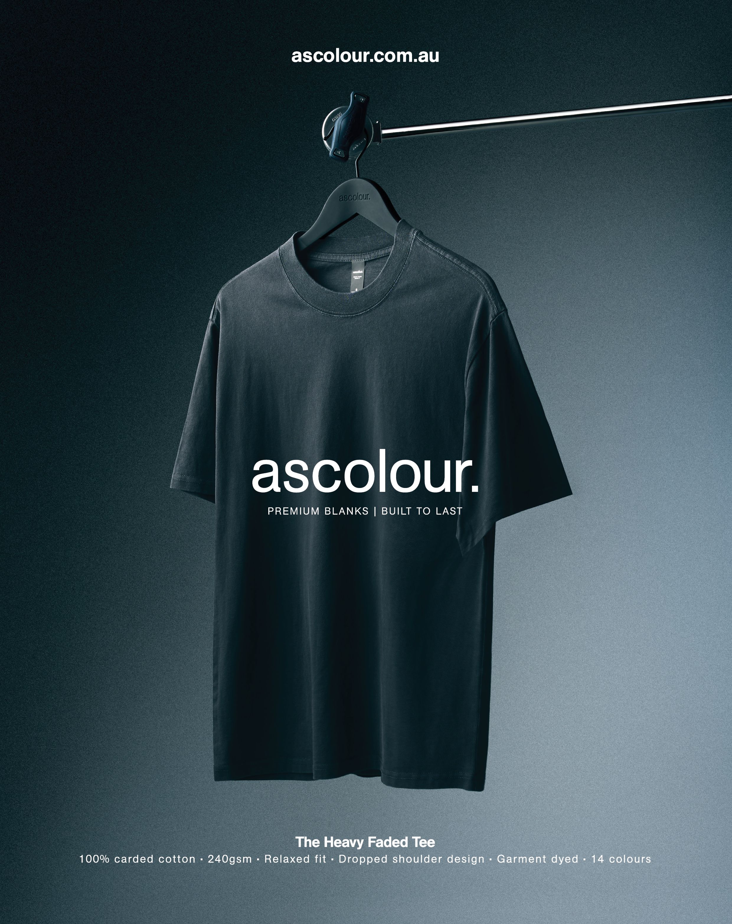
AS Colour has become the benchmark for quality in the screenprinting world. Since they launched, they’ve filled a huge gap in the market for high-end, fashion-conscious garments that printers and customers both love. We use them for around 90% of our jobs. They’re consistent, durable, and have that premium feel. Plus, their focus on sustainability keeps them at the forefront of the industry.
How has running a local business on the Sunshine Coast shaped Evolution’s story? What do you love most about being part of the local creative community?
The laid-back vibes of the Sunshine Coast are a big part of our identity, they come through in the fun, relaxed style of the graphics we specialise in. Being part of a small, tight-knit creative community here has been amazing. There’s a real sense of support and collaboration, and it’s helped shape Evolution into more than just a business - it’s become a fixture of the local creative scene.


Homegrown
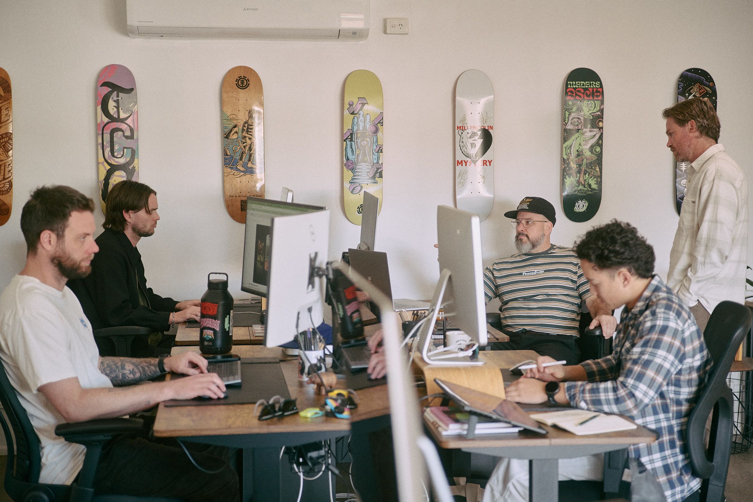
Penny Bridge Studio
Interview: Ruby Avery De-Waal / Photography: Trent Mitchell


With over a decade in business and a stack of awards under their belt, Pennybridge Creative is the kind of studio where big ideas meet good vibes. Based on the Gold Coast, the team works across everything from branding to web design to murals with a playful, people-first approach baked into every brief. We caught up with the crew to chat studio life, standout projects and the moments that make it all worth it.

Your service offering spans all sorts of things from branding and web to murals and app design. Which types of projects get you the most excited and why?
We love work that blurs the lines between disciplines and pushes us to learn something new. If we get to create a new brand that also needs a website, app and wants a mural in their office, we can curate the entire thing, which allows us to feel part of the heartbeat of their business. Some of us lean more into strategy or digital, others into illustration or type, but when a project lets us bring all of that together? That’s when we’re at our best.
What do you love most about working in a small, tight-knit team?
You really get to know the people beside you. You’re in the trenches together - every win, every panic, every pivot. If someone’s struggling, the whole studio rallies to help. That kind of culture builds trust, and that trust fuels better work. It’s not just about output, it’s about how you show up for each other.
From Wu-Tang to Westfield, you’ve worked with some amazing brands across an array of different briefs. Tell us about your most memorable project!
The Wu-Tang project is definitely one for the highlight reel.
But sometimes it’s the ones that go sideways that stick with you. Those tricky projects teach you more than the easy ones ever could, especially about red flags, boundaries, process, and what not to do next time. It’s all about growth and continuously learning. At the end of the day our favourite projects are the ones we get to connect and build trust with our clients. That’s where we do the best work, get the most satisfaction and produce the best results. It all comes back to doing good work with good people.
Do you have any studio traditions or favourite ways to celebrate wins?
Somehow Chumbawamba’s Tubthumping became our unofficial theme song. I don’t know why, but it’s stuck. Celebrating wins is something we need to do more, but every week we do give team feedback which is generally everyone patting each other on the back saying how awesome they think each other's work is. It’s pretty cool we share that every week instead of waiting for one big moment. That being said, we dressed up and took a stretch limo to the AGDA Awards once to celebrate, that was pretty funny.
"We love work that blurs the lines between disciplines and pushes us to learn something new."
It’s no secret AI is making waves in the design world. What’s your take on AI’s role in design, and how do you incorporate it into your creative process?
We’re living in a pretty profound moment in time, that can’t be understated. Creativity has always been about the journey and the outcome, and AI’s speeding up the journey in ways we’re still grappling with. The in-between, that messy middle, is often where the magic happens. For us, the value isn’t in producing something fast, it’s in thinking critically, solving problems, and making something meaningful. The pace lately feels unsustainable and we feel like AI is only going to exacerbate that. We’re currently building an internal manifesto to guide how and where we use AI. Right now, it’s mostly a tool for mock-ups, rapid visualisation, and early-stage ideation. It’s useful, but we’re being intentionally careful not to let it replace the human element, the collaboration and curiosity that makes creativity worth doing.
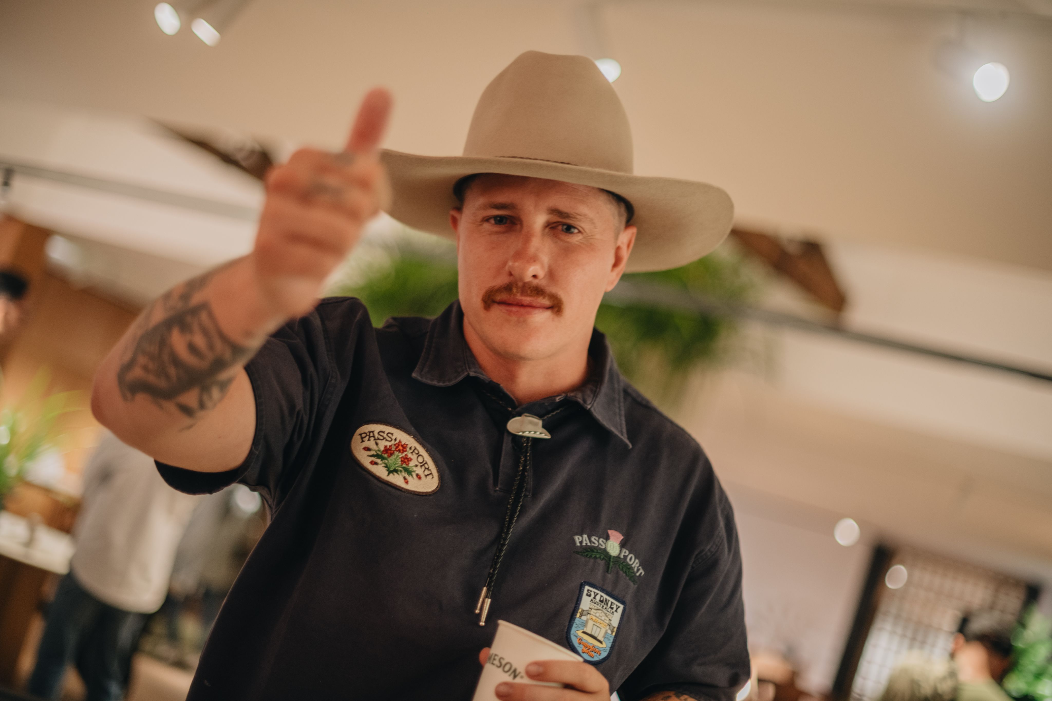
Interview / Dr WolfenBergen
aka: Justin Moll
Interview: Ruby Avery - De Waal

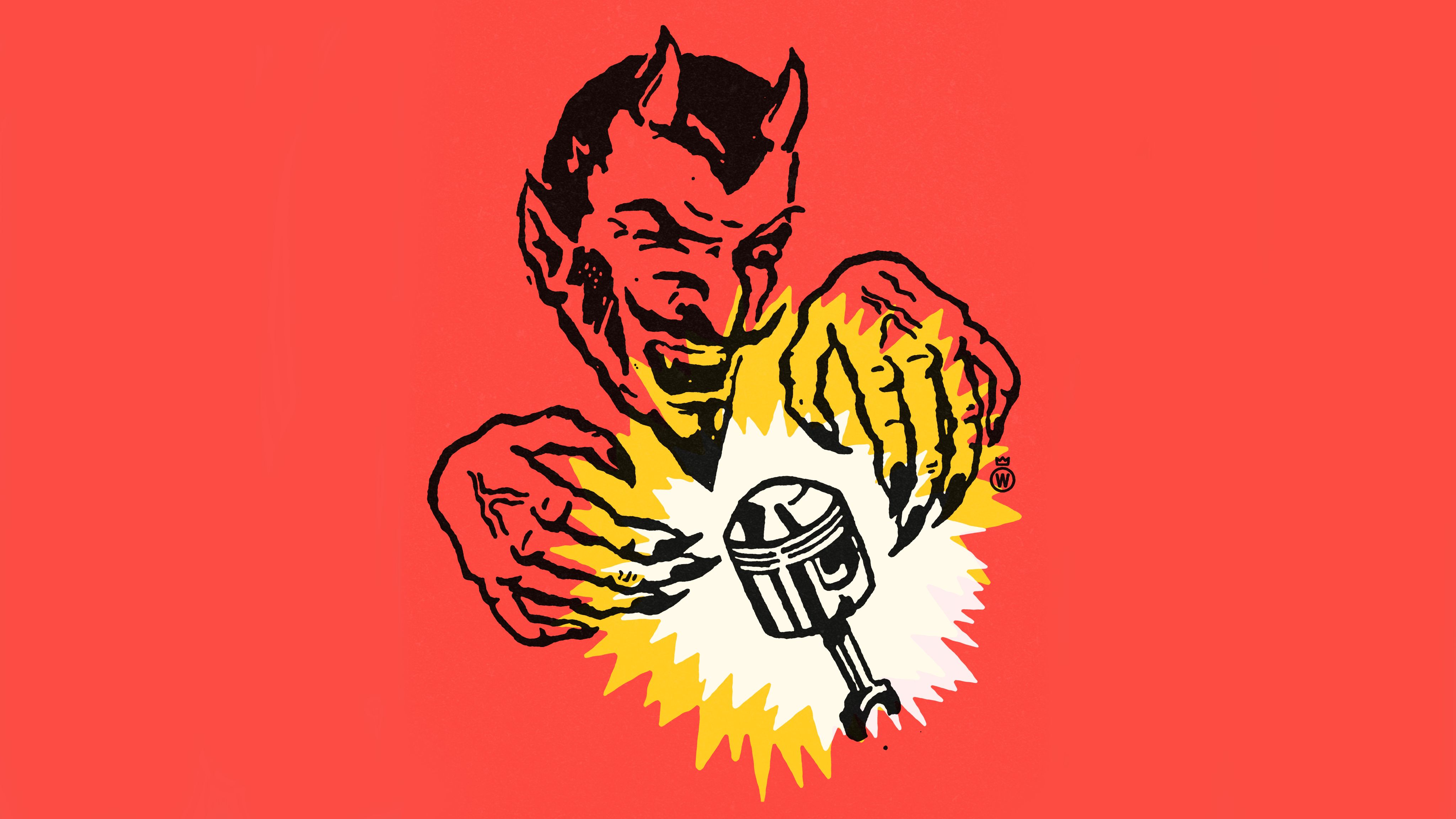
DR WOLFENBERGEN, ALSO KNOWN AS JUSTIN MOLL, IS A SELF-DESCRIBED ‘ART DIRECTOR, DESIGNER AND DUMBASS’ HAILING FROM PENNSYLVANIA. HIS LO-FI ILLUSTRATIONS AND PRINTS TAKE US ON A JOURNEY THROUGH RETRO INFLUENCES, CURIOUS CHARACTERS, AND SURREAL HUMOUR. WE CAUGHT UP WITH JUSTIN TO DIG A LITTLE DEEPER INTO HIS CREATIVE PRACTICE AND SEE WHAT’S UNDER THE HOOD OF THE DR WOLFENBERGEN MACHINE.

What did your earliest creative work look like? Were you the kid constantly sketching in the margins?
Kinda yeah. Was always doodling dumb stuff like Iron Maiden’s Eddie or skulls and stuff. Still do.
There’s no shortage of curious characters in your work. Each one feels like they’ve stepped out of a dusty comic or a forgotten ad. Where do they come from, and what influences shape their look and personality?
My main influences are old clip art and advertising. I never read comics but loved their ads. When I was in school (mid 90s), I saw Charles S Andersen (CSA Design) and Art Chantry making this crazy good work with vintage imagery. Big fat lines and black ink. It scarred my mind. So cool. Now we’ve got Scott Sugiuchi and Jim Madison (print destroyer) carrying the torch for us!
When I’m creating something, I just go for bold and chunky. Always a little wild-eyed and most importantly, It’s gotta look like it came out of the trash. I don’t really want my stuff to feel original. I want it to feel familiar - like it’s been laying around for years and recently found.
How would you describe the persona of Dr Wolfenbergen? How does he shape or influence your creative ideas as Justin Moll?
I made it up so I could do dumb shit without taking myself too seriously. I thought, “What’s a stupid long name that sounds like it came from a bad movie?”. That was it. It’s helped me get out of my own way and grow because Dr. Wolfenbergen has a personality that I don’t. I’m pretty boring!

"My main influences are old clip art and advertising. I never read comics but loved their ads."
- Justin Moll


Do you have any rituals or habits that help get you into the zone when creating?
Coffee, Nicorette. Some late 90s crust punk and a loose idea of what I want to make. Then it’s just trial and error. Drawing’s never a straight line for me - there’s lots of back and forth, lots of squinting at the screen until it feels right.
How do you balance digital tools with the analog feel your work often captures? What is it that you love about print publications/editions?
I use digital tools the same way I’d use a photocopier. There’s just more control and convenience. Instead of sharpies, white out, and scissors, I can slouch in my chair and draw with my middle finger on a track pad. Oh, and command Z!
When it comes to print, I love the realness of the texture. The ink. Everything.

"Coffee, nicorette. Some late 90s crust punk and a loose idea of what I want to make. Then it’s just trial and error."
– Justin Moll
What role has social media played in your growth? Necessary evil, creative platform, or both?
It’s been the only way I’ve gotten my work out there. There was a time when IG was great fun. Lots of good conversation and connections were happening. Less so today, but it’s still a decent platform for showcasing stuff. I really enjoy talking with other artists and seeing new faces pop up.
What’s next for you? More prints, world domination via halftone?
More prints! Hopefully working with bands and brands I’m a fan of. Mostly just continuing to make quirky shit.
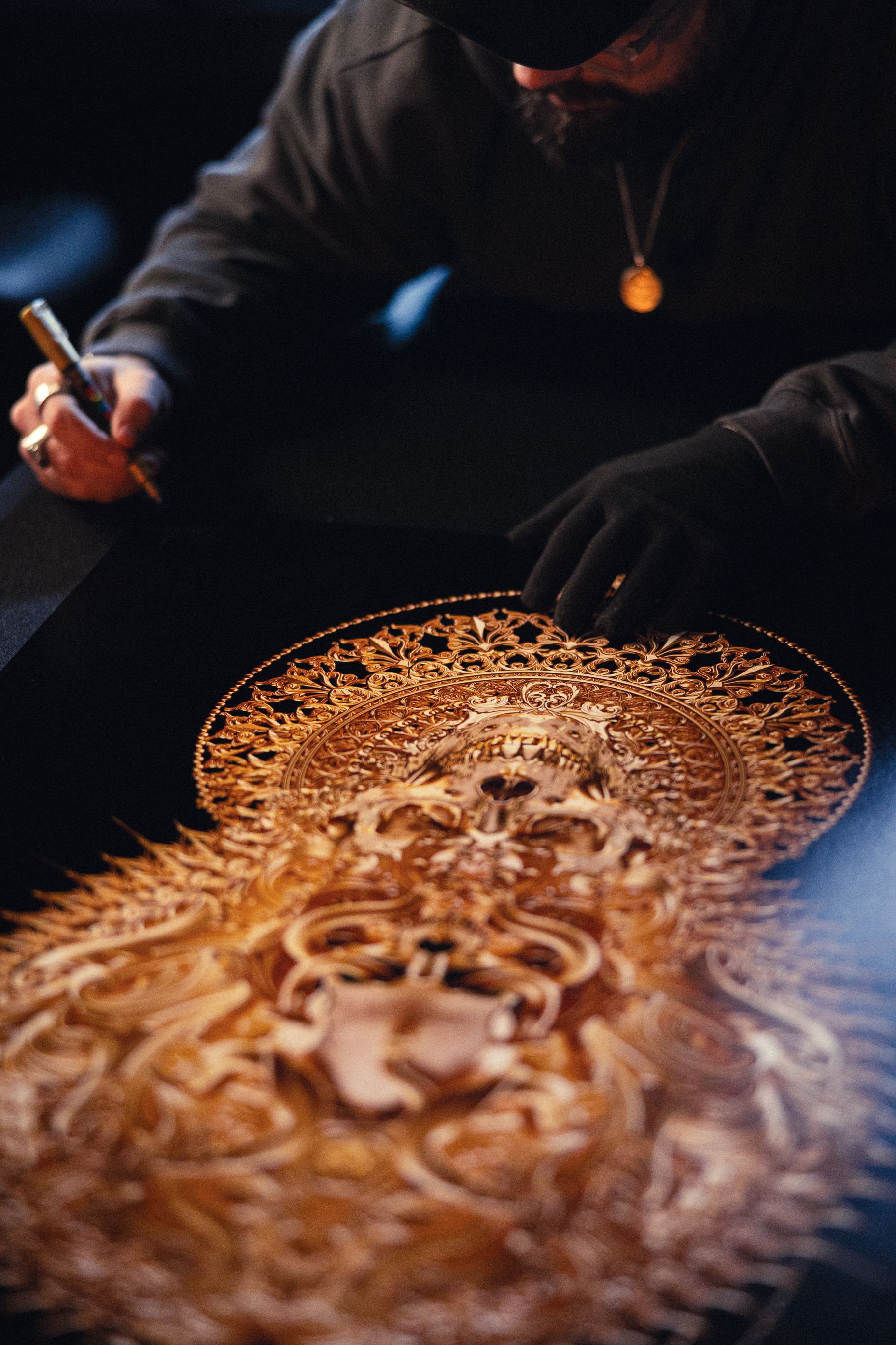
Dark Beauty
The Art of Billelis
Interview: Bianca Valentino

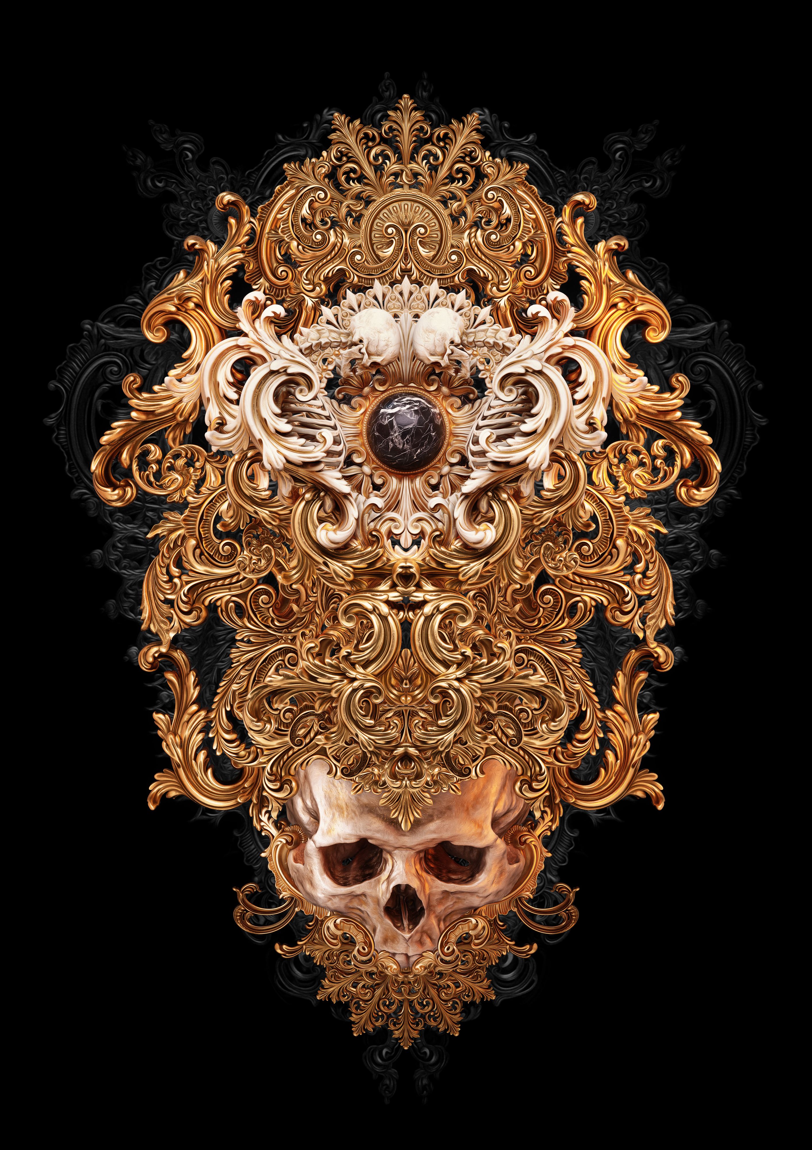
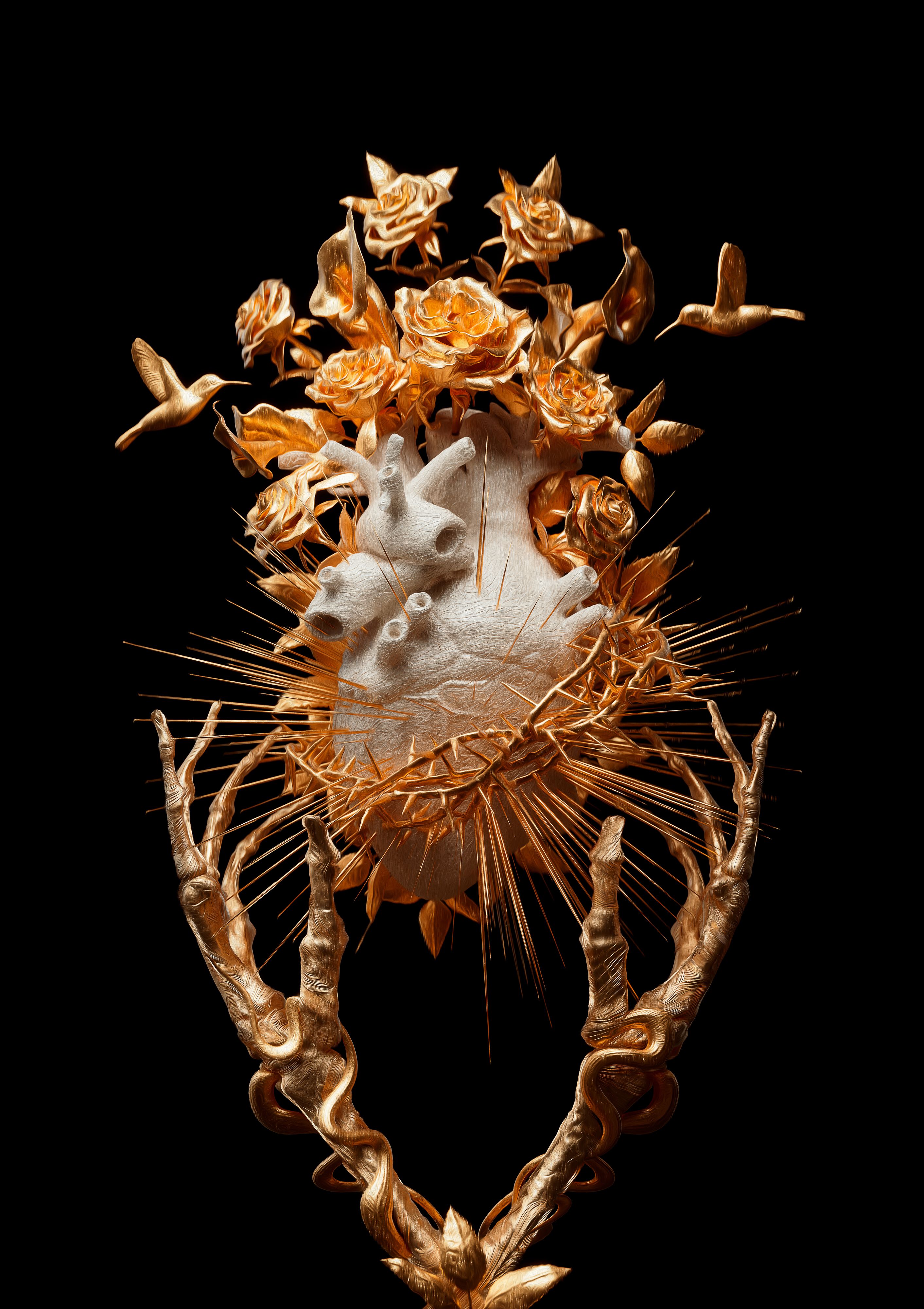
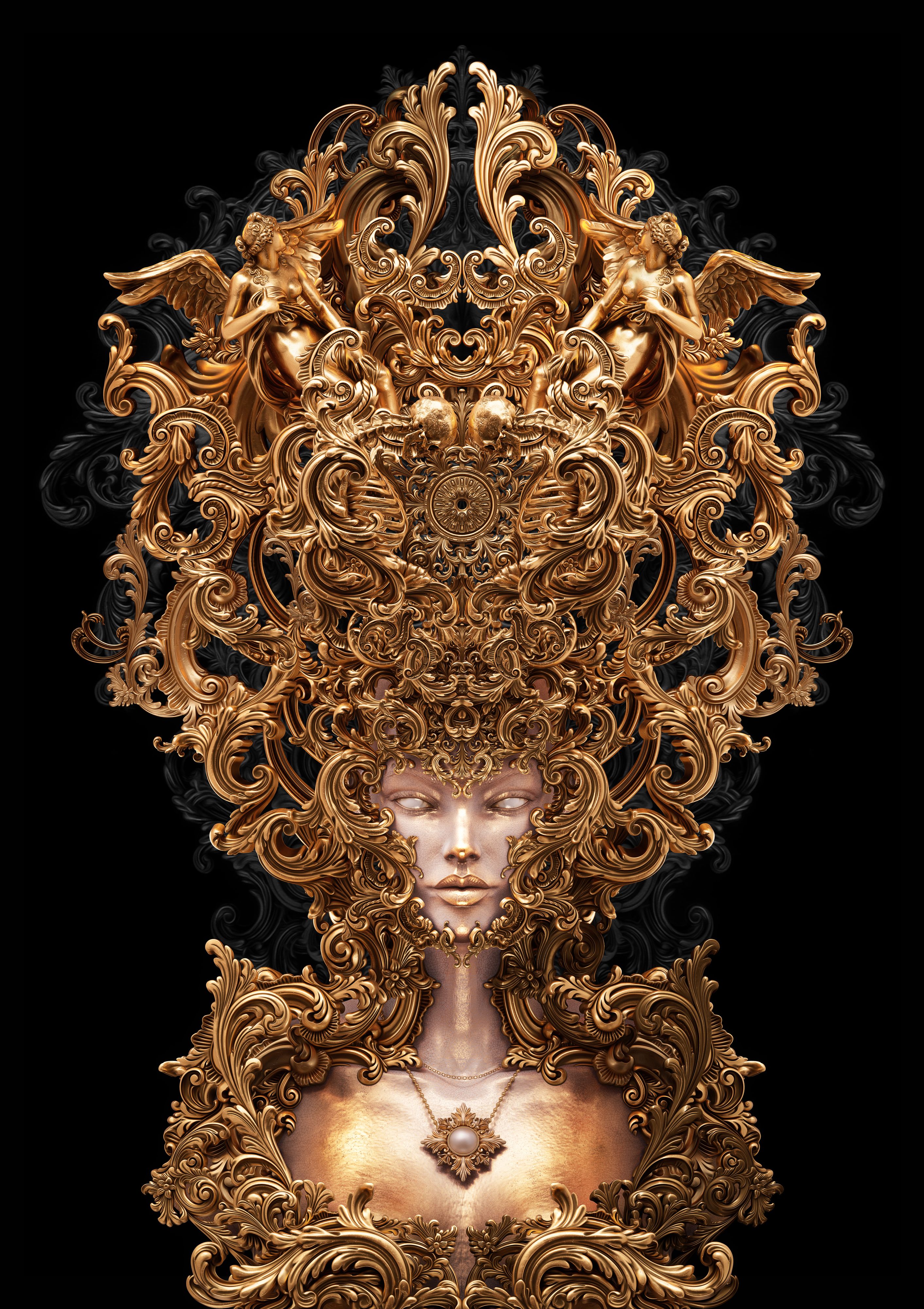
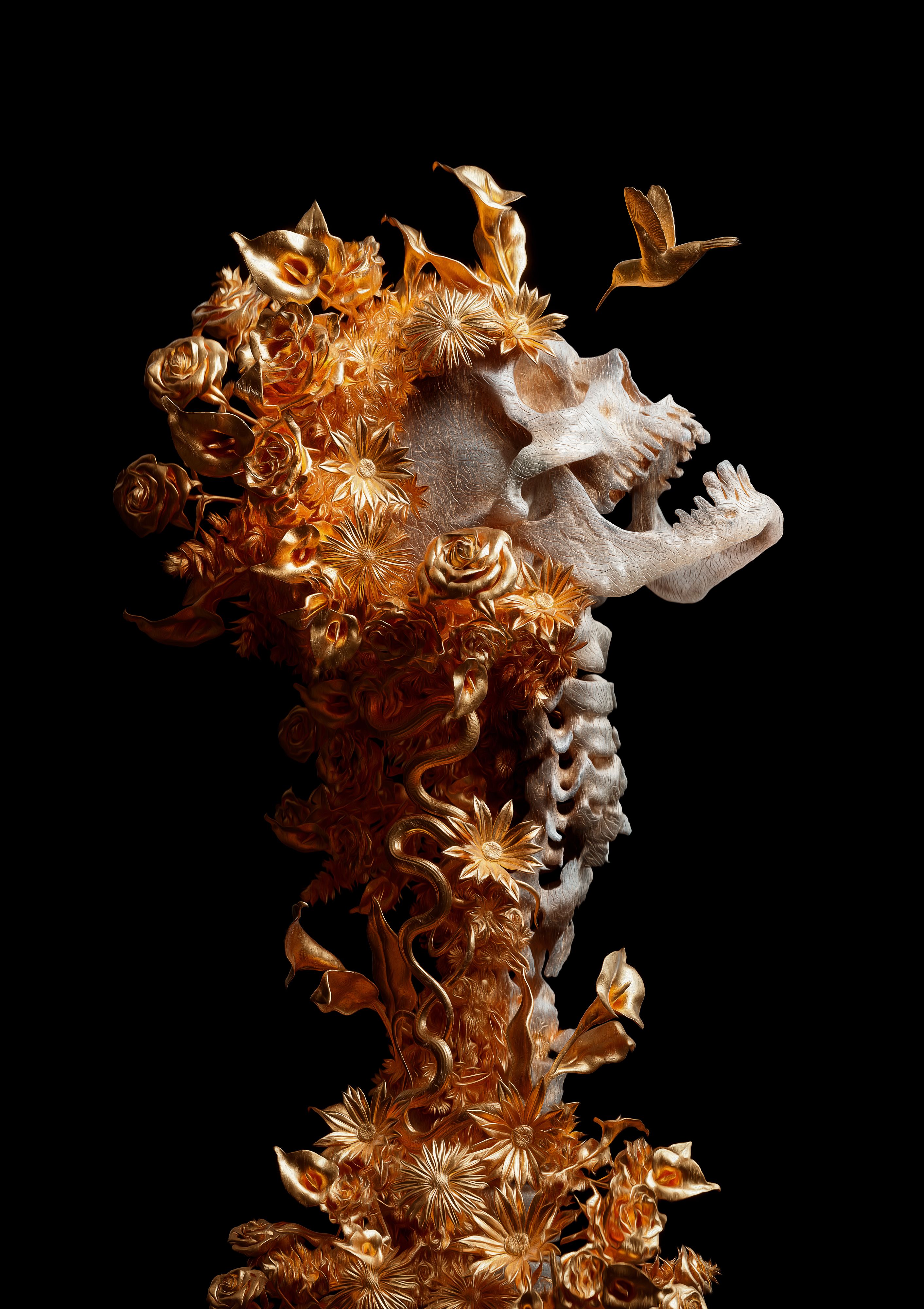
BILLELIS IS A DIGITAL ARTIST OBSESSED WITH DARK BEAUTY AND ORNATE DETAIL. BASED IN EDINBURGH, HE CRAFTS HYPER-REAL DIGITAL SCULPTURES THAT FUSE ELEGANCE WITH THE MACABRE, EXPLORING LIFE, DEATH, FEAR, AND FAITH THROUGH A ROMANTIC, GOTHIC LENS. IN HIS LATEST BODY OF WORK, SYNCHRONICITY, HE LEANS FURTHER INTO THIS DUALITY—BALANCING BEAUTY AND DECAY—WITH HAUNTING PRECISION. EACH PIECE CHALLENGES HOW WE SEE FEAR, USING DIGITAL TOOLS TO SCULPT EMOTION.

With all you create, you’ve said you are searching for meaning, for connection; what did you find while creating your latest collection?
Early on, I was just creating what I was drawn to, the dark, the divine, the surreal. But somewhere along the way, I realised that what I kept returning to were the things I feared most. And in trying to understand those things through my art, I found meaning. I found connection, not just with others, but with myself. I learn’t to see beauty in the things I feared.
With Synchronicity, that idea became crystal clear. It’s a collection about balance. About how nothing exists in isolation. Every line, every shape, every piece is part of a greater whole. Life and death, past and future, beauty and ruin; they don’t cancel each other out, they depend on each other.
You have always been into classic sculptures, religious iconography, gothic artwork, human anatomy, and tattoo artwork—can you talk about how you found this signature style and its evolution?
It was always about finding the beauty in all of them and merging them together. All these very different things that somehow made sense to me when blended. I was experimenting, learning, trying to find my voice.
Over the years, with a bit of age, maturity, and creative growth, it started to evolve into something more refined. I found a rhythm, a tone, a way to balance everything. Now it feels like one language instead of a pile of references.

"Fear has always been a big part of why I create. I lean into it. Fear of loss, fear of time, fear of not creating something that actually means something. It all feeds into the work."
- Billielis


"Something that’s purely dark doesn’t move me. But something dark with a glimmer of light in it, something beautiful that carries a bit of weight or pain, that hits different."
- Billielis
What role does fear play in your creative journey—and how do you harness it in your work rather than shy away from it?
Fear has always been a big part of why I create. I lean into it. Fear of loss, fear of time, fear of not creating something that actually means something. It all feeds into the work.
To sit with those feelings instead of letting them eat me alive. It’s like turning something heavy into something visual, something I can control. Once it’s out of my head and in the world, it starts to make more sense.
Fear shows you what matters. That’s where the good stuff comes from.
There’s a strong sense of duality in your art—beauty vs. decay, light vs. dark. What draws you to these opposing forces
Everything in the universe exists in some form of equilibrium. Life and death, light and shadow. They all depend on each other. One doesn’t exist without the other.
I’ve always been fascinated by contrast. It’s where the emotion lives. Something that’s purely dark doesn’t move me. But something dark with a glimmer of light in it, something beautiful that carries a bit of weight or pain, that hits different.
My work is about exploring that tension. Holding both things at once. Finding harmony between extremes. Because that’s what life actually is.
Duality isn’t just a theme in the work. It’s the foundation of it.
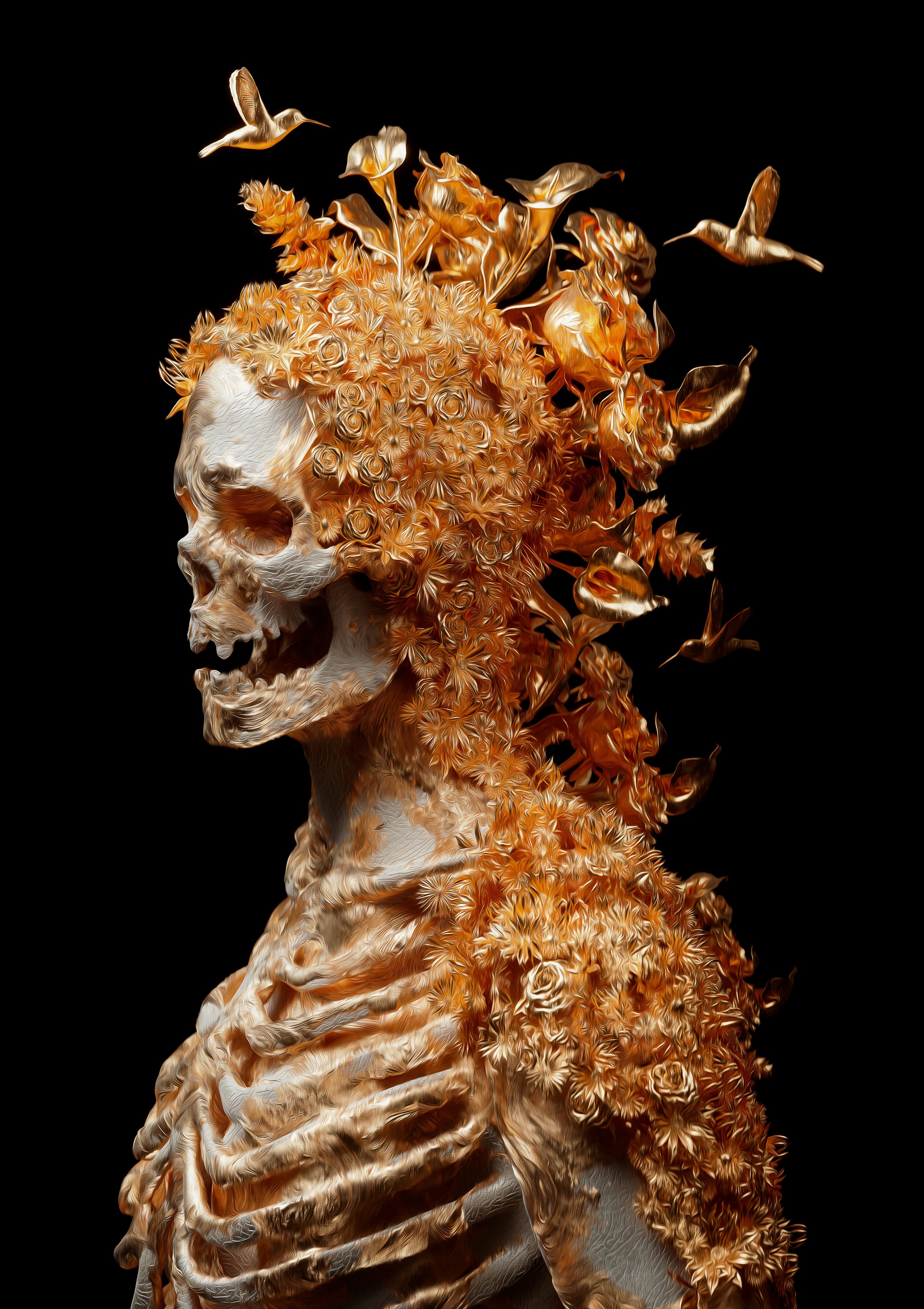
Skulls are a powerful and recurring motif in your work—what initially drew you to them?
Rebellion. Back when I was starting out, everyone kept telling me to draw happy stuff. But I was always drawn to darker imagery, and metal album covers definitely had a big influence on me.
Skulls were everywhere in that world, and they just felt powerful. Honest. Unapologetic.
Over time, they started to mean more. The skull became a symbol of what’s underneath it all. Stripped of identity, status, ego. It’s not really about the skull itself anymore, it’s about what I’m trying to say with it.
How do you stay inspired and avoid burnout in a creative field where trends move quickly and expectations are high?
Not gonna lie, I’m still figuring it out. In the past, I’ve definitely pushed too hard and burnt out. And I’m sure it’ll happen again at some point. The reality is, I’m very lucky to have the career I have, and I’m grateful that I can take breaks when I need to.
We live in a world obsessed with content, and now artists are expected to be everything at once. Your own director, producer, project manager, social media manager, PR agent, even your own personal trainer. It’s madness.
It comes down to staying grounded and knowing I can’t do everything all the time. That pressure will eat you alive if you let it. Rest is part of the process too.
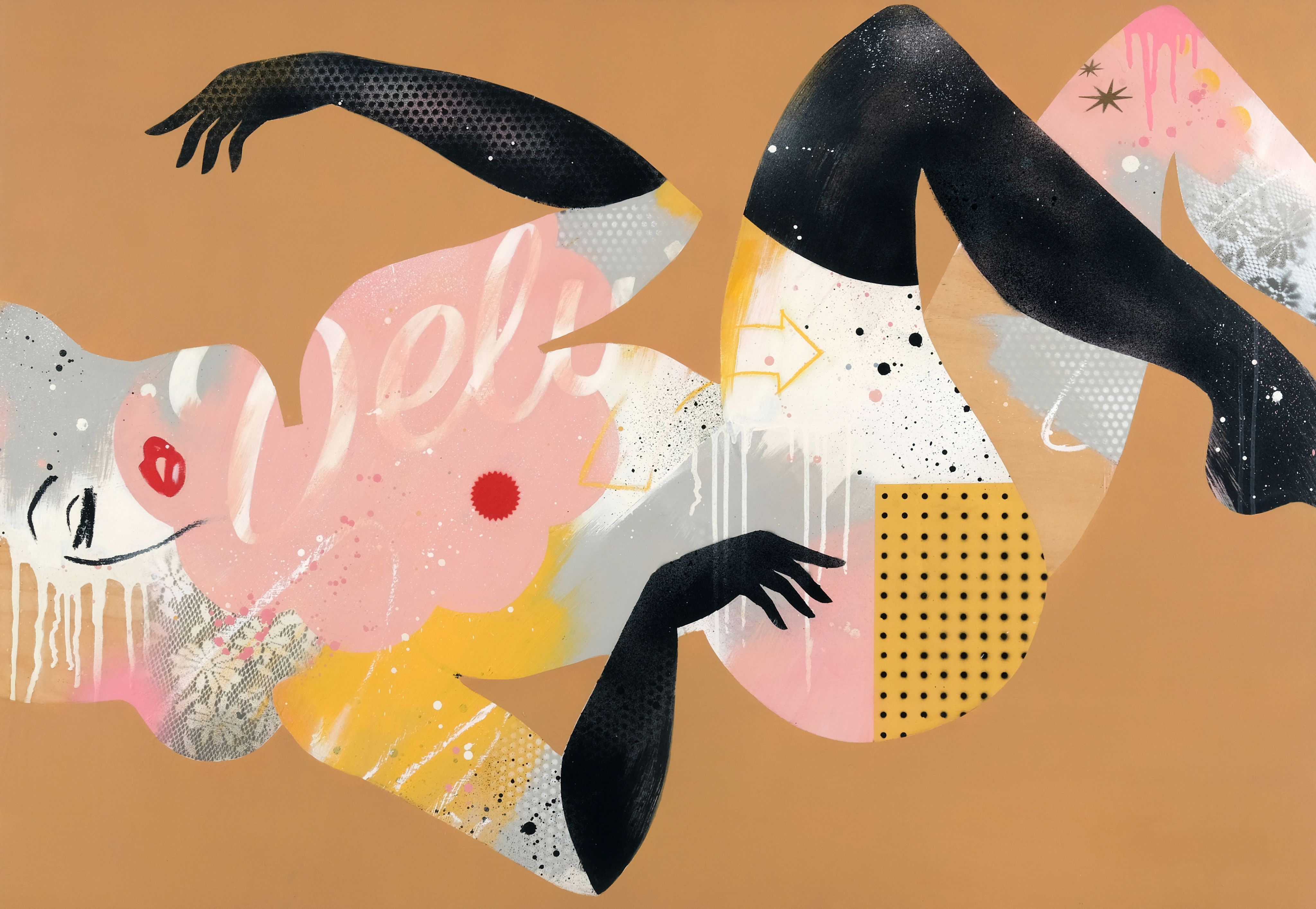
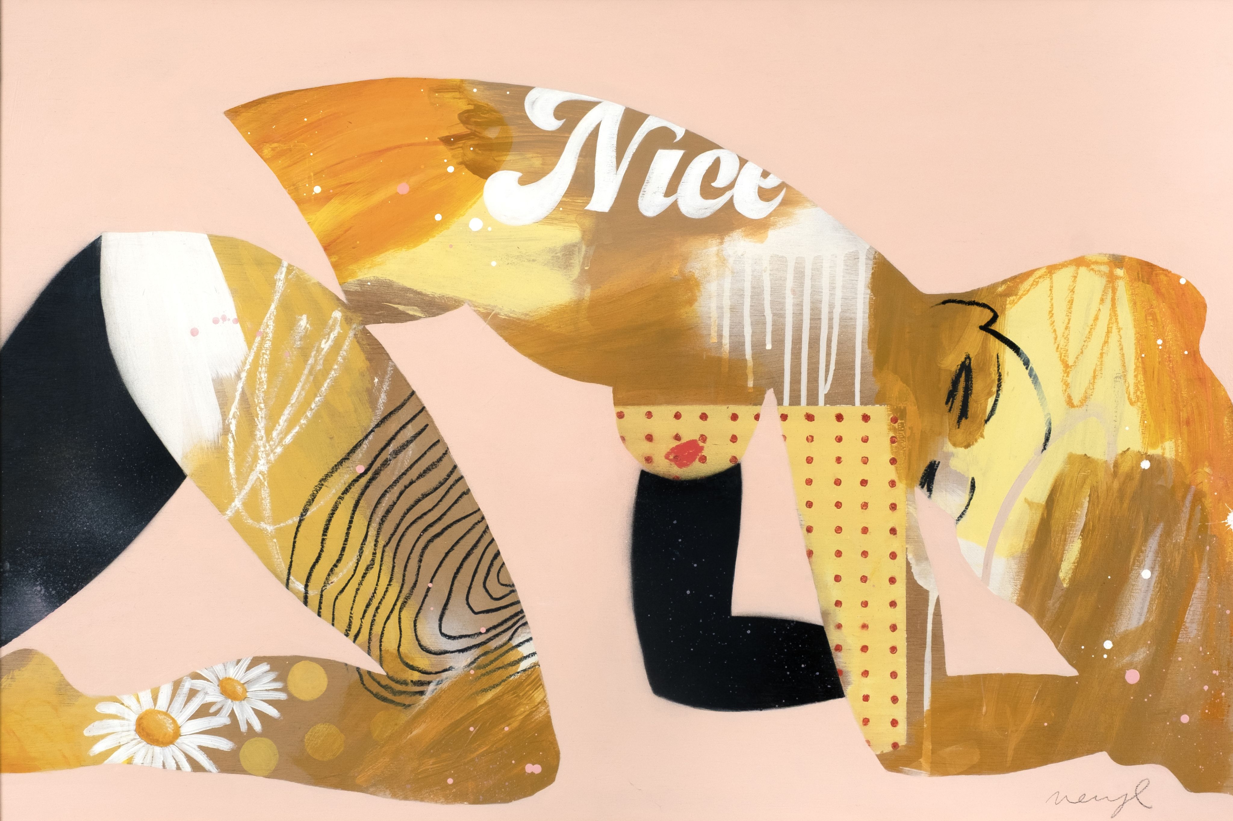
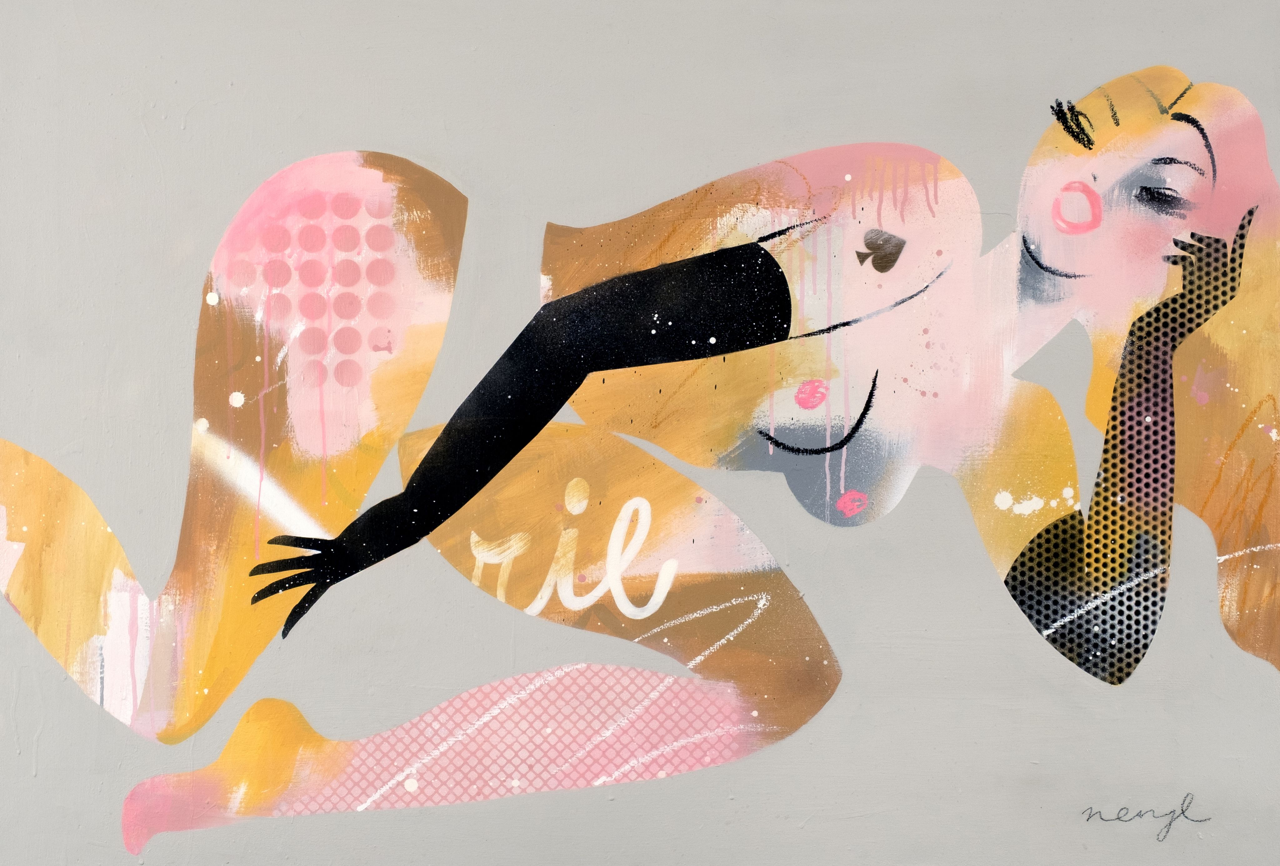
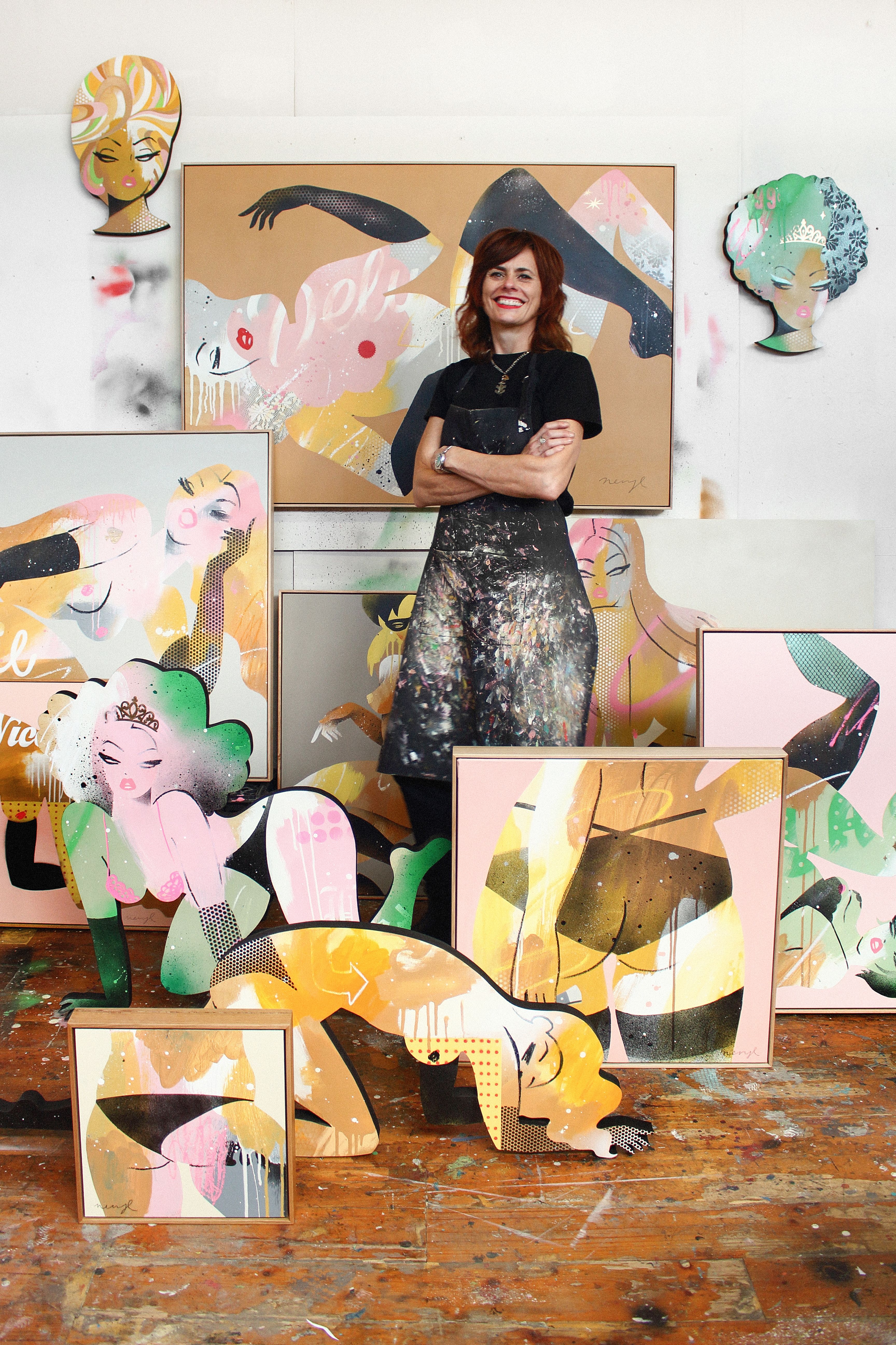
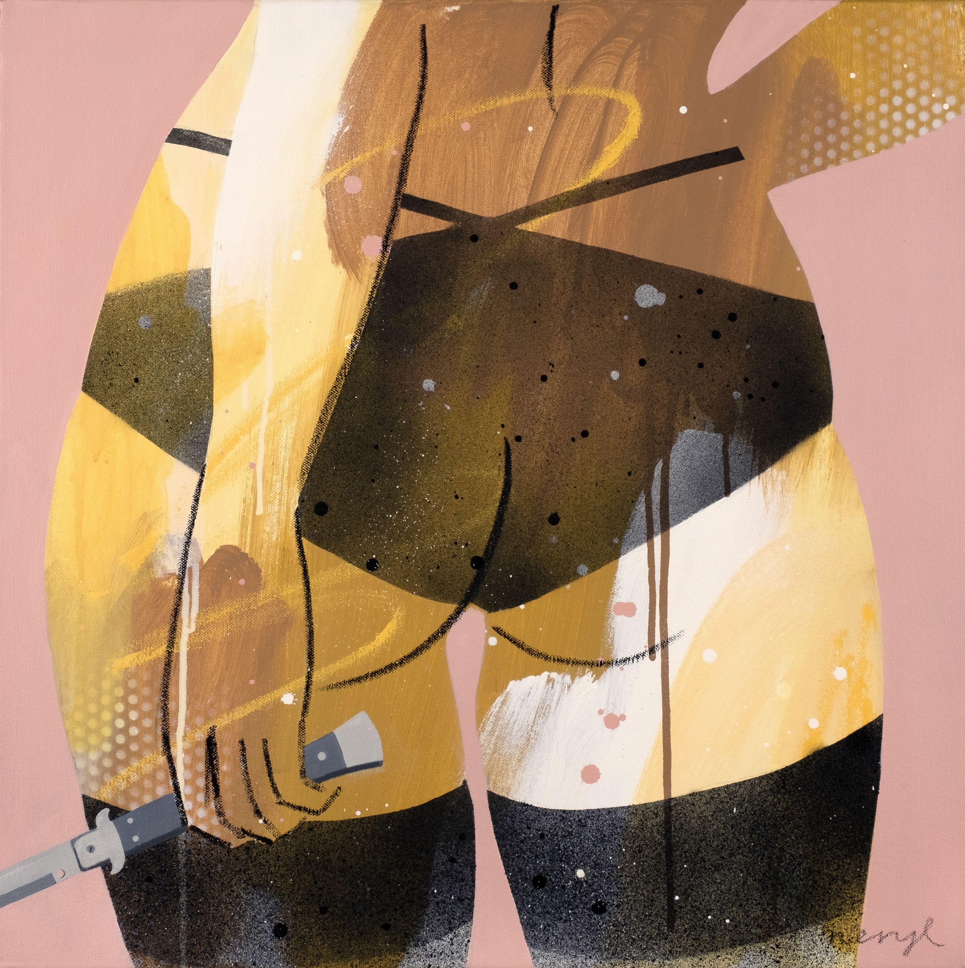
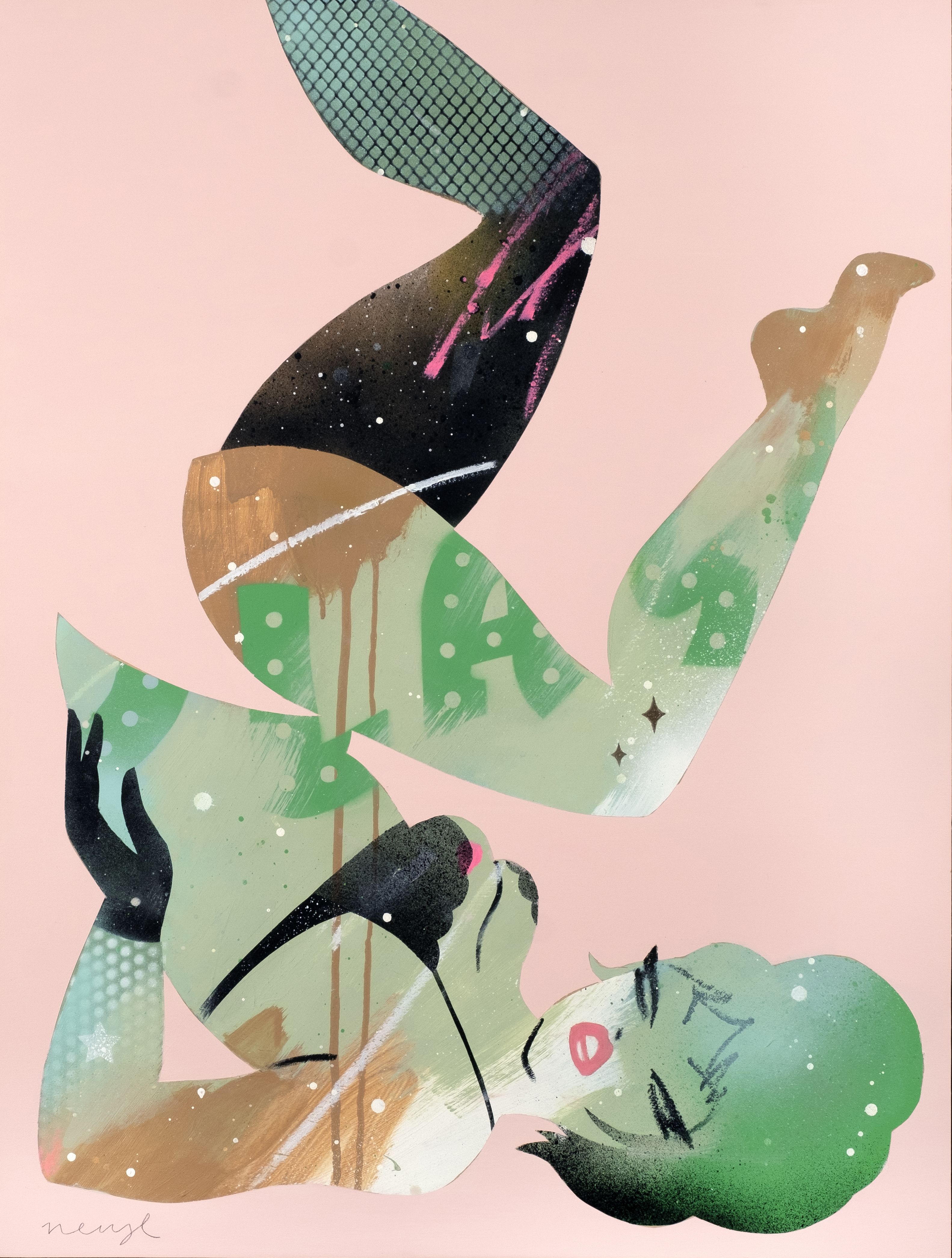
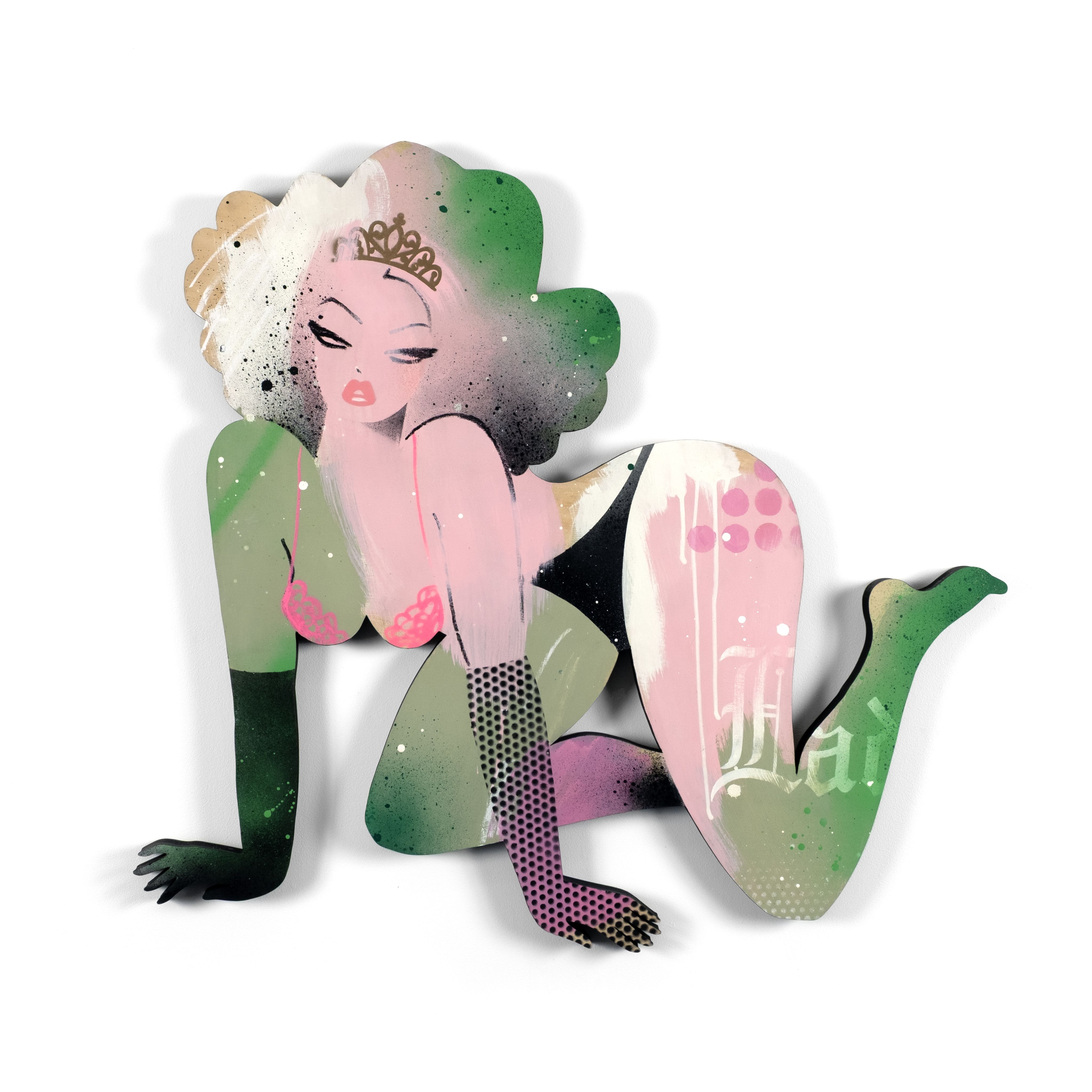
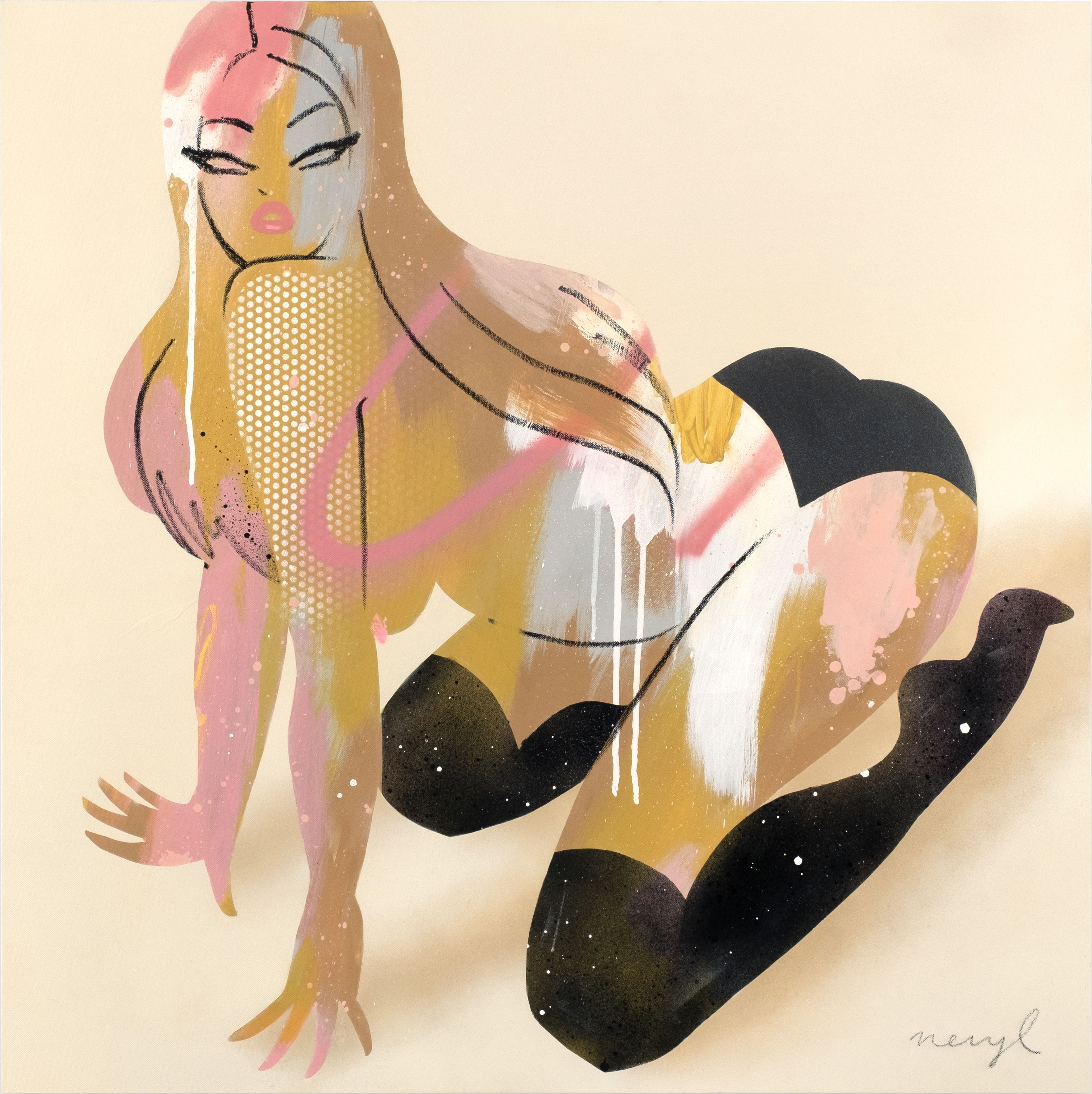
Interview / Neryl Walker
Interview: Ruby Avery - De Waal / Photography: Tim Haynes


What first sparked your love of art and design? Were there particular people, experiences, or ideas that pushed you to start creating?
My mum and three sisters are all naturally creative so I guess I absorbed it by osmosis. Hailing from a small country town, boredom was often the impetus to create. There were no galleries or exposure to the art world outside of school books - but I loved to draw, so design seemed like a viable career path. It wasn’t really until university that I was exposed to so much more in the art and design world.
Your work channels a lot of vintage and pin-up aesthetics with a contemporary twist. What draws you to retro imagery?
I’m a bit of a collector and love to hunt for objects in op shops, thrift stores and flea markets. I’m drawn to mid 20th century fashion, design, imagery, packaging, music, typography, colour palettes - pretty much everything! It reflects a time when thoughtful design was prioritised, and where drawing skills and craftsmanship really mattered.

Your work is filled with fabulous and eccentric women. Are they imagined muses, reflections of people around you, or a bit of both?
The women I draw are strong, playful and free - unbound by society’s expectation around gender. I guess it’s the kind of world I’d love to see, especially for my daughter to grow up in. I’m inspired by women past and present who break the mould, carve their own path, and challenge the patriarchy in their own unique way.

You created a new version of Playboy’s iconic Femlin character, originally drawn by LeRoy Neiman in the ’50s. How did you approach reshaping her for a modern audience, and what was it like working within such a legacy?
The fact that a female art director asked a woman to reinterpret this iconic character speaks volumes from a feminist standpoint and reflects a modern audience. Like all of my work, I’m not creating for the male gaze; I’m just drawing girls having their own fun. It was such a great project, and Playboy were a dream to work with.

“I’M A BIT OF A COLLECTOR AND LOVE TO HUNT FOR OBJECTS IN OP SHOPS, THRIFT STORES AND FLEA MARKETS. I’M DRAWN TO MID 20TH CENTURY FASHION, DESIGN, IMAGERY, PACKAGING, MUSIC, TYPOGRAPHY, COLOUR PALETTES - PRETTY MUCH EVERYTHING!”
- Neryl Walker
Out of the many techniques you use in your work, are there any mediums you find especially rewarding?
I love to paint! I’m enjoying giving myself space for exploration, embracing happy accidents and moving away from sitting in front of a computer.
Your most recent show, Ladylike, at Outré Gallery reimagines the language and themes historically used to define women. Tell us about how the body of work came to be and what you hope audiences take away from the show.
This show has been brewing for a while. It explores how women and femmes are constantly navigating expectations about how they should present themselves, and delves into everyday language that subtly polices and undermines them - words like bitch, nag, emotional, hormonal, bimbo…the list goes on. I’m hoping people can have a bit of a laugh, but also reflect on the many labels consistently placed on women and the impact that has.

What’s next for Neryl Walker?
I’ve just finished painting a large outdoor mural for the Darwin Street Art Festival and an album cover for all girl band, Girl Monstar. Looking forward, I’d love to collaborate on some larger projects - retail window displays, bar interiors, fun branding projects. I also love to travel, so maybe an art residency or international mural festival where I can continue painting at a larger scale.
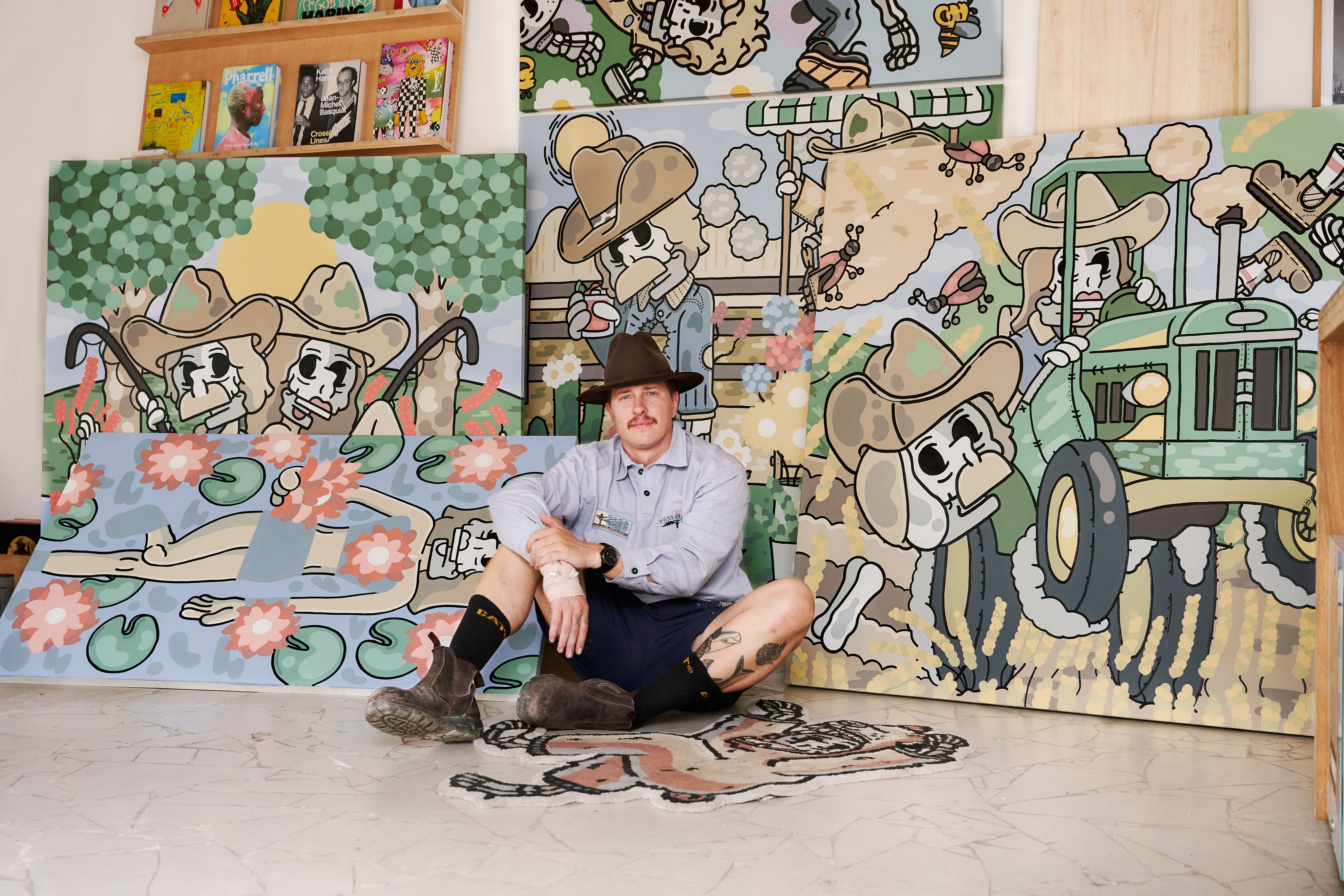
Interview / Jake Ross
Interview: Ruby Avery - De Waal

Meet Jake Ross, a designer and contemporary artist with a flair for the adventurous and eccentric. His work bursts with curious characters and vivid scenes inspired by lives lived boldly, embracing the unexpected and the unconventional. A proud Billy Blue College of Design alum, Jake has carved his own unique career path, blending art and design with the most fun parts of life. We caught up with him to talk about his creative journey and how he took the leap to follow his passion.

Tell us about your earliest memories of getting creative. Were you always the kid with a pencil in hand?
Mum encouraged my brother and I to draw everywhere we went. We used to steal all the sheets of art competitions at local IGAs, and she was a school teacher so she used to bring home boxes of paper and we just sat there and drew all night. I loved drawing as a kid, I didn’t pick up a brush until my late 20’s. I always think when I’m getting smashed with a project about the times I sat around the table with Mum and Ben and just drew all night to abba and the sound of music sound track and laughed. It always brings me back that I have the best job in the world.
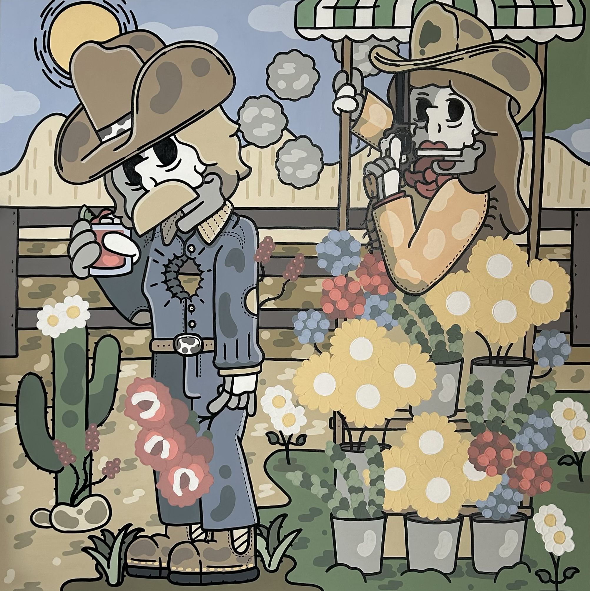
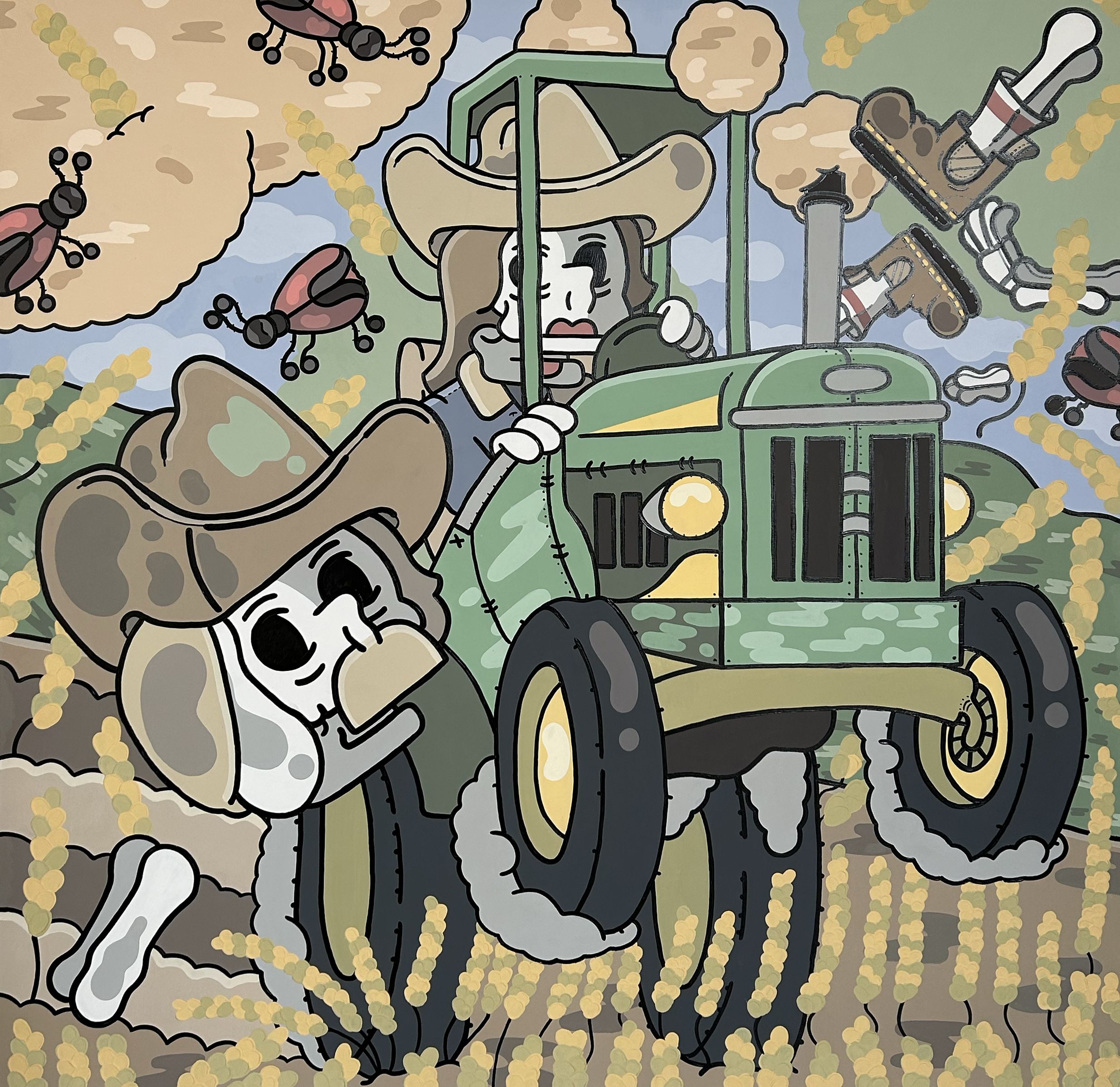
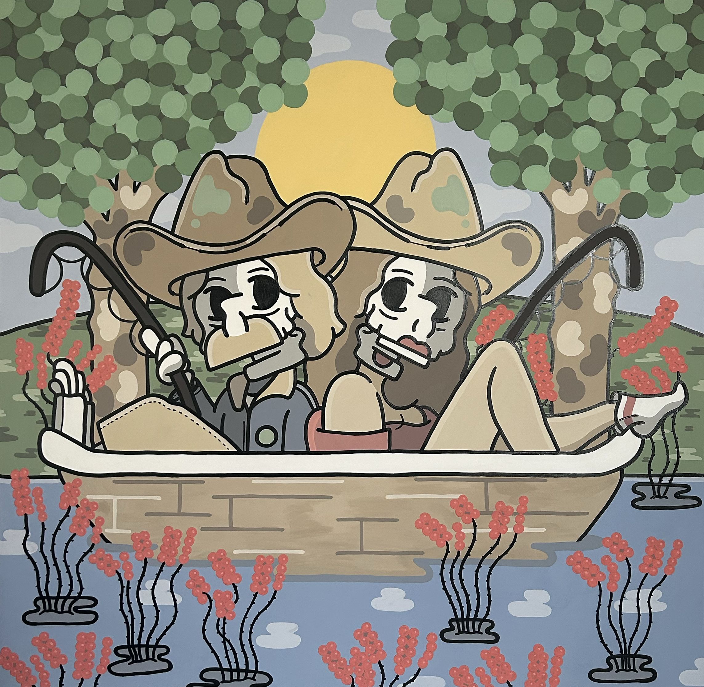
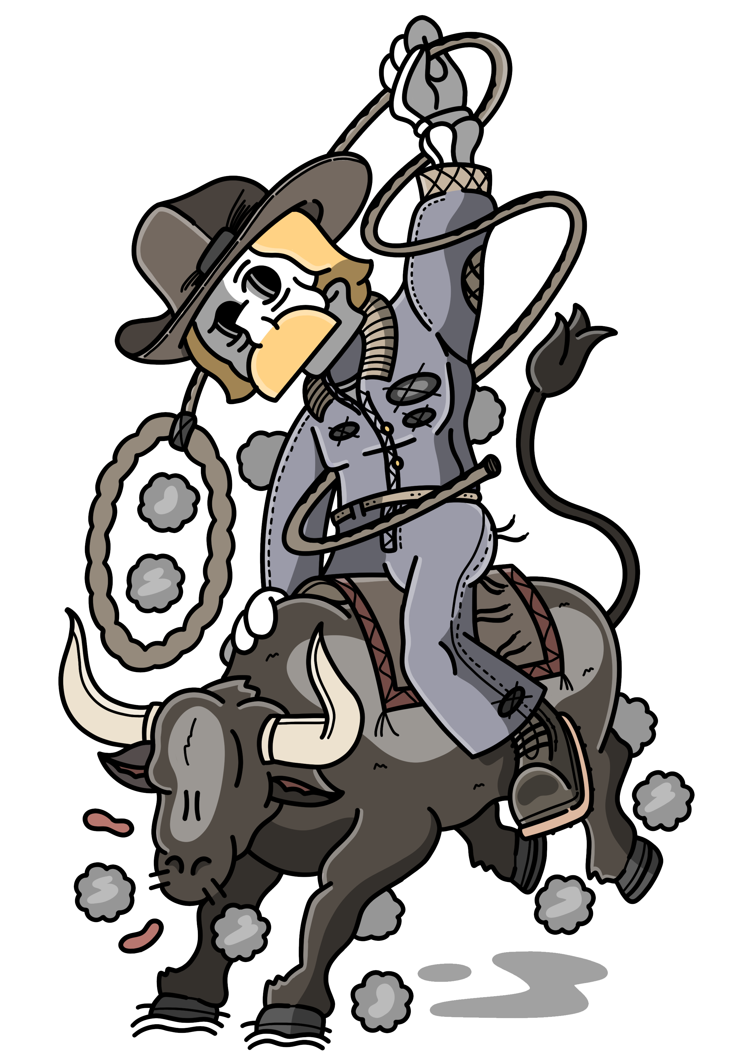
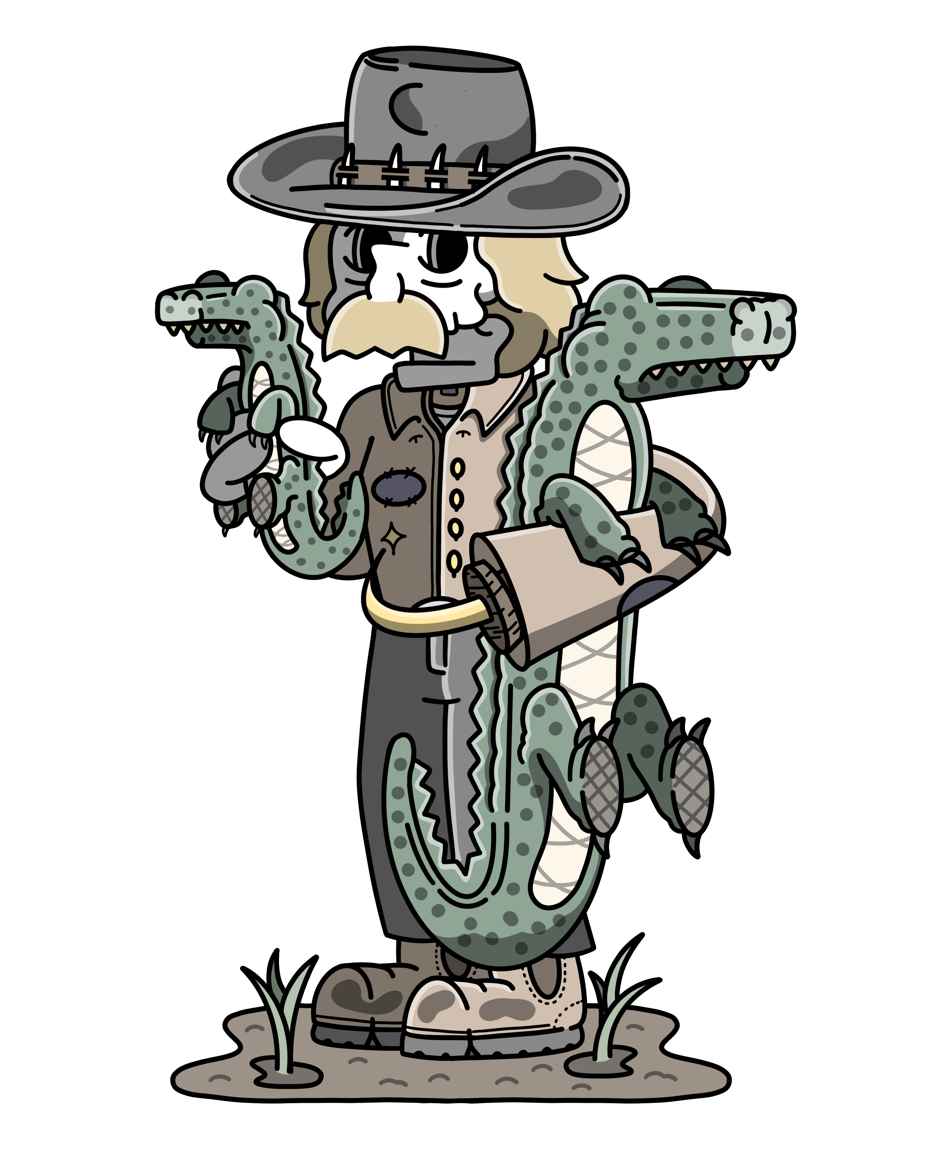
Skating, surfing, cowboys - your work is packed with all kinds of wild fun and quirky scenes and characters. Where do you draw your inspiration from, and what gets you feeling energised to create?
I’m currently mustering some cattle and sheep now into some new fields with the old man and my brother. Usually after a muster or surfing trip I’ll sit in the studio for three months without leaving, having nothing but the air, the waves, the animals, no contact, which empties your mind of all bullshit and rejuvenates an insane amount of great work. I think we are living in a hellish fast-paced world, that anytime you can slow your mind, with a run or surf or gym or playing with animals, your work mind fruits. I always gather inspiration when I’m quiet.
Do your ideas hit you fully dressed and ready to go, or do they unravel as you work? Walk us through your creative process from idea to finished piece.
It’s pretty funny, they usually come to me. I do the shittest rough drawing known to man, sleep on it, and then work on the roughs the next day. When you start eliminating and adding to the scene, it changes dramatically. I drew one the other day, it started as a wild western wife and husband shootout and turned into a wife running her husband over on a John Deere and planting him in the fields… a hell sick idea, but I wouldn’t have had it if I had the initial idea and roughs.

You’ve carved a niche working with some iconic Aussie brands like VB and Budgy Smuggler. How did you break into that space, and what do you find most rewarding about it?
The most exciting part working with these guys is that they are all family and Australian owned, and they all love Australia and a beer as much as I do. I usually get these works either bumping into the creative directors or ambassadors in the surf, farming or creative events and having a fun, innocent chat about what we could do together. You have to understand they are human as much as you, and they want to achieve a goal, you just have to make it easy for them.
Tell us about the decision to change careers to pursue art and design. Was there a defining moment that pushed you to back yourself?
There’ve been a few changes in my career. When I was a young buck, drawing took a back seat and my brother and I were drafted to AFL. I got injured, studied counterterrorism, and joined the Navy. After many deployments, I broke my back offshore and was flown to Sydney. That’s when my creative career took off. I started a clothing brand with my brother, where we finally drew on tees and sold all over Australia. I then challenged myself to study at Billy Blue in Sydney and saw you could actually make a living as an artist. That changed everything, and I started painting and drawing seriously.
What made you follow the instinct to study design, and how did that experience of studying help shape your confidence and creative voice?
I wanted the challenge but I didn’t know where to start as a creative. I wanted to understand how I could make my own website or portfolio, or help clients when print comes around, instead of outsourcing everything, so I reached out to lecturers and alums from Billy Blue. I didn’t realise then, that I had made one of the best leaps for my career. Billy Blue gives you the confidence to reach out to people, they give you the skills to kill it come pitch time, they gave me a community to support me in decisions. Not only do you get to study with some of the coolest cats in the game, you have a contact book that can help you out in any situation.

"I’m currently mustering some cattle and sheep now into some new fields with the old man and my brother."
- Jake Ross


Interview / David Sark
Interview: Sarah Hazlehurst


David, what is it about everyday urban scenes that draws you in to capture a moment that others would likely overlook?
I enjoy capturing those fleeting moments that only I witnessed - being in the right place at the right time and prepared with my camera when something unexpected happens. For me it’s about making the most with what you have and seeing the beauty in the ordinary.
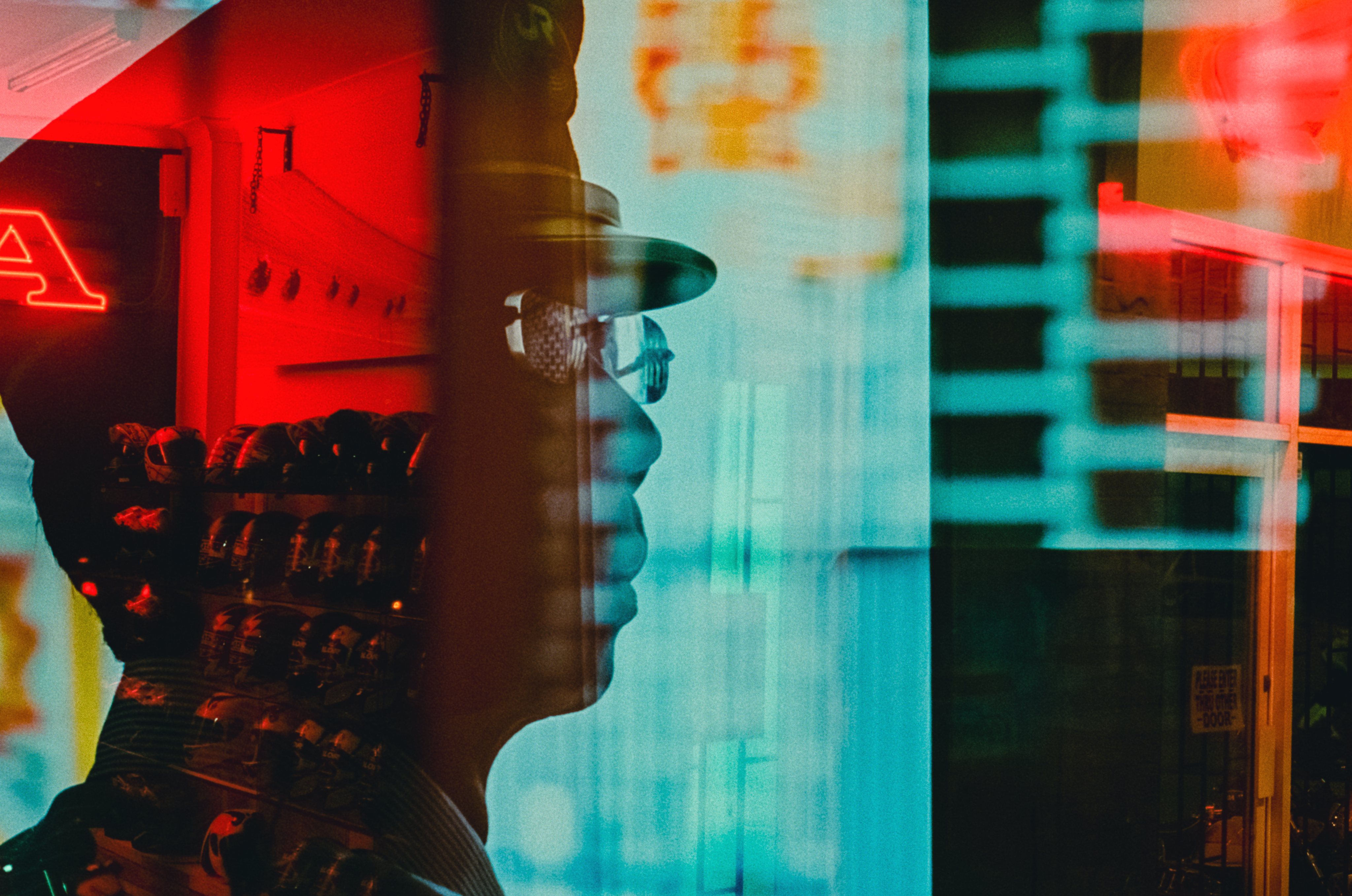
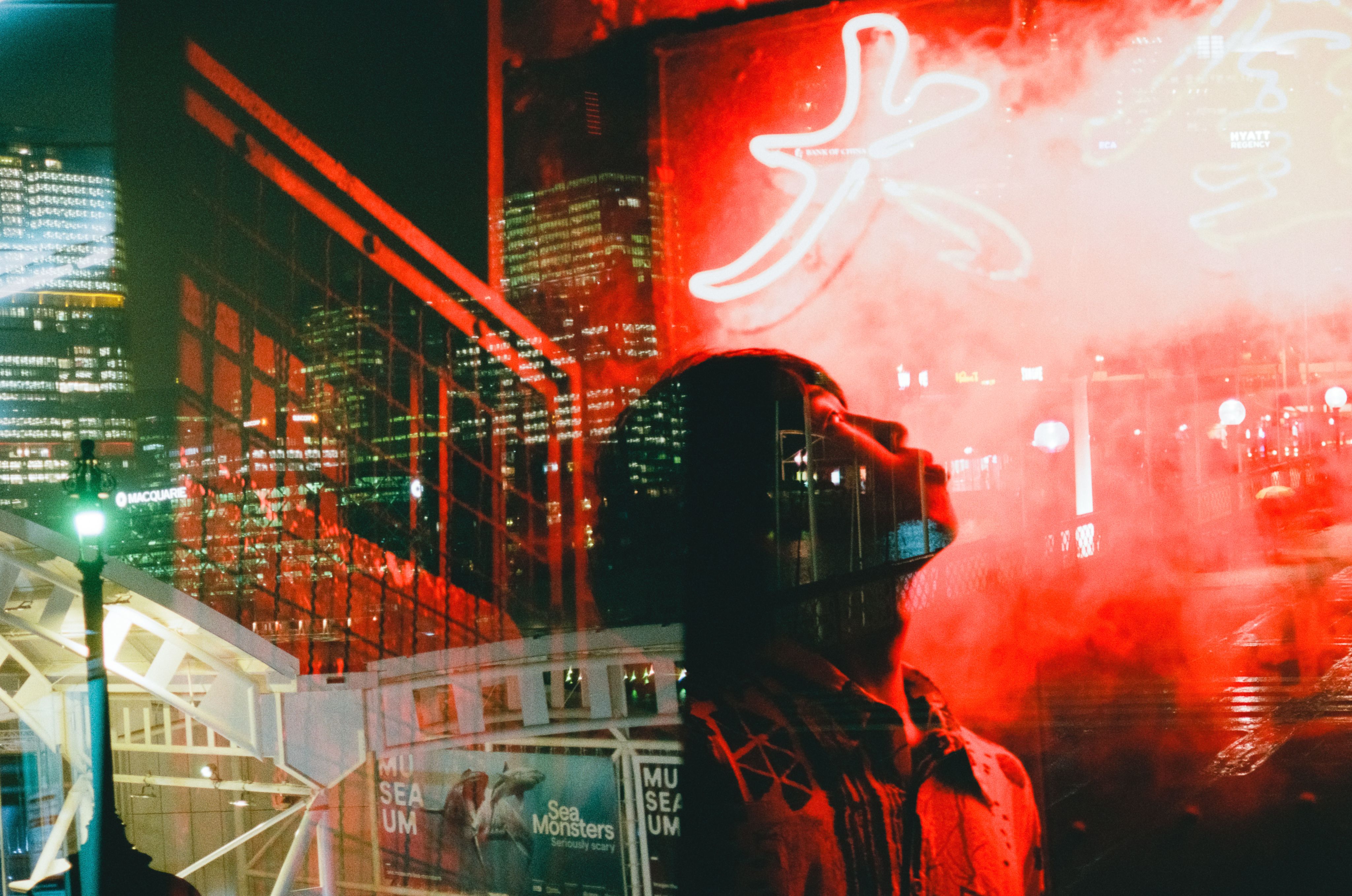
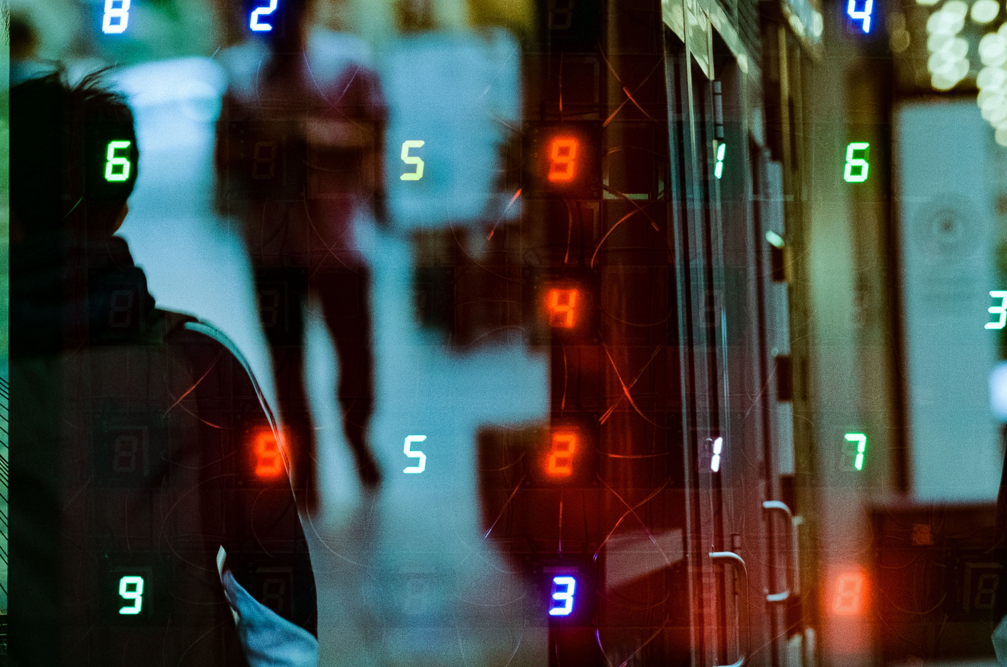
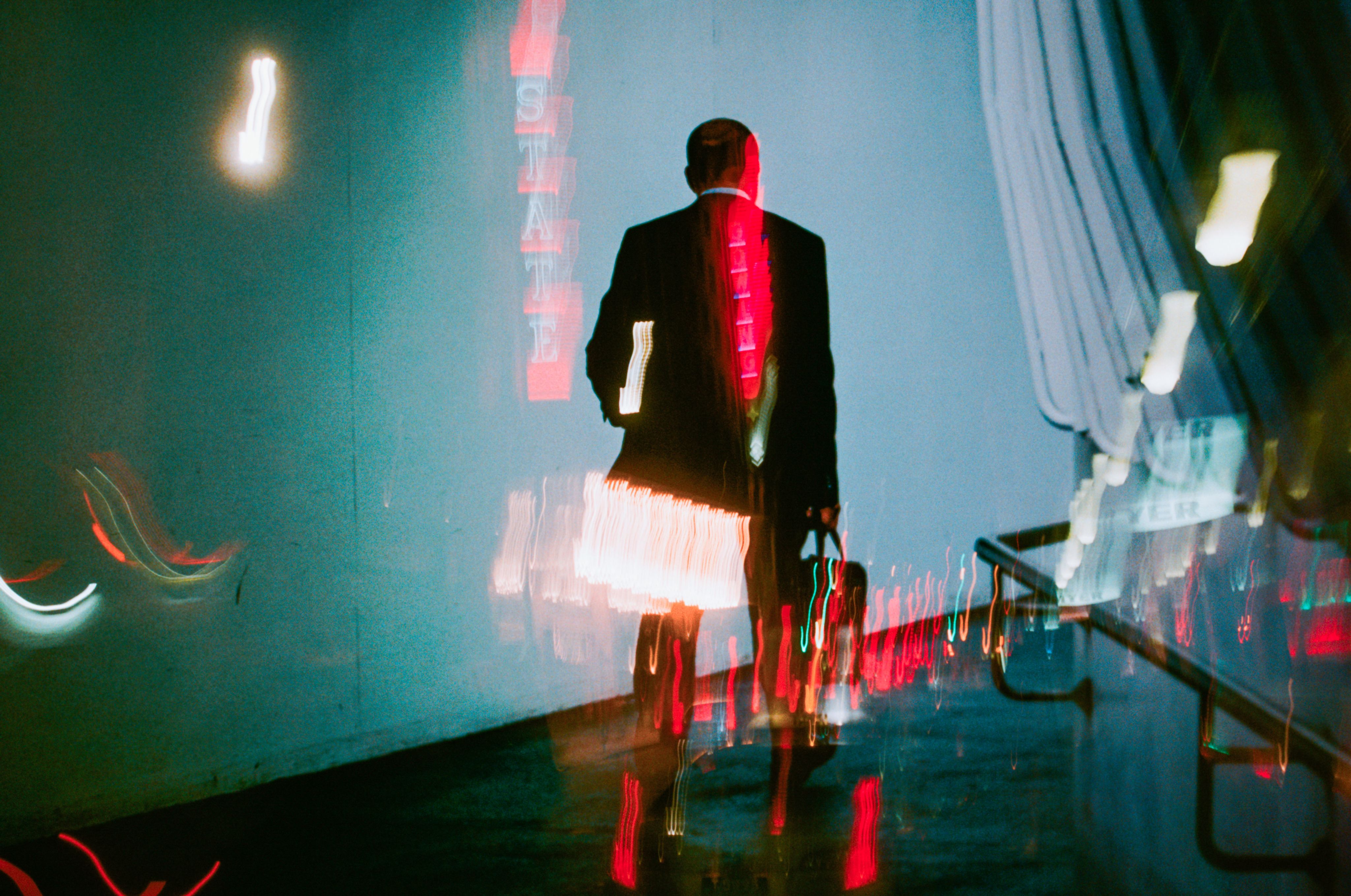
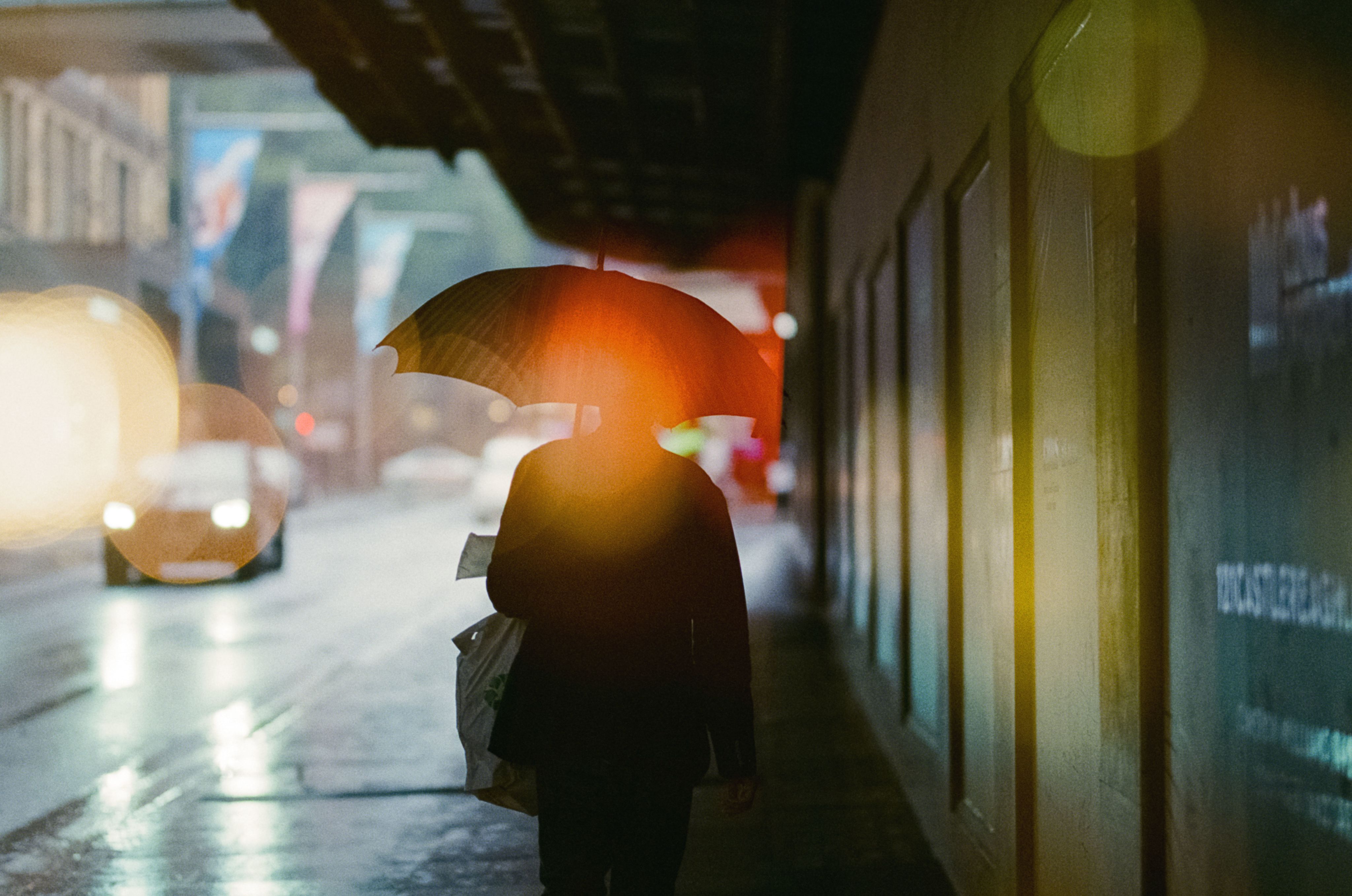
Quiet moments, bright tones, and layered exposures are recurring themes in your work. In a time of digital oversaturation, your images still stand out and jump off the screen. How would you describe your style, and how does darkness play into it?
I don’t think I have made a conscious decision about creating a particular visual style, I feel it’s something that has just emerged through the time spent taking photos and mixing things up when I felt what I was doing was stale. I started taking photos on the street about 10 years ago. I needed something to refocus my mind as work was quite stressful at the time, so I decided to start shooting whatever drew my eye on the walk home. Those photos tended to be dark, layered and contrasty with pockets of colour as it was normally dark by the time I finished work. What interested me most was how a mundane scene during the day could be transformed into something mysterious and film-like after dark once the lights came on. Coloured lights would activate grey concrete walls bringing life to areas ignored during the day, while the silhouettes of people moving through these spaces provided interesting shapes and compositions to photograph.
Let’s talk about light. Do you wait for the perfect natural light, or do you try to bend it to your vision?
You kind of stumble upon a situation with perfect light rather than waiting for it in my experience, so I just try and make the most of the situation I find myself in. When it is perfect I try to make the best of it as it could disappear at any time. At night it can be a little more predictable - if it's a light source from a sign or a street light that I know will be on after dark. I generally like to capture the quality of the light as it appears rather than altering in post production.
Do you come from a graffiti background? There’s a real rawness and anonymous undertone to your work that feels deeply connected to that world.
That’s an interesting observation but no, my background is not that exciting. Growing up in Adelaide, I was a quiet kid happy to sit for hours building Lego, drawing pictures and riding bikes around the streets with the other neighbourhood kids. I grew up in the time before smartphones and the internet where we had to keep ourselves entertained during school holidays while our parents were at work. Making do with what you have, viewing life as it was in all its rawness and the influence of friends being themselves and saying things with no filter helped shape who I am as a person today. I think those experiences instilled a sense of authenticity that I'm instinctively drawn to and comes through in my photography to this day.
Are you someone who pre-visualises the shot or do you let the moment guide you?
I would say that most of the time I am open to exploring and to see what I would find rather than heading out to shoot with a predetermined idea of what I would shoot. I have found with my street photos the best results have come from the most unexpected situations or encounters.
Let's talk about your origins as a photographer - what pulled you into photography, and what keeps you coming back to shoot?
I remember being given my first camera for my 15th or 16th birthday. Thinking back, it was a cherished gift that was my first true introduction to the joy of taking photos and my first ‘grown up’ present my parents had given me. It was a small Canon point and shoot film camera (I still have it today) that I used to take photos of friends and family at parties or around the house. It wasn’t until Uni that I became interested in proper photography. The way you can use photography to express an idea or create a story quickly really appealed to me. I enjoyed the physical aspect of developing my own film in the dark room and the joy of seeing my image magically appear in the developing tray. With photography I always feel like there is more to learn or ways to improve, which keeps me going.
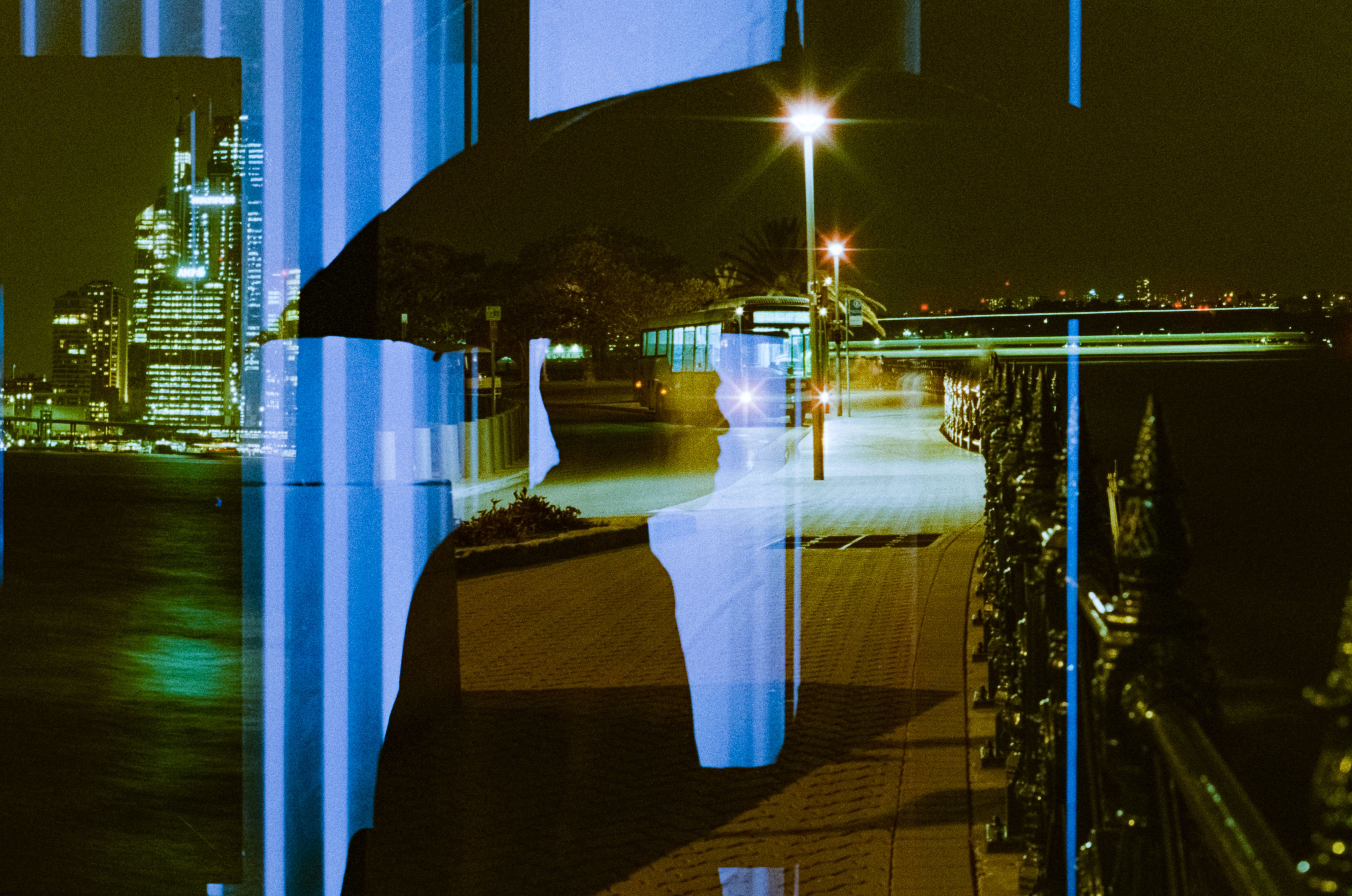
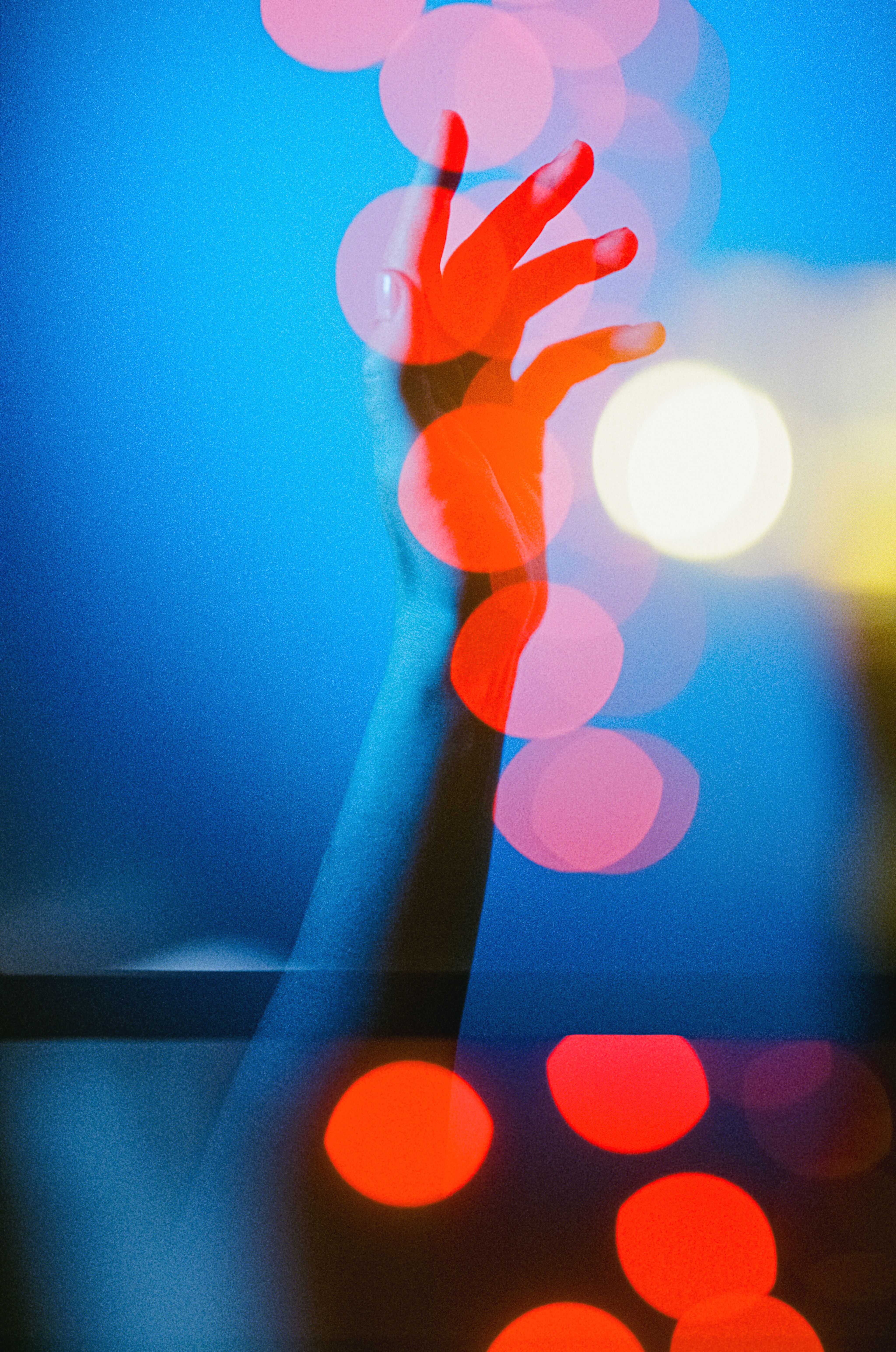
Do you shoot with film? The layered exposures, and unexpected light feels like spontaneity, like the surprises you’d get from a roll of expired film. Is that an intentional influence? Is it a particular technique you use to capture moments and layer this way?
I shoot both digital and film, but I feel more of a connection to analogue and have been shooting more film than digital recently. Sometimes digital can feel too perfect. Life isn’t perfect and sharp, being blurry around the edges feels like a better reflection of what I see around me. The appeal of film for me is in the way the results can surprise me, the imperfections in the colour shifts and rough grain when using expired film, unexpected contrasts if the wrong exposure was dialled in, light leaks and unexpected compositions layered through multiple exposures. I experiment with a lot of double exposure, exposing the complete roll of film, rewinding, and re-exposing the same roll at another time. It can be a hit or miss process but there are times I see results that I could never plan or replicate and it makes the effort all worthwhile.
Is being a street photographer your full time gig?
There was no grand plan to become a ‘street photographer’, it was just something I started to explore as a creative outlet in my spare time. Over the years photography and image making has become a bigger part of my life with my interests expanding beyond just street photography into more of a fine art direction. I would love to push my ideas further and see where they lead without it becoming commercial work for someone else. To balance this aspect of my life I work as a Graphic Designer which also complements my passion for photography.
How do you think Graphic Design has shaped your photography journey?
As a part of my visual communication degree at university I was taught all the fundamentals of design and visual language including composition, colour theory, form, contrast and harmony etc and once that became second nature and a natural part of my design and conceptual thinking process, framing scenes through my camera lens became an intuitive action. My design intuition subconsciously helps me to identify quickly whether a particular scene is interesting or if a composition will work even before I get my camera out.
Who or what inspires you?
Getting off social media and observing what is happening in the world is my biggest inspiration. Travel. Time spent wandering through art galleries and watching films also sparks ideas for me. Films with inspiring visual direction including work by Wong Kar-Wai (In the mood for love), Wim Wenders (Paris Texas) and Blade Runner (Original and 2049) are a few of my favourites that I can watch over and over. Artists Basquiat, Jeffery Smart, Magritte. Photographers Trent Parke, Saul Leiter, William Eggleston, Bill Henson. Designers David Carson, Stefan Sagmeister, Vaughan Oliver. However my biggest inspiration is my partner Lidiia. She is always there for support and advice and is the one that keeps me going.
What keeps the passion for photography as a creative practice alive for you, especially in times of creative burnout or doubt?
I often put too much pressure on myself to create amazing images constantly so I must take a breath and remind myself why I am doing this and it's supposed to be fun. Taking a break to give my mind a chance to relax and reboot also helps to minimise my burnout and aid in regaining my passion for creating.

"I enjoy capturing those fleeting moments that only I witnessed - being in the right place at the right time."
– David Sark
Do you ever feel tension between preserving a moment as it is, and reimagining it through your lens? How do you balance authenticity with interpretation?
There are many moments I observe and stay with me without the need for taking a photo. After shooting for years I find I'm more selective with the moments I chose to shoot and preserve. They need to be authentic, real life moments that I find interesting or have a personal connection to. It’s all intuition, something I don’t think about too hard at the time. I believe the interpretation comes after. The final image may speak to me differently compared to the moment it was captured and my audience may also have a different interpretation viewing the image with no context explained.
The theme of this NC issue is resurrection - what does resurrection mean to you?
For me resurrection relates to my inspiration and my creative output at this moment. My father passed away in 2023 and I experienced a long period of grief. Losing complete interest in photography and most other things. Only now I feel as though I'm working my way out of a hole and gaining that lost inspiration to start creating again, a new lease on life.
Tokyo streets and scenes appear often in your work. What’s your relationship with the city, and what is it like shooting there?
Travel is a great way to reignite the passion for taking photos. I've always enjoyed being in a new city, exploring and discovering all the little details that make it unique and different from home. With my travels throughout Japan I felt there was an infinite amount of little details to discover with fresh eyes. Everywhere I went or every corner I turned I found something new and interesting I needed to take a photo of. I thought I needed to take as many photos as I could knowing I would probably never go back to those places as there were so many new places to see. Not knowing the language, I found it a very different experience to shoot in places like Tokyo, Osaka and Kyoto compared to home. The sound of people talking and announcements in Japanese seemed to fade into the background leaving me to focus on all the visual elements around me, undistracted.
You seem to have done a lot of international travel / work - where else have you loved to shoot outside of Australia and why?
I lived and worked in London for a few years and tried to make the most of the short distances to cities in Europe. I loved being able to journey to cities with different languages and cultures in a matter of hours. I love the winding narrow laneways in old European centres never knowing what’s around the corner, the energy of New York where there is always something happening on the streets at all hours of the day and the tranquility and culture of Kyoto.
With social media being so oversaturated with images now, do you think photography as an artform is being diluted by quantity over quality? And if so, how can we fix this?
Definitely so, but like everyone else on social media I’m still trying to work out the best way my work can be more visible. Social Media has changed so much since I first started posting on Instagram 10 years ago. There is still plenty of quality photography and active communities on Instagram but as the barrier to enter the space is now non-existent, photographers will continue to struggle for visibility against the sheer tsunami size wave of new ‘content’ being posted every hour. I feel we have to either go into battle with an algorithm that we have no control over or instead dedicate time to producing more meaningful work that is true to ourselves and values. Maybe you can do both, but at the end of the day, I think everyone needs to find an outlet and platform that works for them in a positive way.
When editing, what makes a photo 'complete' for you? What's your definition of done?
Editing photos is my least favourite part of the process. There are endless possibilities that can be a little too overwhelming for me. I try to keep things simple, correcting exposure, white balance and contrast. With my street photos I still aim to retain a realistic/natural aesthetic, I'm not a big fan of shifting colours too dramatically. For me the editing is just the final touch on a photo I'm already happy to have captured. I feel an image is complete when I feel it is. Again, it’s weird to talk about a process that I am not consciously thinking about. It’s done when it’s done! But saying that, I think if you need to spend more than an hour to edit a photo - you’re overcooking it and it probably wasn’t a good photo to begin with.
Any famous last words?
“Just start” is my current mantra.
Trent Mitchell
Australian Lustre
Interview: Bianca Valentino

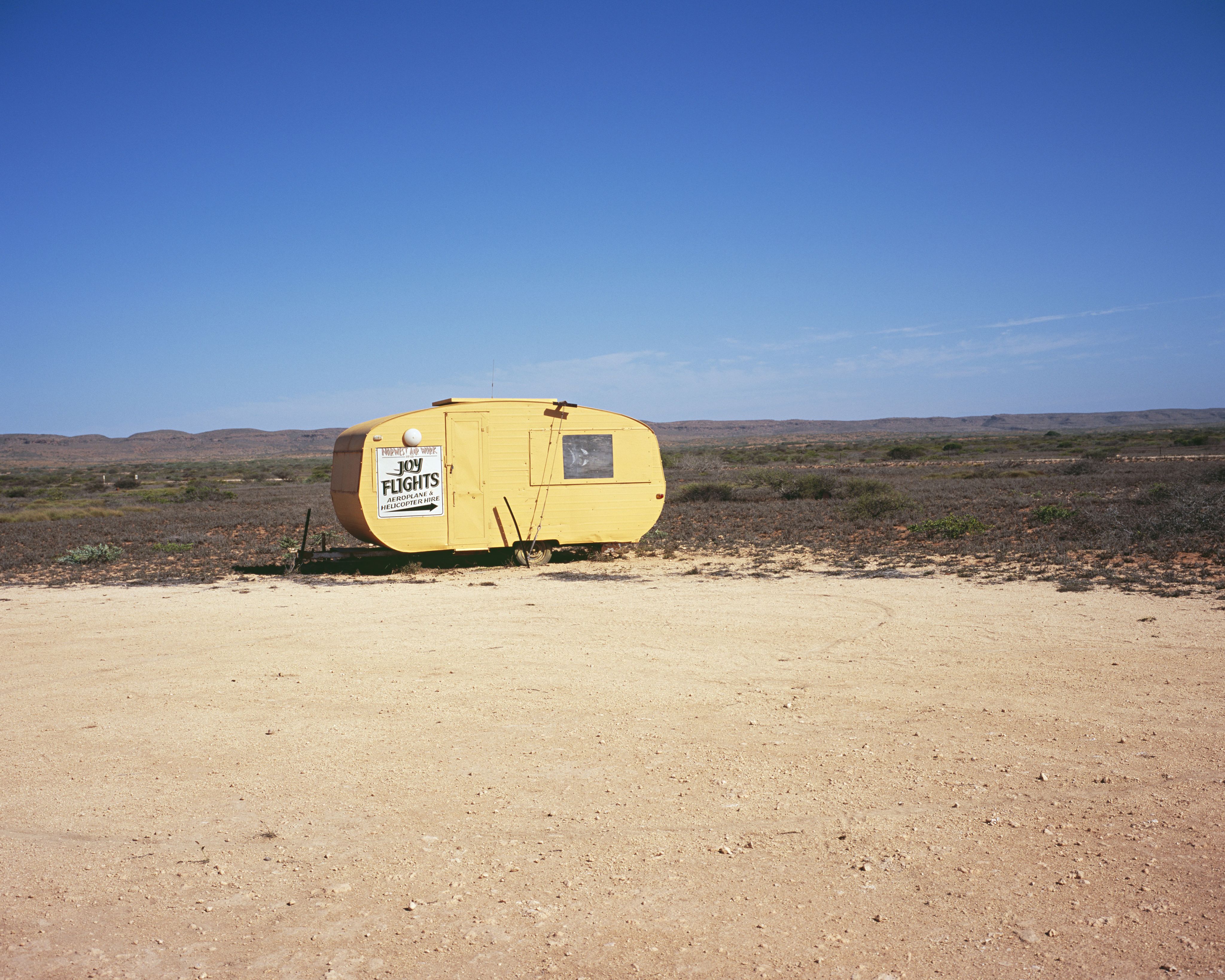


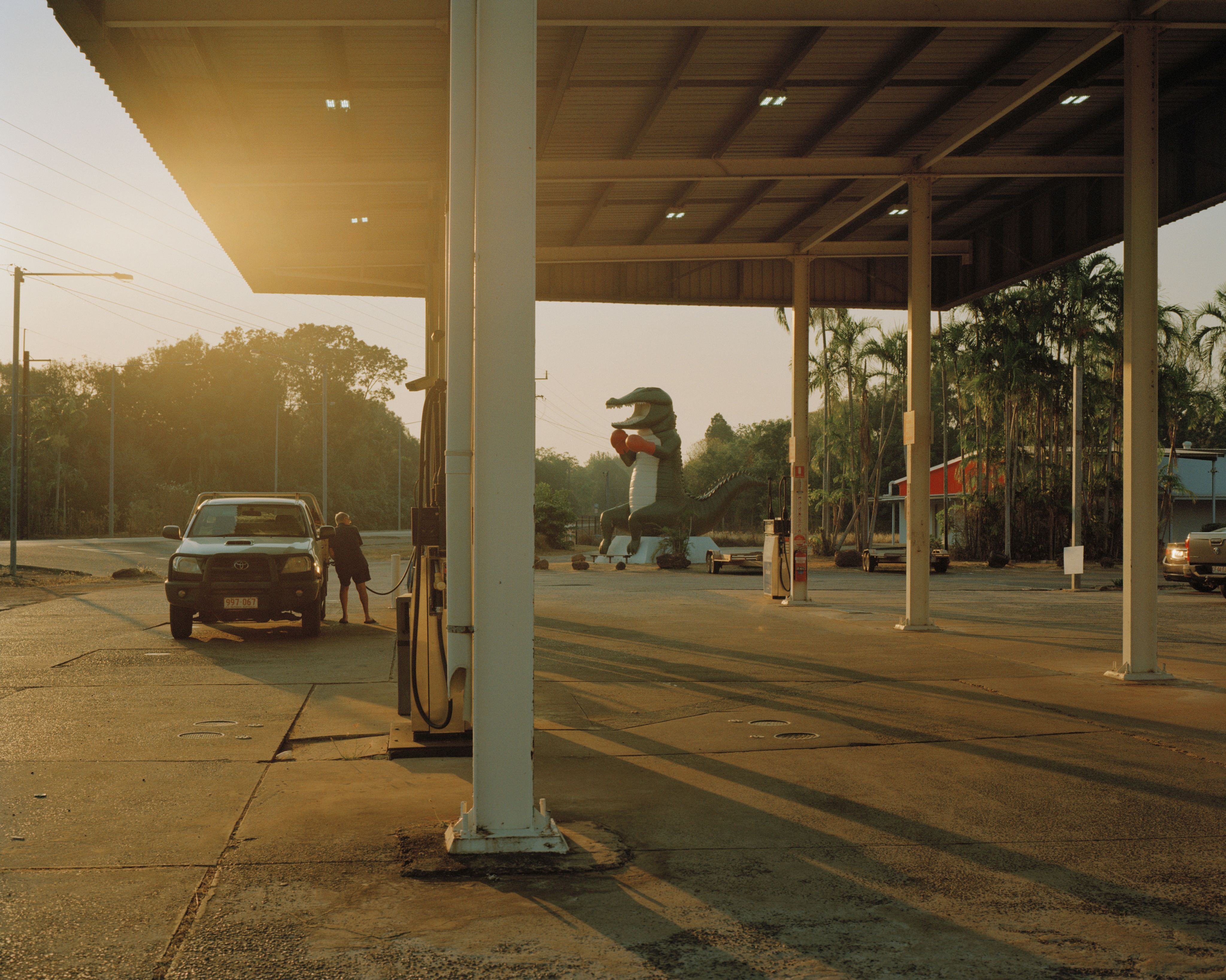
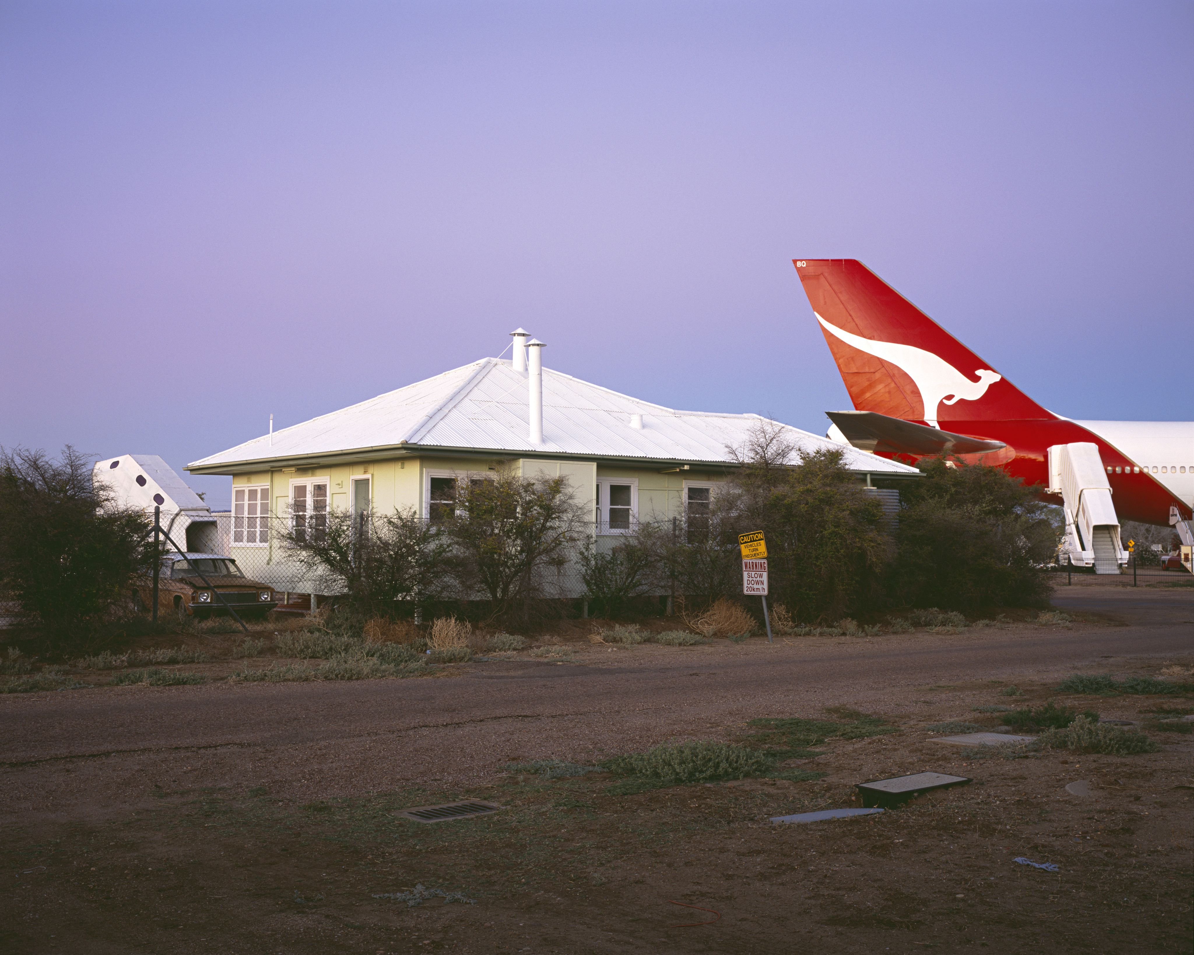
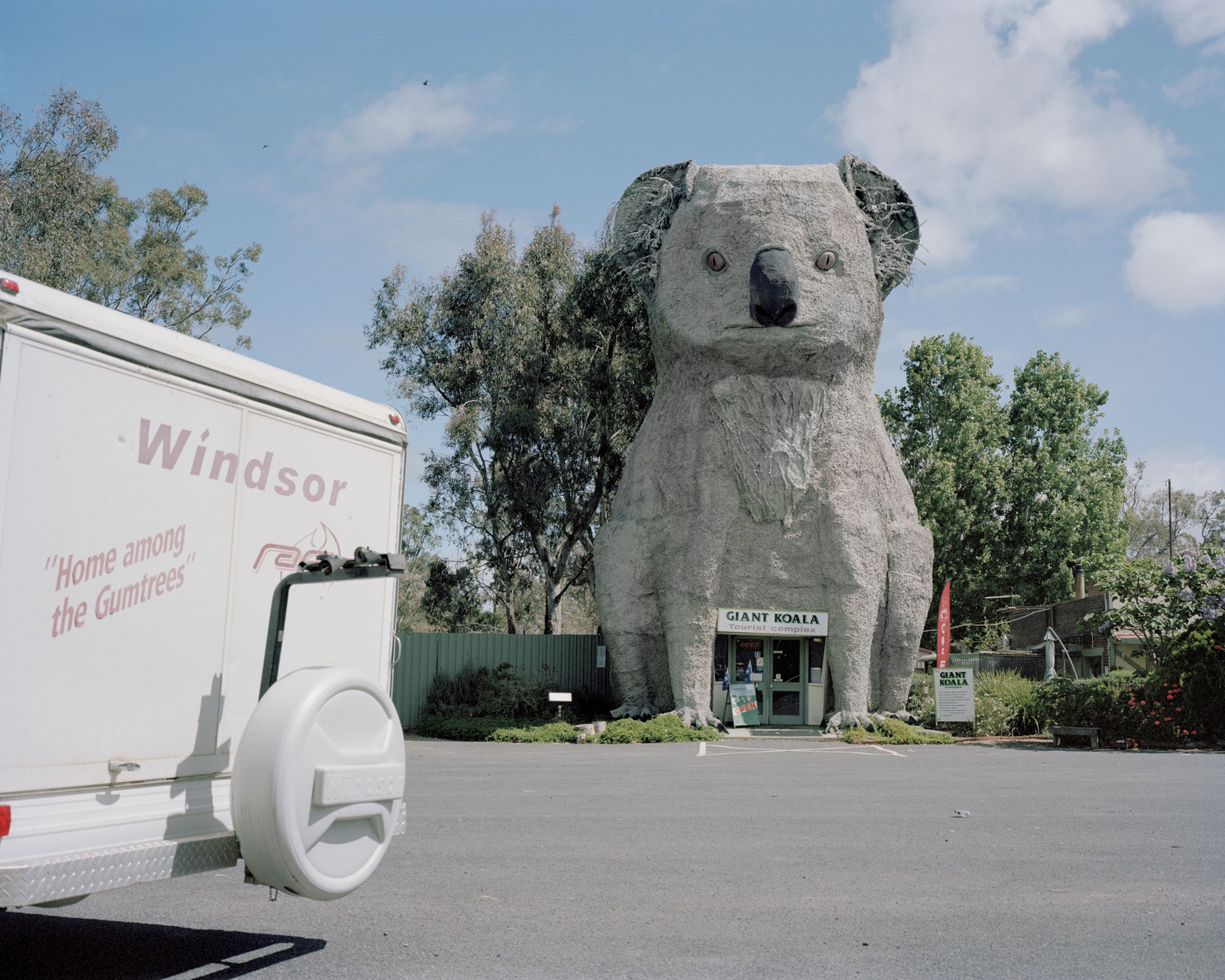
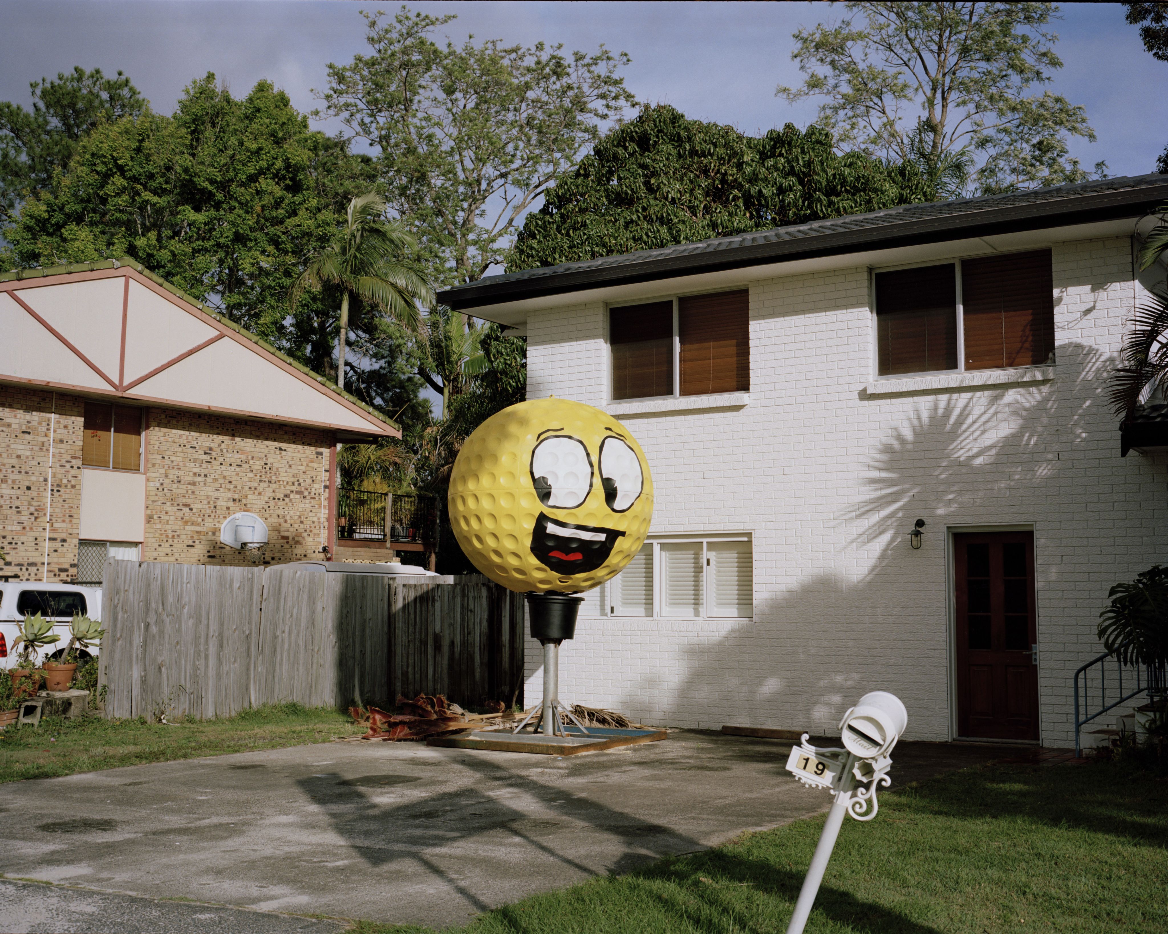
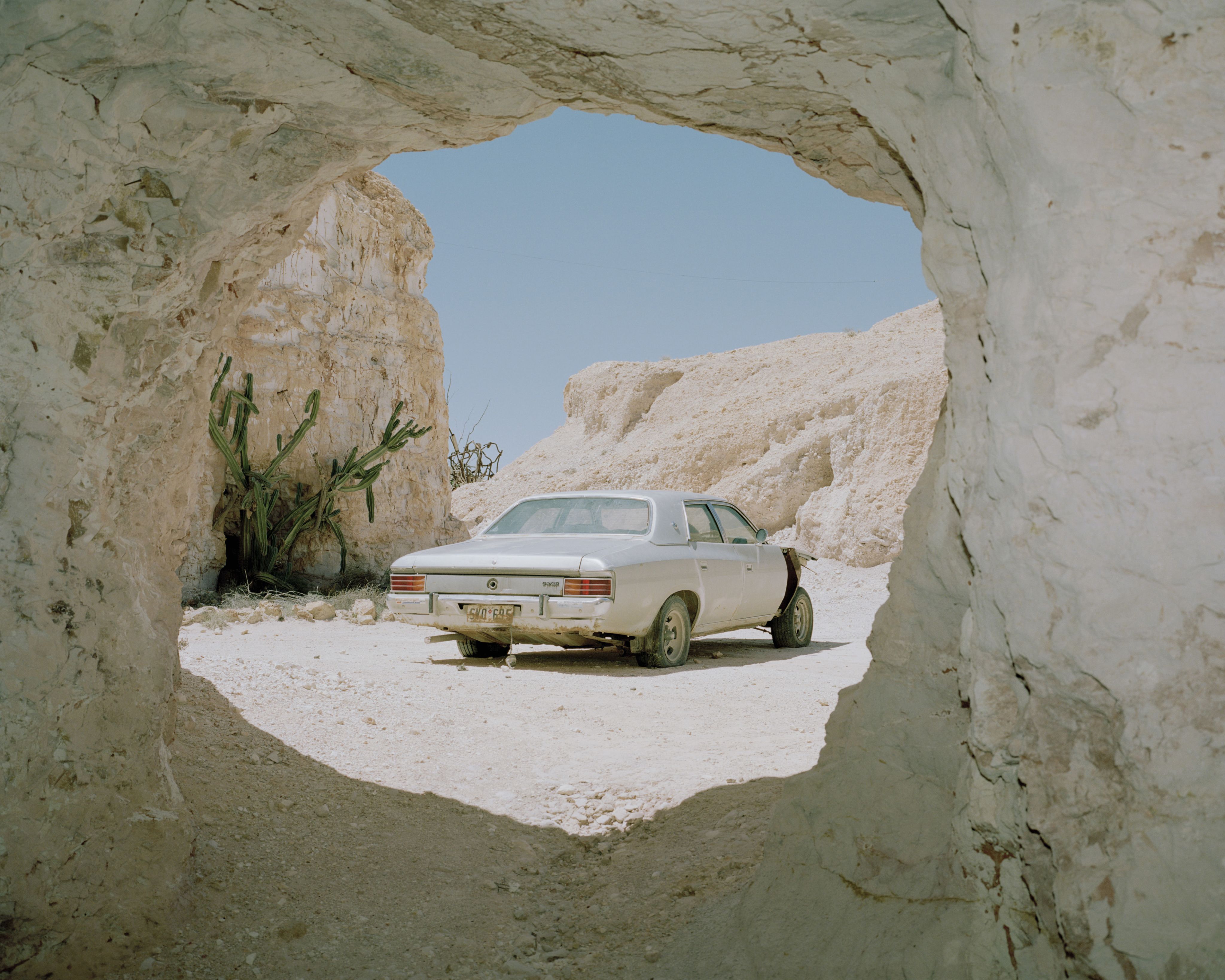
Trent Mitchell’s Australian Lustre is a vivid and reflective journey through memory, place, and identity. Drawing on childhood holidays spent in coastal caravan parks, Mitchell captures the strange beauty and contradictions of regional Australia — sun-bleached rituals, decaying relics, and nostalgic landscapes. Best known for his evocative water photography, Mitchell brings a sensitive, narrative eye to this series, exploring what we inherit, what we remember, and what still lingers. No Cure sat down with Trent to talk about the stories behind the images, and how photography helps him reckon with the past and present of this complex country.

What does ‘lustre’ mean to you in the context of Australia?
It’s a word that relates to the surface quality of gemstones and the degree to which they reflect light. I was a bit of a rock geek as a kid and started fossicking with my son during the making of the book. So the word was on my mind a lot and it stuck. And the book has a lot to do with childhood memories and dreams. Metaphorically speaking, I like the idea that memories have a particular lustre to them as well — the way they can become brighter over time, or dim completely and fade away. Like how a gemstone can roll down a creek and gain a higher lustre as time passes, or stay where it is and have no lustre at all. Australian Lustre interprets to me as Australian memories and Australian surface quality. Both at the same time.
"I see the book as a holiday photo diary that I wish I’d made as a kid. It’s a random mix of things I’ve experienced as both a kid and an adult."
You describe Australian Lustre as a "photographic road trip" and a “voyage based on a true story.” Can you tell us more about the narrative arc?
I see the book as a holiday photo diary that I wish I’d made as a kid. It’s a random mix of things I’ve experienced as both a kid and an adult. The lines blur in the book and the completely random sequencing was intentional. The sequencing was instinctual and driven by aesthetics and visual energy. It really is based on my personal life. It turns out that a lot of people who engage with the book also feel the same way about their own past. They’ve been to these places or experienced very similar trips. I had no idea it would play out that way — it’s almost a product of a collective memory and a time capsule of a bygone era.
There’s a strong sense of nostalgia throughout Australian Lustre, but also an undercurrent of unease. How did you approach capturing the beauty and contradictions of regional Australia?
For at least 10 years, I was just photographing whatever I was drawn to — with no purpose other than feeling it would make an interesting image or a record of something that might not exist in the future. I had a sense that things were on the cusp of changing at an unprecedented rate. I would photograph things I did and didn’t like about home with equal importance. After reflecting on that decade of work, I recognised the tension between the playful images and the sobering ones. After that realisation, I made a conscious effort to lean into each aspect and bring out that tension through colour, energy and pace.
Tell us about a funny moment that ensued during one of your photos.
I’m not sure if this is funny — it’s more of an uncanny moment. I had just driven non-stop from Melbourne and turned up at the Giant Koala, feeling out the area and looking for interesting angles. I’d shot a couple of rolls of film and found my spot for the next shot. While I was loading my cameras, a campervan rolled into the carpark and pulled up right where I wanted to stand. They blocked my angle. I remember thinking, “These guys have just ruined my shot — oh shit!” I figured I’d just let them eat lunch and move on.
Then I looked back at the van and noticed a faded sticker on the back that read: Home Among the Gumtrees. I couldn’t believe it. It felt like the world had gifted me this image. In the foreground was this quintessential road-trip vehicle, the sticker, and the Giant Koala looming behind — it had this dry Australian humour baked into it. I shot three rolls from multiple angles and formats. They left after about 30 minutes. I couldn’t have been happier with the result — it’s one of my favourites in the book.

There’s mention of your colonial ancestry and a reckoning with identity. How did those personal histories shape the way you saw and photographed the landscape?
It definitely informed my feelings about the contradictions on which this nation was built. I’m a First Fleet descendant, and my family retraced our heritage back to Norfolk Island and the Hawkesbury River area, where my sixth great-grandmother was buried. I documented it all. Her name was Anne Forbes and she was one of the last surviving people from the First Fleet.
There are images in Lustre that mock our colonial past — if one looks deeply. It’s something I feel equally proud and ashamed of. I feel like that’s where the underlying sense of unease may come from. These are real feelings I have.
You also mentioned "the darker undertones and contradictions" of Australian culture. Were there moments when your camera served more as a critique than an act of nostalgia?
Absolutely. The closing image of the book pictures the reverse sides of tourism billboards staggered across an outback horizon. These billboards advertise pubs, tours, accommodation, your next cheap meal in town — you name it. But on the back of one, in white graffiti, are the words Black Lives Matter. To me, that says so much about the contradictions — where it was, what the words were made on, and how they were written. All seen from the perspective of someone leaving town, headed back to the city. There are other moments too, but that closing image says it all in the context of Lustre.


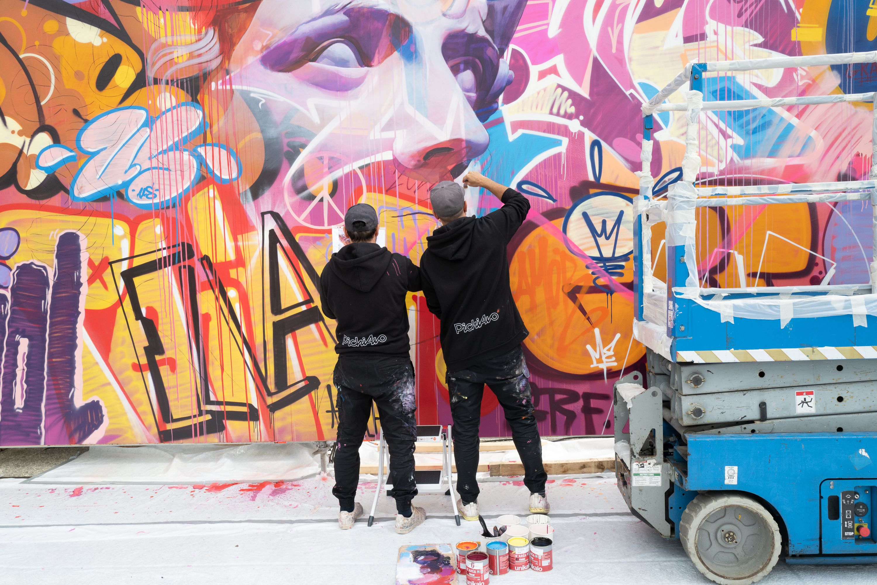
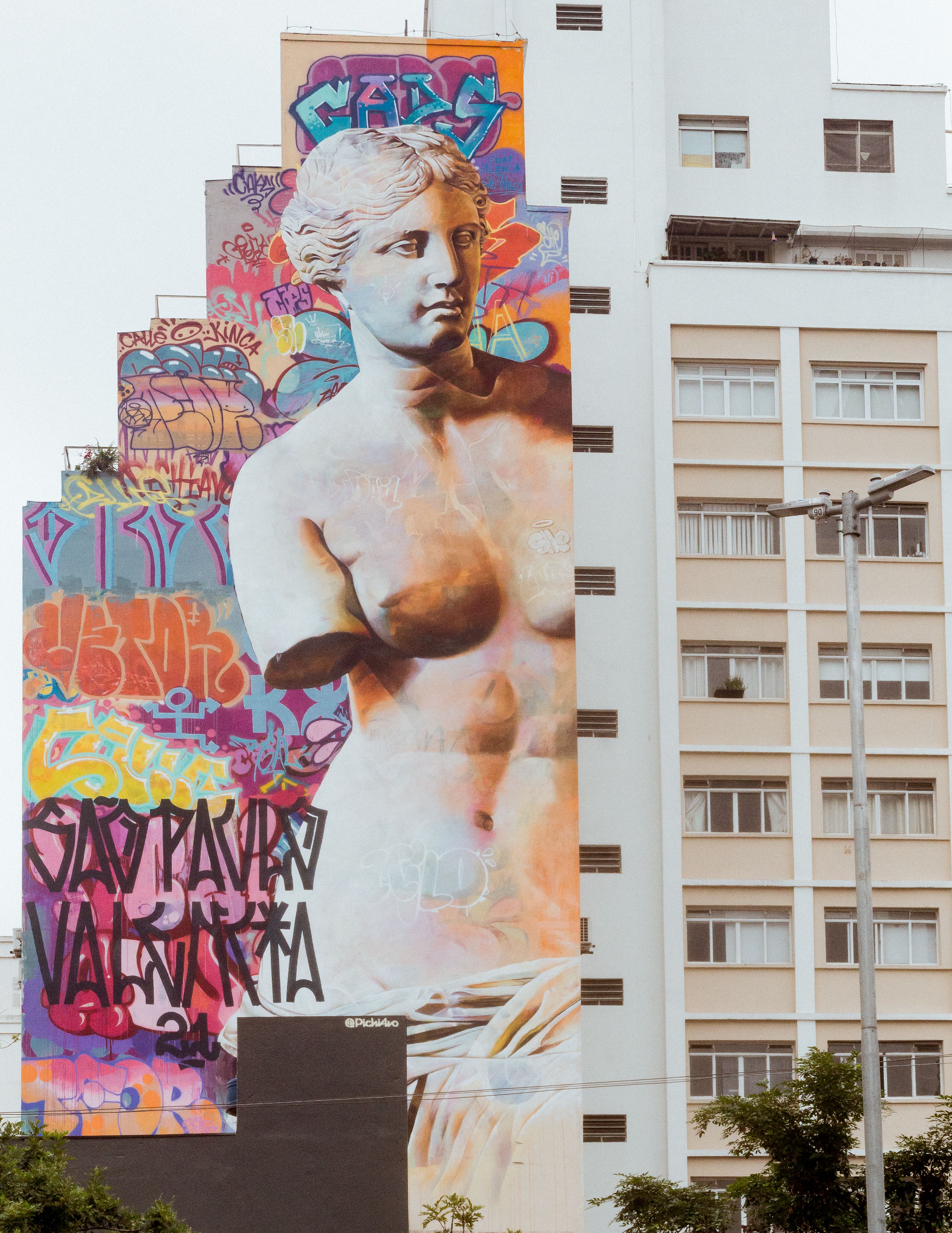
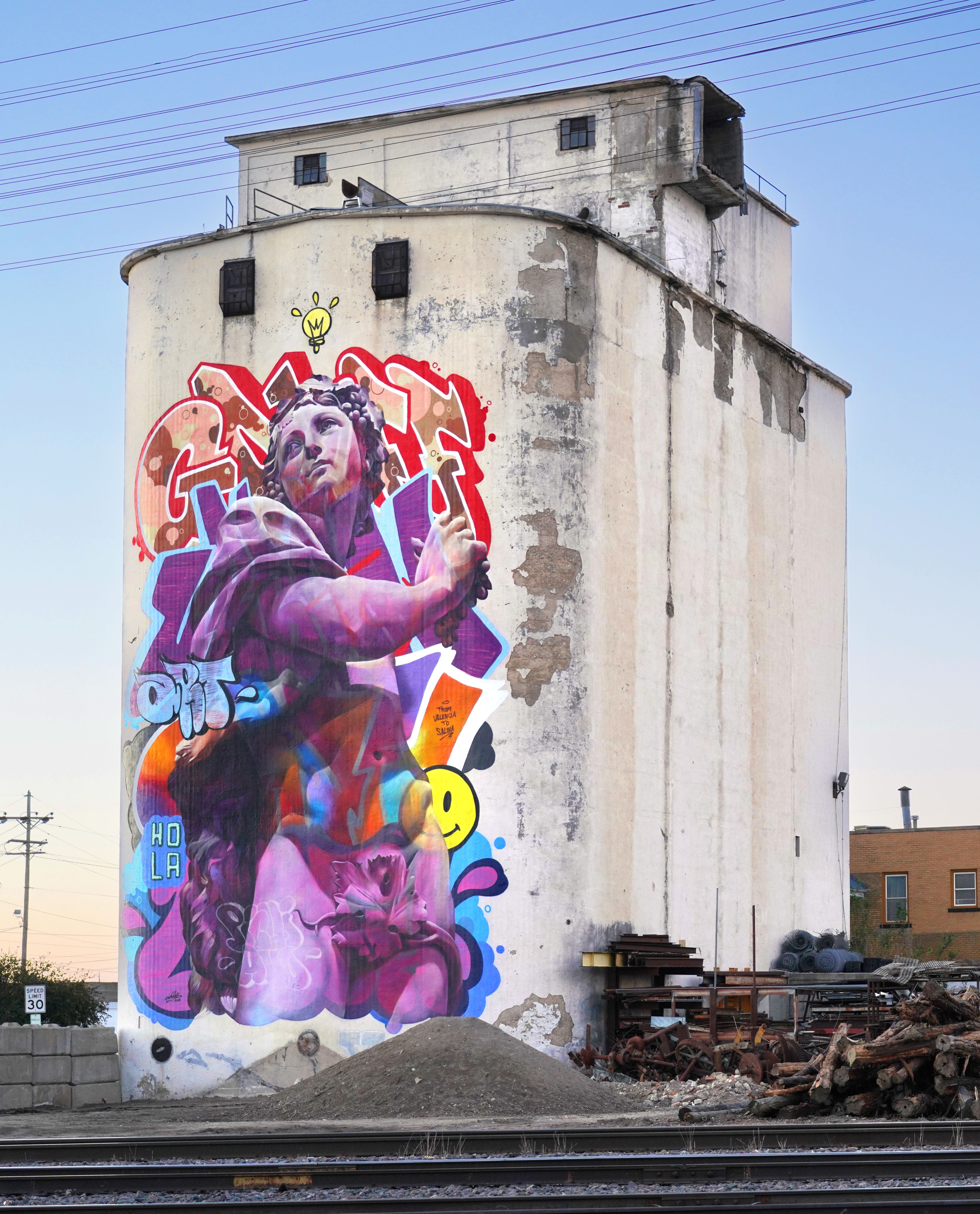
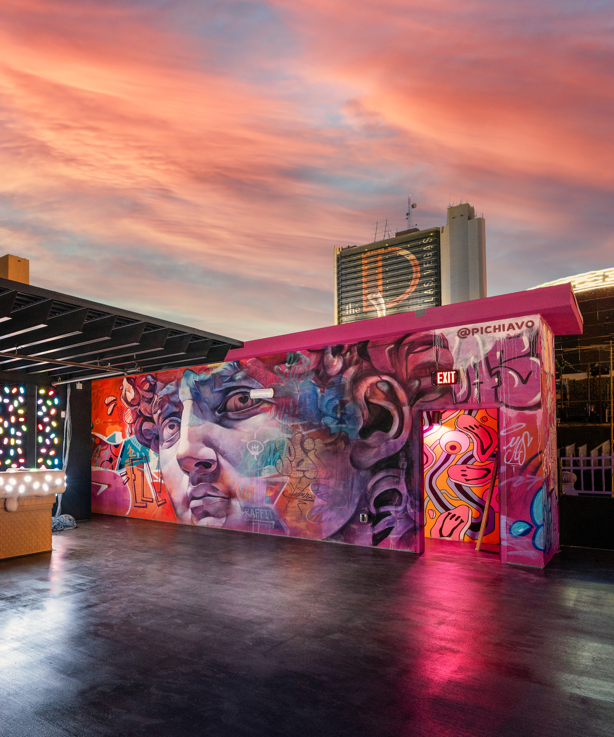
PichiAvo
Interview: Sarah Hazlehurst


As a duo, who are PichiAvo?
Two friends who met while painting. We both come from graffiti backgrounds. It's our roots, but we also have formal training in Fine Arts and Design, so our work is really a dialogue between the street and the studio.
How did your partnership come to be and how long have you been creating together?
We met in 2005 painting graffiti in the streets of Valencia. We quickly realised that we shared a vision, and since 2007, we’ve been working together on every piece as one artistic voice.
How has your identity as a duo evolved over time? Are there parts of yourselves (individually or collectively) that you’ve had to 'resurrect' or reinvent through your practice?
Over time, we’ve grown into a single creative identity. In the beginning, our styles were more separate, but now our process is completely collaborative. We've had to constantly adapt, reinvent and evolve, especially as our work moved from walls to galleries and public sculptures.

A working creative partnership could be even closer than a marriage! As a duo, how do you navigate creative differences or decisions? Are there a set of unspoken rules you’ve developed between yourselves?
Absolutely! It's a relationship built on respect, communication, and trust. We don’t have strict roles; instead, we make decisions together. It's not always easy, we also argue and have opposing opinions! But in the end we always reach an agreement and the result is good. We know each other’s strengths and we flow with that.
Tell us about home? What does home look like for you?
Home is Valencia. It’s where we were born, where we paint, and where our creative roots are. The Mediterranean light, the streets, the culture, it all feeds into our work. Home is also where our studio is located. We built a space for ourselves in 2020 that meets our needs and has been designed for our artistic practice. Now we have a team and we spend more time at the studio, that’s where all projects start.

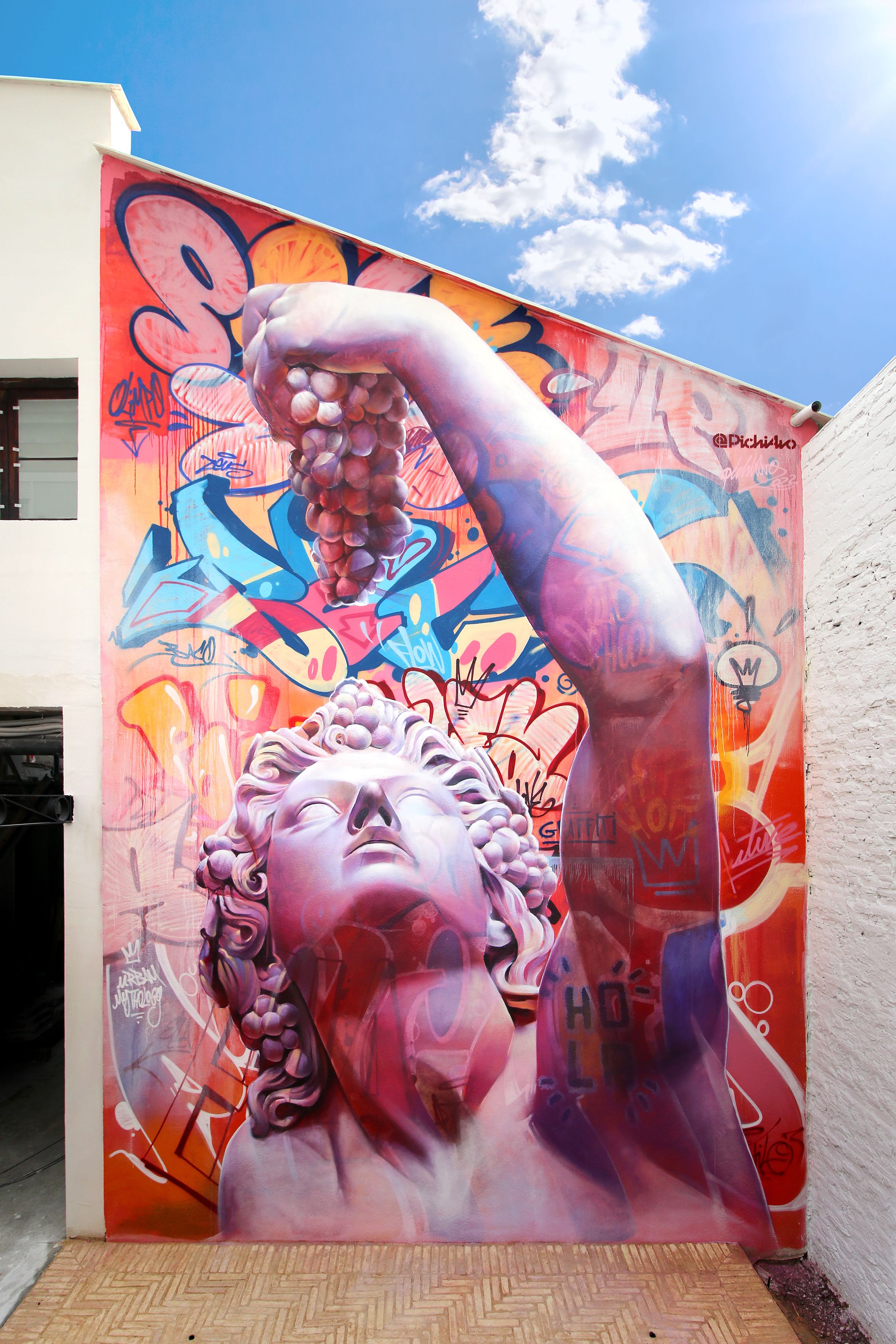
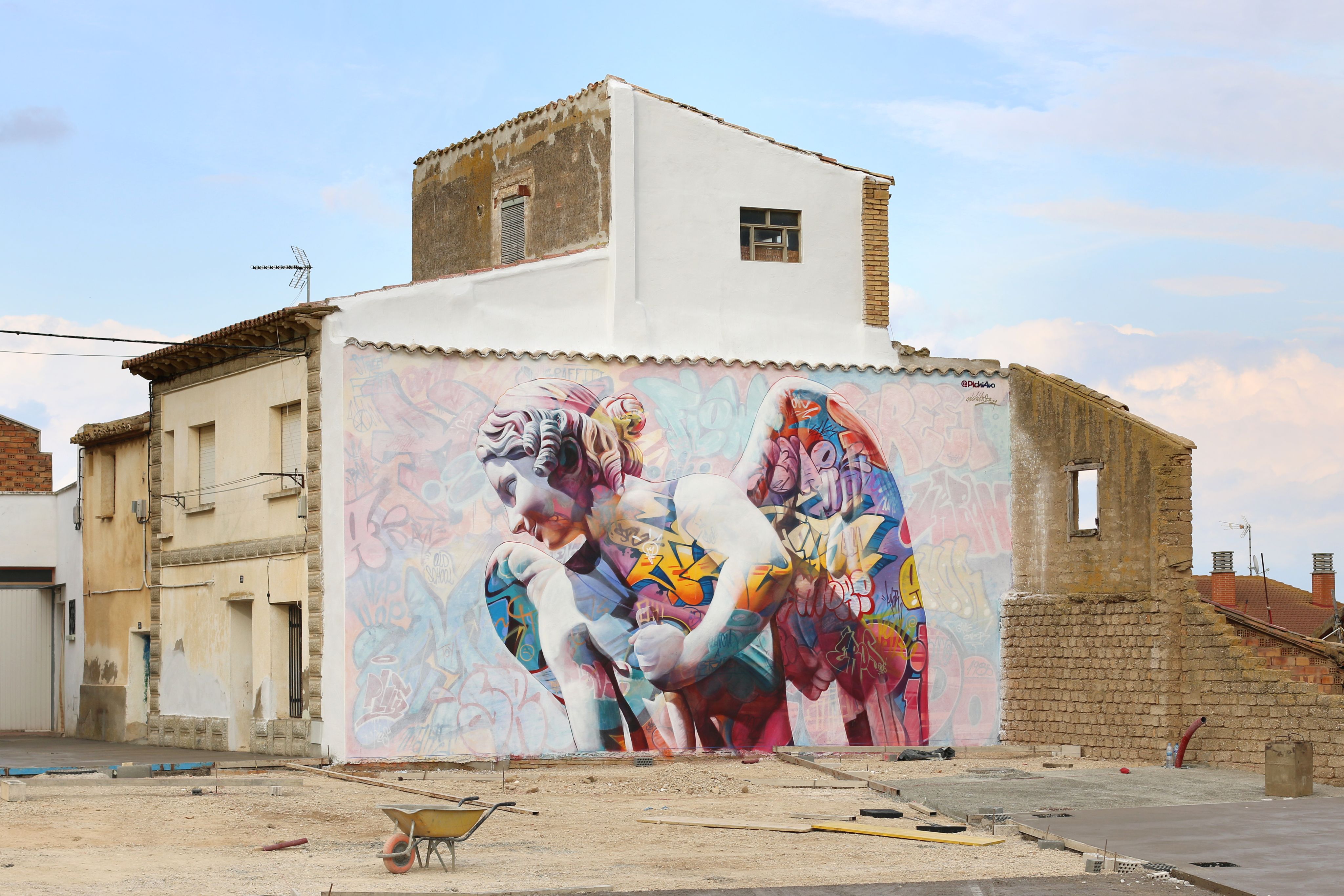
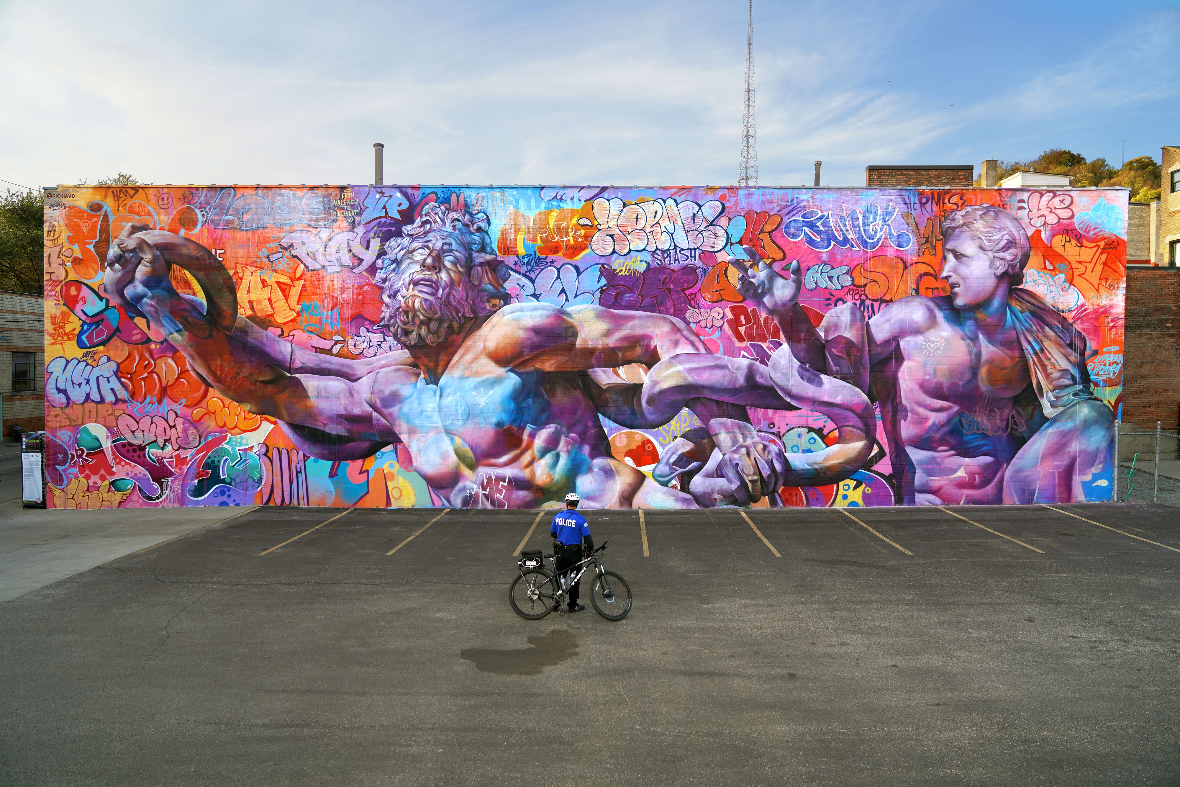
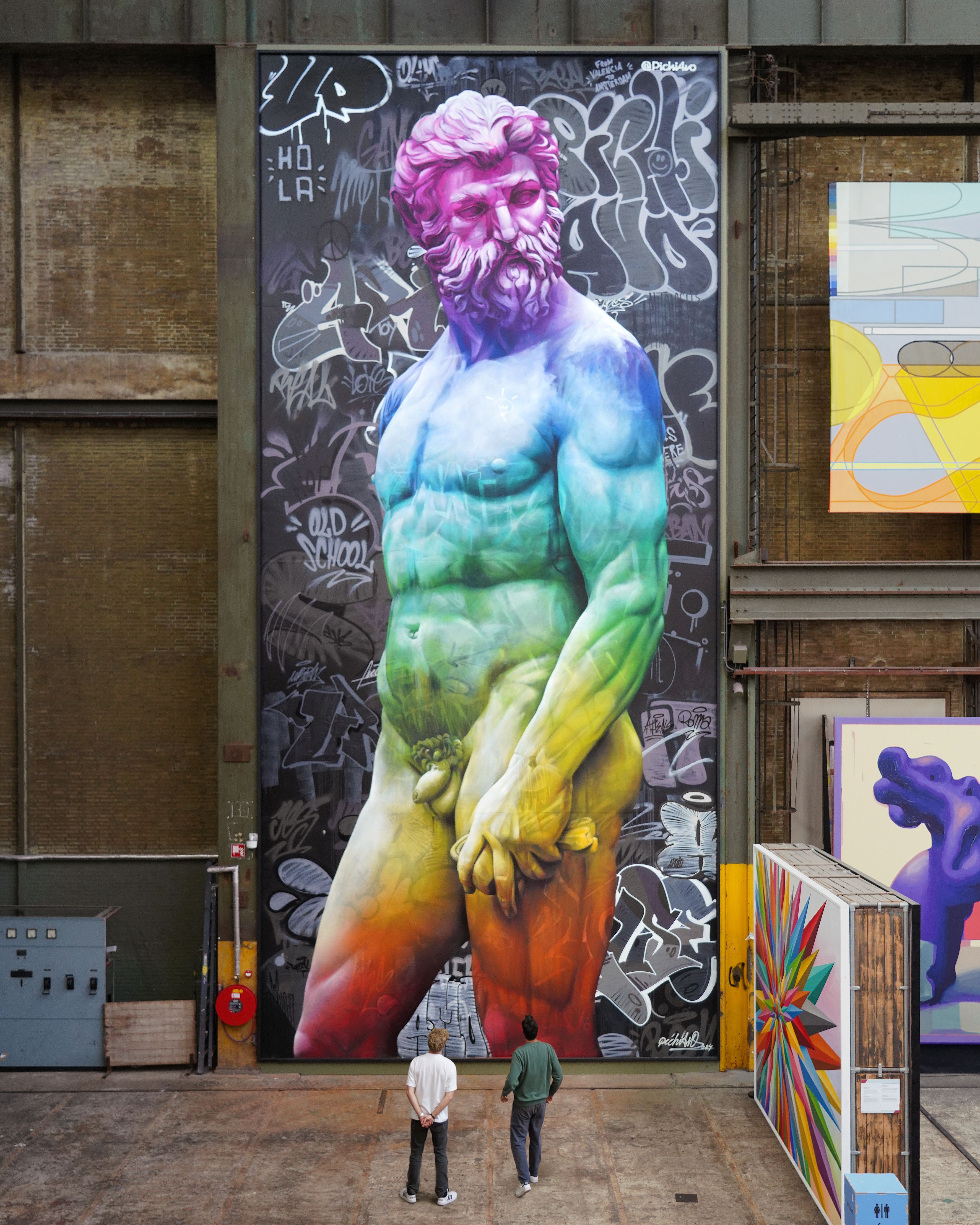
Your signature style - ancient mythology meets modern graffiti - reflects a powerful dichotomy and dialogue between the past and present. What does this juxtaposition mean to you both personally, and how did it come to become the signature style of PichiAvo?
It’s our way of showing that the past and the present can speak to each other. Mythology represents timeless human stories while graffiti is our contemporary voice. Combining them is about honoring tradition, while breaking it and creating a new language that’s both historical and urban, sacred and rebellious. It came out of experimentation when we were younger. We were painting realism and graffiti and one day we decided to paint sculptures. We saw the potential in the result instantly.
Graffiti and street art in nature is ephemeral - here today, often gone tomorrow. The long lasting nature of your murals offers a promise of permanence and cultural legitimacy to an artform that’s historically been dismissed as vandalism. Do you see your work as a way of resurrecting graffiti’s value to the public?
Graffiti has always been a voice from the streets, but it deserves to be heard in galleries, museums, and public spaces. By merging it with classical art, we’re showing that it’s not just a fleeting trend, it’s a legitimate form of cultural expression. In any case, we don't mind the ephemeral nature of murals and street art. It's a kind of artwork that can be part of the urban landscape today and change radically tomorrow.
The figures you depict from Greco-Roman mythology like gods, mortals, and symbols of ancient power, they often embody themes like justice, identity, pride, vengeance, and fate. What draws you to these particular characters, and what message or meaning are you hoping to convey through their resurrection in your work?
These figures represent the complexities of human nature: strength, wisdom, passion, and flaws. By bringing them into the urban landscape, we’re reminding people that these themes are timeless and still relevant today. Our work has something that attracts audiences of totally opposite generations.

How do you approach layering these two opposing styles into a final piece?
We start with graffiti - raw, energetic, and full of life. Then, we introduce classical elements - structured, timeless, and sculptural. Our work at the technical level is the result of many layers. When we paint in the studio with oils, some layers are thin glazes. Those transparencies that make the two worlds (graffiti and classical art) intertwine are fundamental.
"Mythology represents timeless human stories while graffiti is our contemporary voice."
– PichiAvo
What does resurrection mean to you?
Resurrection is about giving new life to old ideas. It’s about taking something from the past, reimagining it, and making it resonate in the present. For us, that often means revisiting classical art, (mythology, sculpture, architecture) and merging it with the language of contemporary urban culture. It’s a way of keeping tradition alive, by reinterpreting it and placing it back into public space. It’s a continuous cycle of creation and reinvention.

Large scale murals often carry a lot of significance and purpose with their size and prominence in cities/locations. What are your intentions when creating a large scale work for a city or community?
We seek to provoke reactions in the people who pass by and see the work, and create an impact that contrasts with the urban environment. We always seek creative freedom and try to impose our instinct that is moved by different factors that we often do not analyse. It is simply our perception.

How does the community react to your work and how do their reactions make you feel?
It is curious to see people's reaction to our murals. With experience we have seen that during the creation process, it changes a lot every day with each layer we add. The first few days we only paint the graffiti and many people are opposed or frustrated when they see what we do. Once the classic figures emerge, the same critics change their minds and begin to react positively. After all, the public highly values the aesthetic dimension of the mural and expresses their opinion based on that.
How do you see your work evolving over time? Are there art forms or mediums you haven’t yet explored but would like to in the future?
Our journey has always been about pushing boundaries. While murals and studio artworks remain at our core, we’re increasingly drawn to sculpture and installations. We’re exploring how our mythological figures can transcend the wall and interact with space in new ways. Next year we are presenting a temporary pavilion in our city, (something that we call Fallas here) and hopefully we will be installing our first permanent sculpture in an outdoor public space.

5 OF AUSTRALIA’S SMART-ARSIEST AND WHACK HOTEL REVIEWS
WORDS: NICHOLA DAVIES / ILLUSTRATION: CASS STEVENS
MELBOURNE’S REDAN APARTMENTS
The reviews of this place are so dire I almost want to book a night. Between researching and writing this article the rating actually went down by 0.2. It makes me think of that episode of The Simpsons when Homer and pregnant Marge are looking for a place to live and they inspect the house with a chalk body outline on the floor and on the wall is written in blood ‘I’ll be back’. Poor orbit2018 got the fright of their life staying here, finding cocks in every room and (allegedly) getting electrocuted:
“A massive penis had been spray painted in white on the carpet in the 'living' part of the room, taking up most of the floor space… On turning to the shower stall, we found that there was yet another giant penis spray painted on the door, and filth in the stall… On pulling the blind down when we went to 'bed', graffiti had been spray painted on it saying the following (please excuse the language): "This @$&* of a place &%#!@$ stinks". Well I have to say, I agree, but it is not a nice thing to read...”
Later in their review under the heading ‘MAJOR PROBLEMS’, they say: “Mr A (?) received an electrical shock strong enough to throw him back on the bed, and take a few minutes to recover himself. He did not receive burns, but he did suffer shock, after 'tingles', and was most upset.”
TRIPADVISOR RATING: 1.0 - TERRIBLE
DARWIN'S FRONTIER HOTEL
Apparent pisshead Diane Palmer was one of many who described the Frontier Hotel as having an odor:
“Three nights in this unfriendly and unfortunately smelly hotel. If we hadn't prepaid we would have moved. Internet charges were extortionate and wifi signal was very poor. There were some suspicious stains on the carpet in corridor to our room. Only redeeming factor bottle shop on site.”
No mention of whether the restaurant was also smelly, but Cobbydale wrote: “We were staying elsewhere & selected this restaurant for dinner as it was described on the website as being on the 7th floor with beautiful views. There was only a buffet on offer & it was cold. The food choices were unappealing. Frankly we should have looked at the food before paying any money. The small meal we had was awful. Also observed a staff member packing it up into takeaway food containers & placing it into the fridge. The decor is very dated & worn, smashed window & rotting windowsill. Cannot comment on the accommodation.
The best part of this detailed restaurant review is the simple reply - Response from Ashwinn1, General Manager at Frontier Hotel Darwin:
“Thank you for the review”
TRIPADVISOR RATING: 2.5 - AVERAGE
BRISBANE'S MANOR HOTEL
This one has to be included because it features one of my favourite things, and that is people trying to show off with their big words but spelling them wrong.
With the misspelling in the heading “Great place for entamologists” Review E wrote:
“Great place for entomologists* who specialise in Periplaneta australasiae**. Provides all night entertainment locating, removing, eliminating in their unnatural environment. Conversations with three other guests 11:00pm agreed. Not recommended for human habitation.”
So smart. But not smart enough to avoid staying somewhere that’s riddled with roaches. Credit to another review of the same hotel titled ‘STAY AWAY UNLESS YOU LIKE DISGUSTING’.
TRIPADVISOR RATING: 2.5 - TERRIBLE
CANBERRA’S GREENWAY WATER SUITES
Wisend-traveller tells a tale with some of the greatest visuals possible:
“I was a late arrival, at about 8.30pm. Not that late really. However, the reception was locked up tight, and I had to call up to the receptionist to check in… I was in no mood for small talk, I just wanted to get to my room and relax after a very long drive. I made a small comment on how their website is a little misleading - more like 35 minutes as opposed to 20 minutes - and the guy went completely off the handle…
I was constantly trying to calm this guy down, and kept saying I just wanted my room key. The whole thing escalated and when I made further comment on his ***stinking*** attitude, he snapped. He grabbed a handful of pens, made a shrieking noise and snapped them all in half!”
Long story short the cops came and he went elsewhere.
TRIPADVISOR RATING: 1.0 - TERRIBLE
SYDNEY’S THE GRAND HOTEL
Wading through the masses of ‘Not-so Grand Grand Hotel’-titled reviews was this gem from ExpatMatt, titled ‘Rats or Large Mice – does it matter? Don’t book here:
“I woke up early this morning since the bed was killing my back… Made a cup of coffee and toast, and was reading the paper on my computer to kill time until my wife awoke. While reading, I saw a rapid shadow that drew my attention to the door to the room. A couple seconds later the RAT ran back into the room and under the sofa by the door not 5 feet from where I was sitting. On the other side of the wall is my bed that I was just sleeping in, and that my wife is still sleeping in as I write this. Can't wait for that upcoming conversation. Now the rodent has a body about 4-5 inches long, so perhaps it's a mouse and not a rat, but honestly I don't think it matters. We pre-booked, so I'm worried we won't be able to get our money back, but you can bet we'll be trying.”
The best part of course, is the fact he’s live reviewing the situation as it unfolds.
TRIPADVISOR RATING: 3.0 - AVERAGE


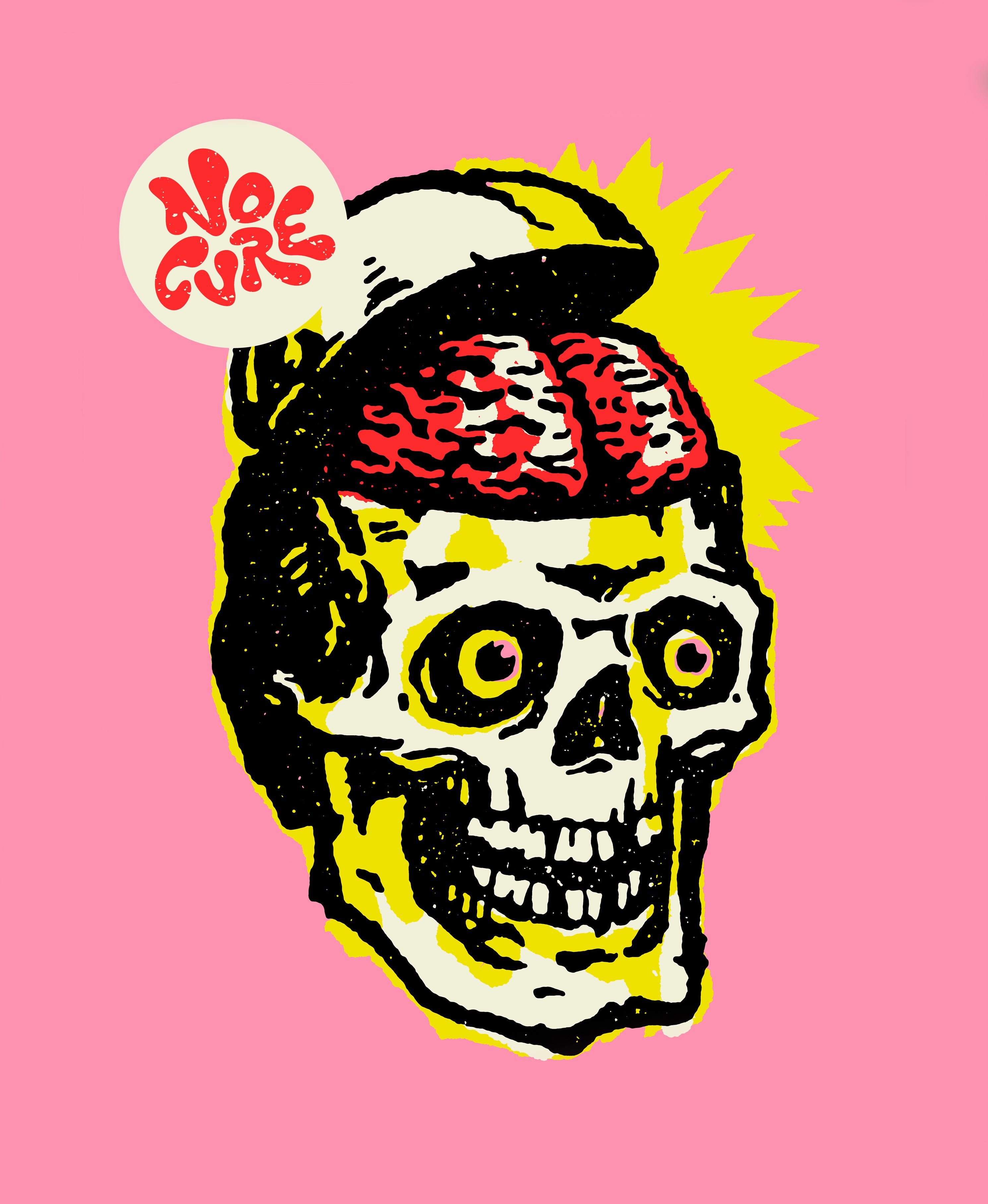
HAIL TO THE SKULL
Words: Bianca Valentino / Photography: Mark Zeidler
From the psychedelic haze of the ’60s to the grit of punk, the pulse of synth-pop, the power of rock, and the heaviness of metal, one visual motif has remained defiantly timeless: the skull. Loaded with meaning—mortality, rebellion, transcendence—it resurfaces across decades and genres, shifting its tone without losing its bite. Musicians have long embraced the skull as a visual shorthand for danger, depth, cool—or just damn good design.
Why does the skull continue to fascinate musicians and designers alike? Because it defies categorisation. It can be fun or fearsome, political or poetic. Whether on a tie-dye tee, a punk patch, a neon flyer, or a vinyl gatefold, it thrives on contradiction—celebration and mourning, beauty and decay, power and vulnerability.
In a world where album art is often reduced to a thumbnail on a streaming app, the skull still cuts through. It grabs the eye and stirs something deeper. It’s a cultural mirror. Whether grinning, howling, melting, or staring us down, the skull channels music’s primal pull—louder than life, closer than death.
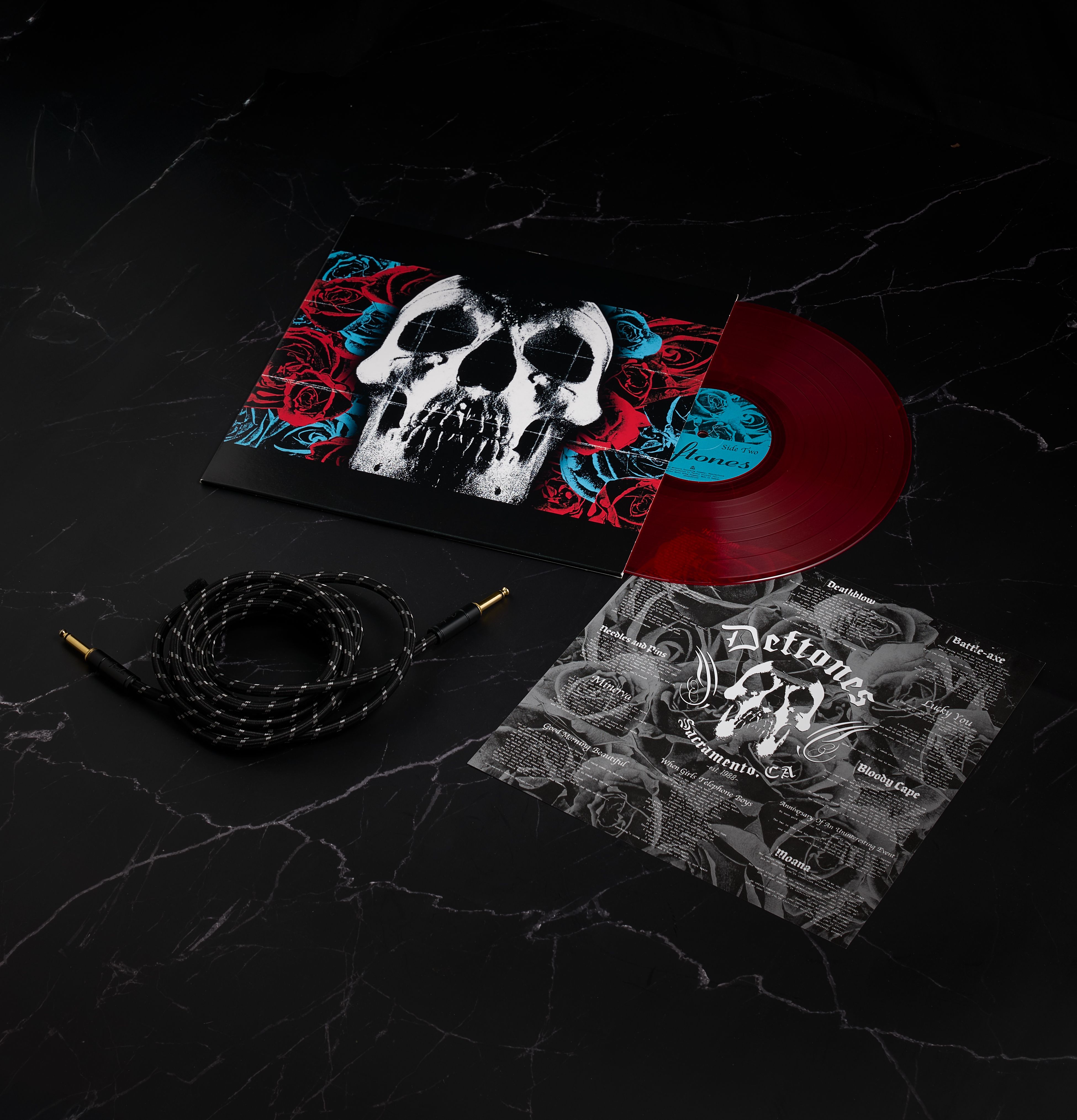
DEFTONES
Deftones / 2003 / Sacramento, California
The original title of Deftones’ 2003 album was rumoured to be Lovers, a concept perhaps echoed in its haunting cover: a skull entwined with roses. Designed by longtime collaborator Frank Maddocks, the image captures love’s duality—its passion and fragility entwined with the inevitable decay of time. The pairing of skull and rose alludes beauty and mortality coexisting, a reminder that intimacy often walks hand in hand with impermanence. Though the album was ultimately self-titled, the Lovers concept clearly shaped its visual identity. The artwork has become iconic, with fans even tattooing it as a symbol of the album’s emotional weight. When asked about his inspiration, Maddocks responded playfully on Instagram: “It’s a long story lol,” hinting at a more hectic, and perhaps more personal origin. For Deftones, skulls are sensual, surreal emblems of the fine line between devotion and destruction.

SEPULTURA
Beneath the Remains / 1989 / Rio de Janeiro, Brazil
The cover art for Sepultura’s Beneath the Remains (1989) is as intense as the music itself, brought to life by acclaimed fantasy and sci-fi artist Michael Whelan—also known for Meatloaf’s Bat Out of Hell II, and the Jackson’s Victory, and H.P. Lovecraft paperback covers. Frontman Max Cavalera personally sought out Whelan. The chosen image, Nightmare in Red, wasn’t originally created for the album. Painted with acrylics over pastels, it was born from Whelan’s grief after losing his mother—a surreal red skull adrift in a black void, radiating raw emotion and dread. Though the band initially wanted another Whelan piece (later used by Obituary for Cause of Death), Nightmare in Red ultimately defined the record’s visual tone. More than a metal album cover, it became a symbol of shared anguish. The success of the collaboration helped cement Whelan’s place in metal iconography and shaped Sepultura’s visual identity for years to come.


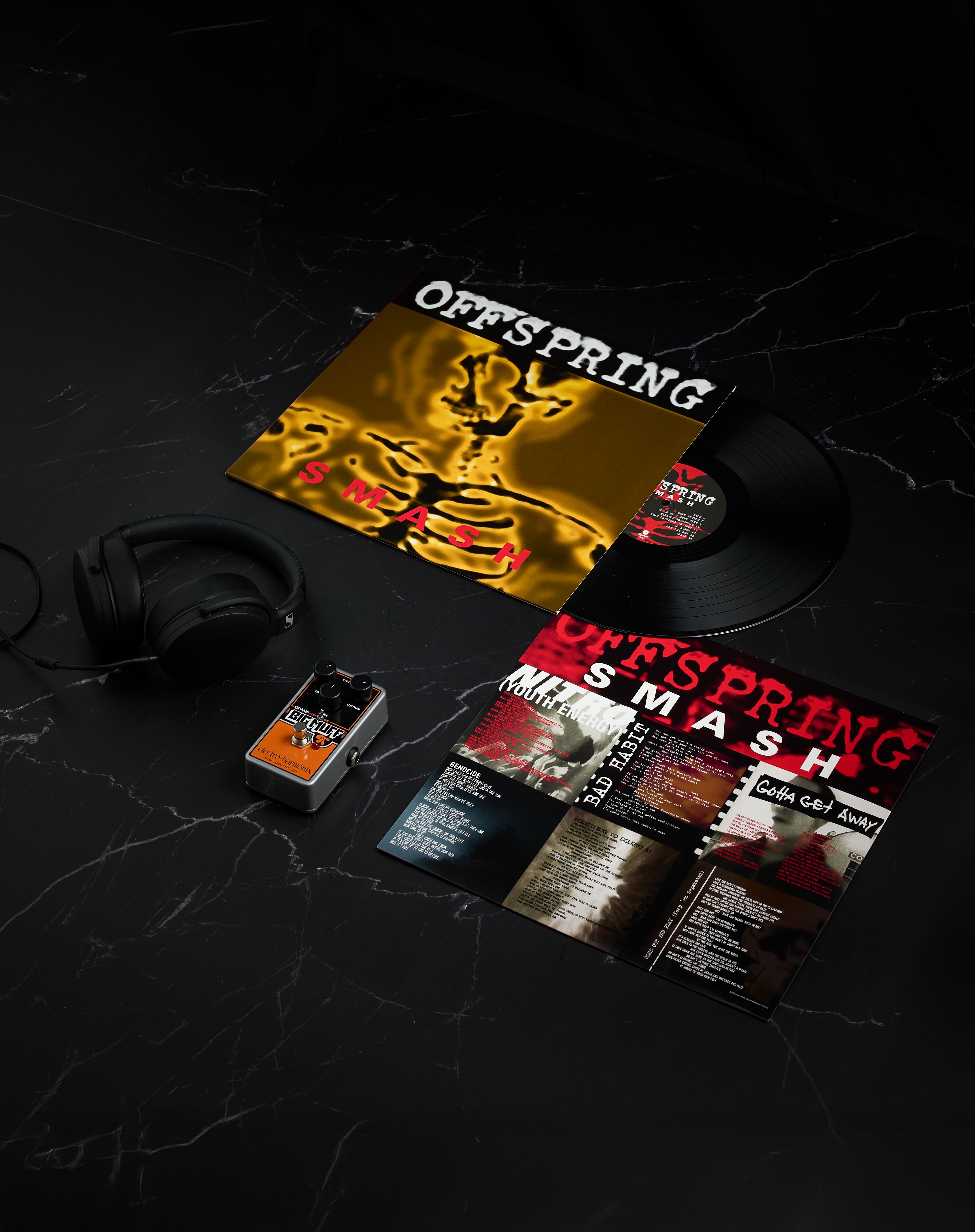
OFFSPRING
Smash / 1994 / North hollywood, California
Smash (1994) by The Offspring is a landmark punk album that helped fuel the genre’s 1990s resurgence. Released on Epitaph Records, it sold over 11 million copies worldwide, becoming the best-selling indie release of its time. The cover, designed by Kevin Head and Fred Hidalgo—who also worked with Bad Religion, NOFX, and Pennywise—features an X-ray of a skeleton on a stark black background. The minimalist image reflects the album’s raw energy and themes of anxiety, addiction, alienation, and violence, laced with sardonic social commentary. Vocalist Dexter Holland wrote most of the songs during daily commutes in his 1979 Toyota Pickup while pursuing a biochemistry PhD at USC. The skeleton artwork also appeared on all the album’s singles, creating a cohesive and unforgettable visual identity that mirrors the record’s stripped-back, no-frills ethos. Smash became a defining moment in punk rock, influencing a new wave of bands.

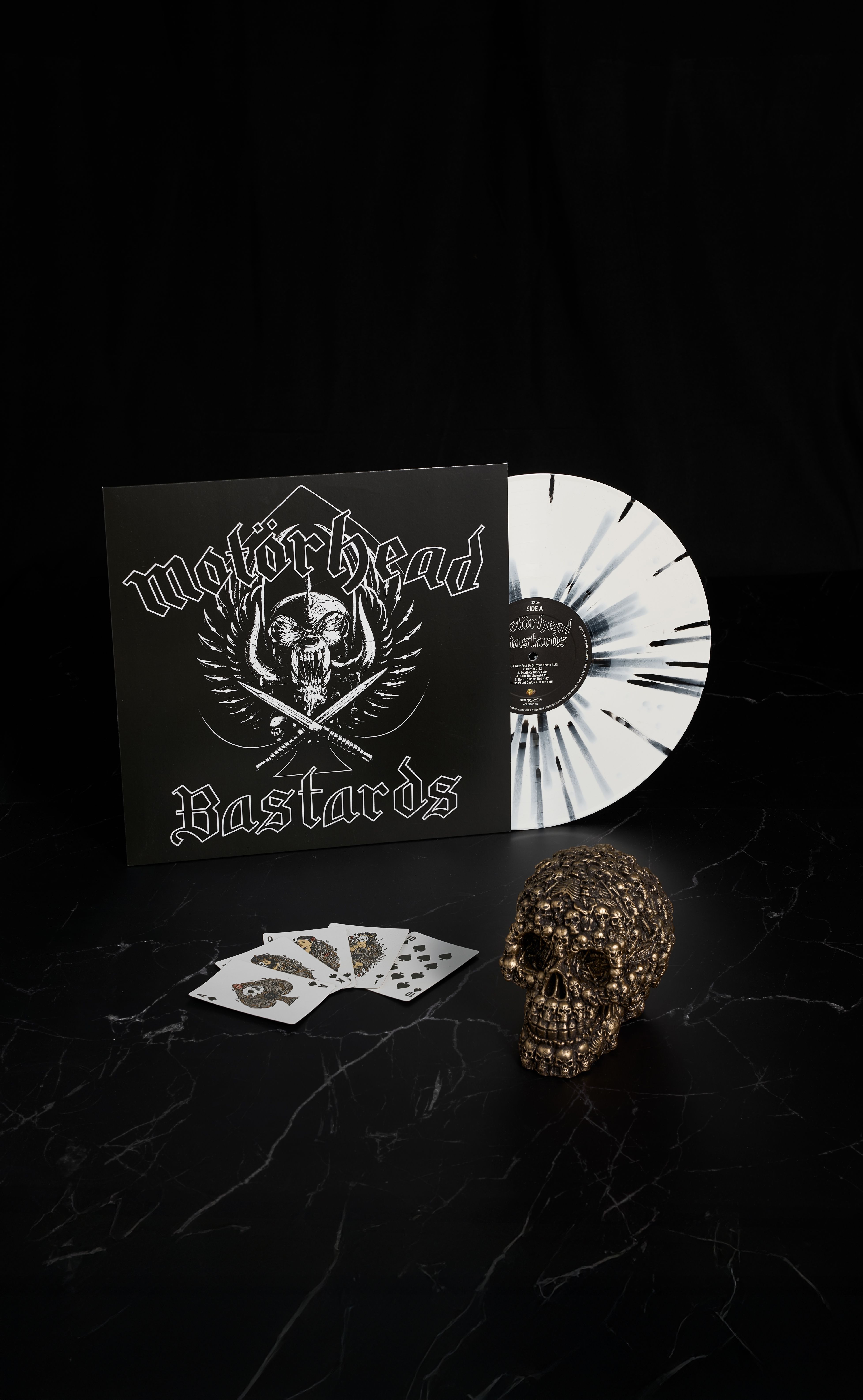
MOTORHEAD
Bastards / 1993 / Hollywood, California
Snaggletooth, Motörhead’s fierce mascot, was created by artist Joe Petagno in collaboration with Lemmy Kilmister. Initially, Kilmister envisioned a blend of decaying robot and medieval knight, but Petagno’s first draft wasn’t quite right. After Lemmy suggested putting the horns in the mouth, the creature started to take shape. A trip to the library sparked Petagno’s imagination—he found a book of animal skulls and fused elements from a dog, wolf, and gorilla, adding oversized wild boar tusks. The result: a snarling hybrid beast, adorned with an iron cross, chains, and spikes. Snaggletooth debuted on Motörhead’s 1977 self-titled album. More than just a logo, it embodied the band’s outlaw spirit and all attitude. It remains an enduring symbol of Motörhead’s defiant legacy. Kilmister originally wanted to name the band, Bastard. That didn’t stick, but their 11th studio album was titled Bastards (1993)—a record some fans call underrated, and others just call loud.


/ Interview
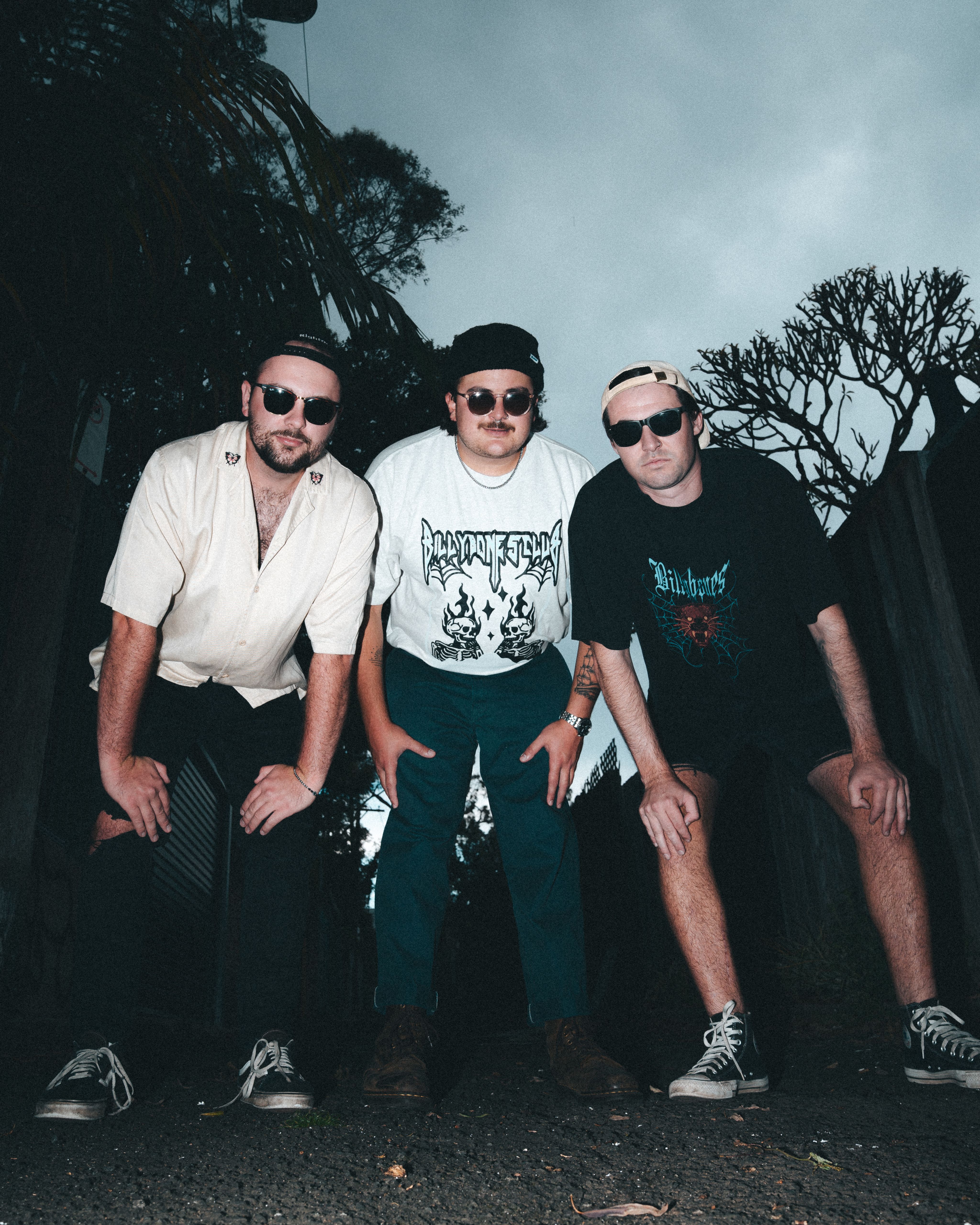
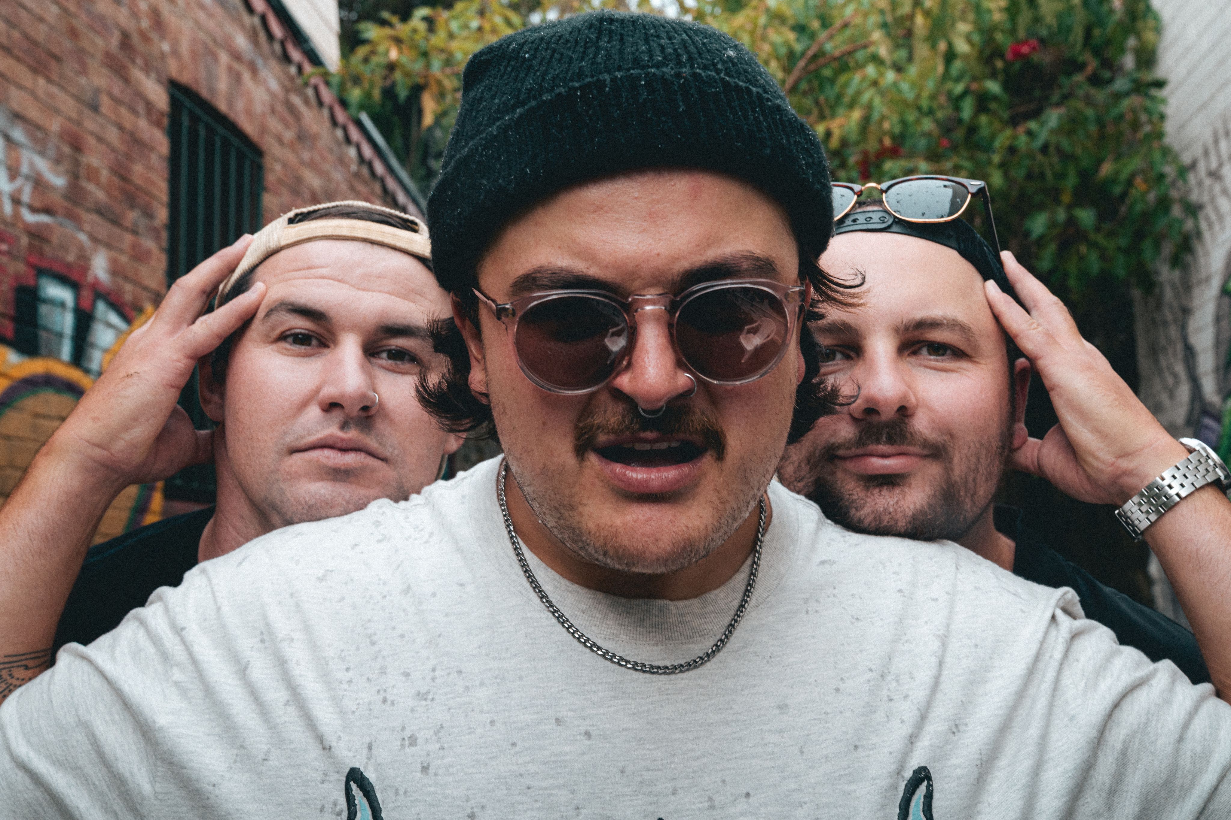
Smacked Youth
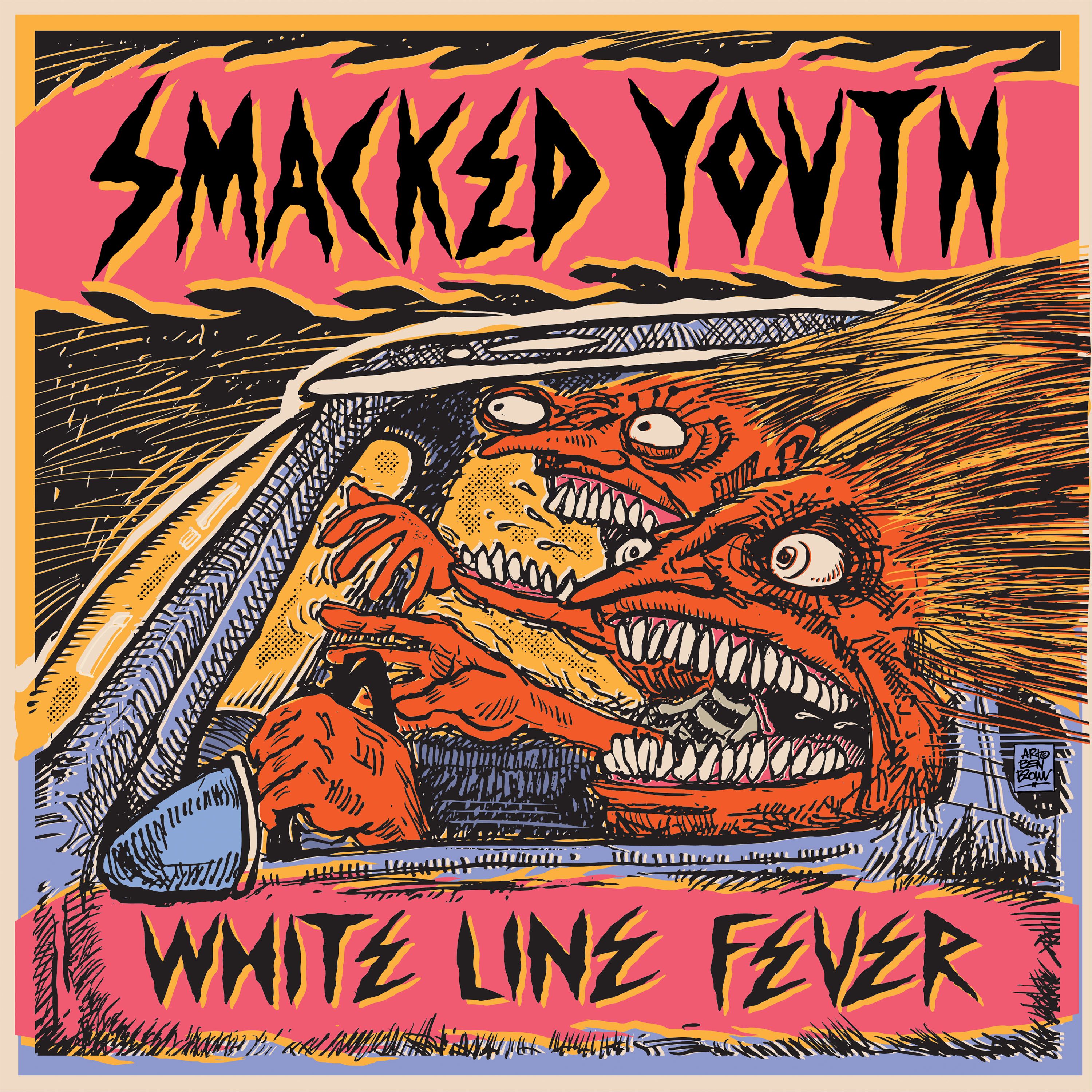
Interview: Bianca Valentino / Album Cover Art: Ben Brown
SMACKED YOUTH ARE A PUNK TRIO FROM NEWCASTLE—SAM D’AGOSTINO (VOCALS/GUITAR), JAKE ELLIS (DRUMS), AND SEAN DOYLE (BASS/VOCALS)—WHO’VE MADE THEIR MARK FROM BERLIN TO BYRON. THEY’VE KICKED OFF 2025 WITH MASSIVE SHOWS ALONGSIDE DUNE RATS AND ROSE TATTOO. THEIR EXPLOSIVE NEW SINGLE ‘WHITE LINE FEVER’ IS OUT NOW, DELIVERING HIGH-ENERGY RIFFS. THEY’RE CHARGING INTO THE REMAINDER OF THE YEAR, LEAVING A TRAIL OF GOOD TIMES BEHIND.
How did Smacked Youth come together? Where did the name come from?
SAM: Smacked Youth came to be while I was in Year 10 at Whitebridge High School, just south of Newcastle—long before the others joined. The name came from wanting something with 'Youth' in it. I thought 'Smacked' sounded kind of edgy when I was 16, as I was going for an 'Off Chops' sort of vibe. The band went through a few lineup changes, with me being the only constant member until Jake and Sean cemented themselves as full-time members.
Can you introduce each member and tell us a bit about them?
SAM: I’m the group founder, chugger and GYG lover! Sean is the groovy shirt enthusiast bringing the thundering low end! Jake is a lover of hard hitting and KFC!
What’s an album that had a big impact on you?
SAM: Frogstomp by Silverchair. All I wanted to do was recreate this album when I was a teenager.
JAKE: Songs For The Deaf by Queens Of The Stone Age. Dave’s hard hitting groove and his fills really inspired me on that album.
SEAN: Discoveries by Northlane. This album still holds it’s place in my heart and is a huge influence and inspiration
You’re based in Newcastle — what’s it like living and making music there? Any local bands or artists we should keep an eye on?
JAKE: Bloody love Newy! We’re very lucky to call it home, as it’s surrounded by beaches and good vibes. We have a strong music culture here, but recently it’s taken quite a hit with venue closures—like the Cambridge—and some popular night spots. A local Newy band to keep your eyes on is STOMP. Those kids are going to go places!
Your latest single ‘White Line Fever’ captures that dizzying feeling of life on the road. How do you stay sane between shows — any go-to road snacks?
SEAN: Between shows, I love getting outdoors. Especially camping and switching off for a couple of days. Playing gigs is pure adrenaline, so it’s good to flip the coin and tap out for a bit! As for road snacks, it’s gotta be salt and vinegar chips. Red Rock Deli too, it’s worth breaking the bank.
Tell us about the weirdest gig you’ve ever played?
SAM: In Amsterdam back in June 2023, our former management had stuffed us over big time booking our European tour. We flew into the Netherlands with no show booked! We ended up having to lie to a venue, telling them we were a cover band under a different name, as most small venues in Europe post-COVID were exclusively booking cover bands at the time. We rocked up under a false alias, hit the stage, and told them we were Smacked Youth from the other side of the fucking world—then launched into our original set.
The artwork for ‘White Line Fever’ was created by Ben Brown, who’s worked with Nirvana, Pearl Jam, and DZ Deathrays. How did you first find his work?
JAKE: I’ve been aware of Ben's work for a while—my dad had a bunch of posters of his album artworks in our garage, and my uncle is also a huge fan. I think Sam came up with the idea. I was so stoked when Ben agreed to do the art for us, and we couldn't be more stoked with how it turned out!
What kind of headspace do you need to be in to create?
SAM: Definitely a free flowing one. It’s like trying to squeeze out a shit. You can’t force it or you’ll rupture your arsehole, so you just have to let it come out naturally.